


中断时间序列分析#
本笔记本侧重于如何进行简单的贝叶斯中断时间序列分析。这在准实验设置中非常有用,在这些设置中,干预措施应用于所有处理单元。
例如,如果对网站进行了更改,并且您想知道网站更改的因果影响,那么如果此更改有选择地且随机地应用于网站用户测试组,那么您或许可以使用A/B 测试方法来提出因果主张。
但是,如果网站更改推广到网站的所有用户,那么您就没有对照组。在这种情况下,您没有对反事实的直接衡量,即如果未进行网站更改会发生什么。在这种情况下,如果您在“良好”的时间点上拥有数据,那么您或许可以使用中断时间序列方法。
有兴趣的读者可以参考优秀的教科书The Effect [Huntington-Klein, 2021]。第 17 章介绍了作者更喜欢使用的“事件研究”而不是中断时间序列术语。
因果 DAG#
下面给出了中断时间序列的简单因果 DAG,但有关更通用的 DAG,请参见 [Huntington-Klein, 2021]。简而言之,它表示
结果受时间(例如,随时间变化的其他因素)和处理的因果影响。
处理受时间的因果影响。
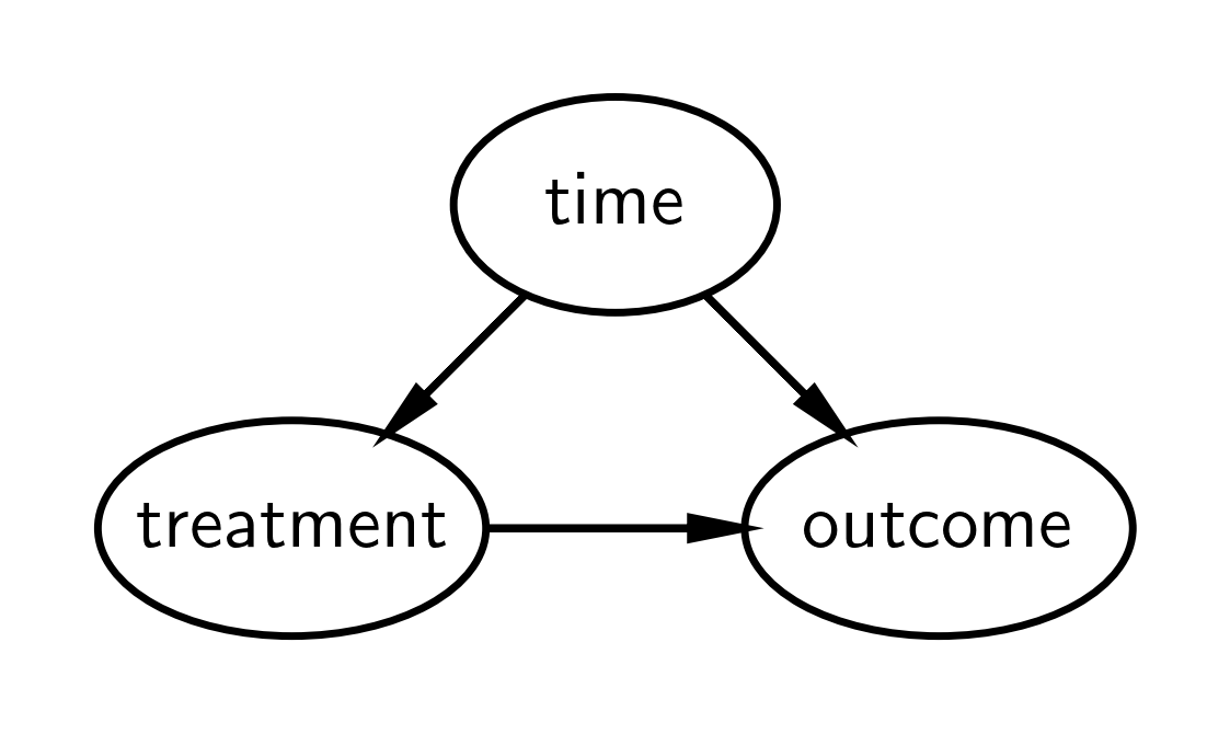
直观地,我们可以将该方法的逻辑描述为
我们知道结果随时间变化。
如果我们在治疗之前构建结果随时间变化的模型的模型,那么我们可以预测如果未发生治疗,我们期望发生的反事实。
我们可以将此反事实与干预后时间的观察结果进行比较。如果存在有意义的差异,那么我们可以将其归因于干预的因果影响。
如果我们排除了与干预同时(或之后)发生的其他合理原因,这是合理的。自从干预发生以来,这种情况变得越来越难以证明,因为其他相关事件可能发生,从而可能提供替代的因果解释。
如果这没有立即理解,我建议查看下面的示例数据图,然后重新访问本节。
import arviz as az
import matplotlib.dates as mdates
import matplotlib.pyplot as plt
import numpy as np
import pandas as pd
import pymc as pm
import xarray as xr

from scipy.stats import norm
%config InlineBackend.figure_format = 'retina'
RANDOM_SEED = 8927
rng = np.random.default_rng(RANDOM_SEED)
az.style.use("arviz-darkgrid")
现在让我们定义一些辅助函数
显示代码单元格内容
def format_x_axis(ax, minor=False):
    # major ticks
    ax.xaxis.set_major_formatter(mdates.DateFormatter("%Y %b"))
    ax.xaxis.set_major_locator(mdates.YearLocator())
    ax.grid(which="major", linestyle="-", axis="x")
    # minor ticks
    if minor:
        ax.xaxis.set_minor_formatter(mdates.DateFormatter("%Y %b"))
        ax.xaxis.set_minor_locator(mdates.MonthLocator())
        ax.grid(which="minor", linestyle=":", axis="x")
    # rotate labels
    for label in ax.get_xticklabels(which="both"):
        label.set(rotation=70, horizontalalignment="right")


def plot_xY(x, Y, ax):
    quantiles = Y.quantile((0.025, 0.25, 0.5, 0.75, 0.975), dim=("chain", "draw")).transpose()

    az.plot_hdi(
        x,
        hdi_data=quantiles.sel(quantile=[0.025, 0.975]),
        fill_kwargs={"alpha": 0.25},
        smooth=False,
        ax=ax,
    )
    az.plot_hdi(
        x,
        hdi_data=quantiles.sel(quantile=[0.25, 0.75]),
        fill_kwargs={"alpha": 0.5},
        smooth=False,
        ax=ax,
    )
    ax.plot(x, quantiles.sel(quantile=0.5), color="C1", lw=3)


# default figure sizes
figsize = (10, 5)
生成数据#
本示例的重点是使用中断时间序列方法进行因果主张。因此,我们将使用一些相对简单的合成数据,这些数据只需要一个非常简单的模型。
treatment_time = "2017-01-01"
β0 = 0
β1 = 0.1
dates = pd.date_range(
    start=pd.to_datetime("2010-01-01"), end=pd.to_datetime("2020-01-01"), freq="M"
)
N = len(dates)


def causal_effect(df):
    return (df.index > treatment_time) * 2


df = (
    pd.DataFrame()
    .assign(time=np.arange(N), date=dates)
    .set_index("date", drop=True)
    .assign(y=lambda x: β0 + β1 * x.time + causal_effect(x) + norm(0, 0.5).rvs(N))
)
df
| 时间 | y | |
|---|---|---|
| 日期 | ||
| 2010-01-31 | 0 | 0.302698 |
| 2010-02-28 | 1 | 0.396772 |
| 2010-03-31 | 2 | -0.433908 |
| 2010-04-30 | 3 | 0.276239 |
| 2010-05-31 | 4 | 0.943868 |
| ... | ... | ... |
| 2019-08-31 | 115 | 12.403634 |
| 2019-09-30 | 116 | 13.185151 |
| 2019-10-31 | 117 | 14.001674 |
| 2019-11-30 | 118 | 13.950388 |
| 2019-12-31 | 119 | 14.383951 |
120 行 × 2 列
# Split into pre and post intervention dataframes
pre = df[df.index < treatment_time]
post = df[df.index >= treatment_time]
fig, ax = plt.subplots()
ax = pre["y"].plot(label="pre")
post["y"].plot(ax=ax, label="post")
ax.axvline(treatment_time, c="k", ls=":")
plt.legend();
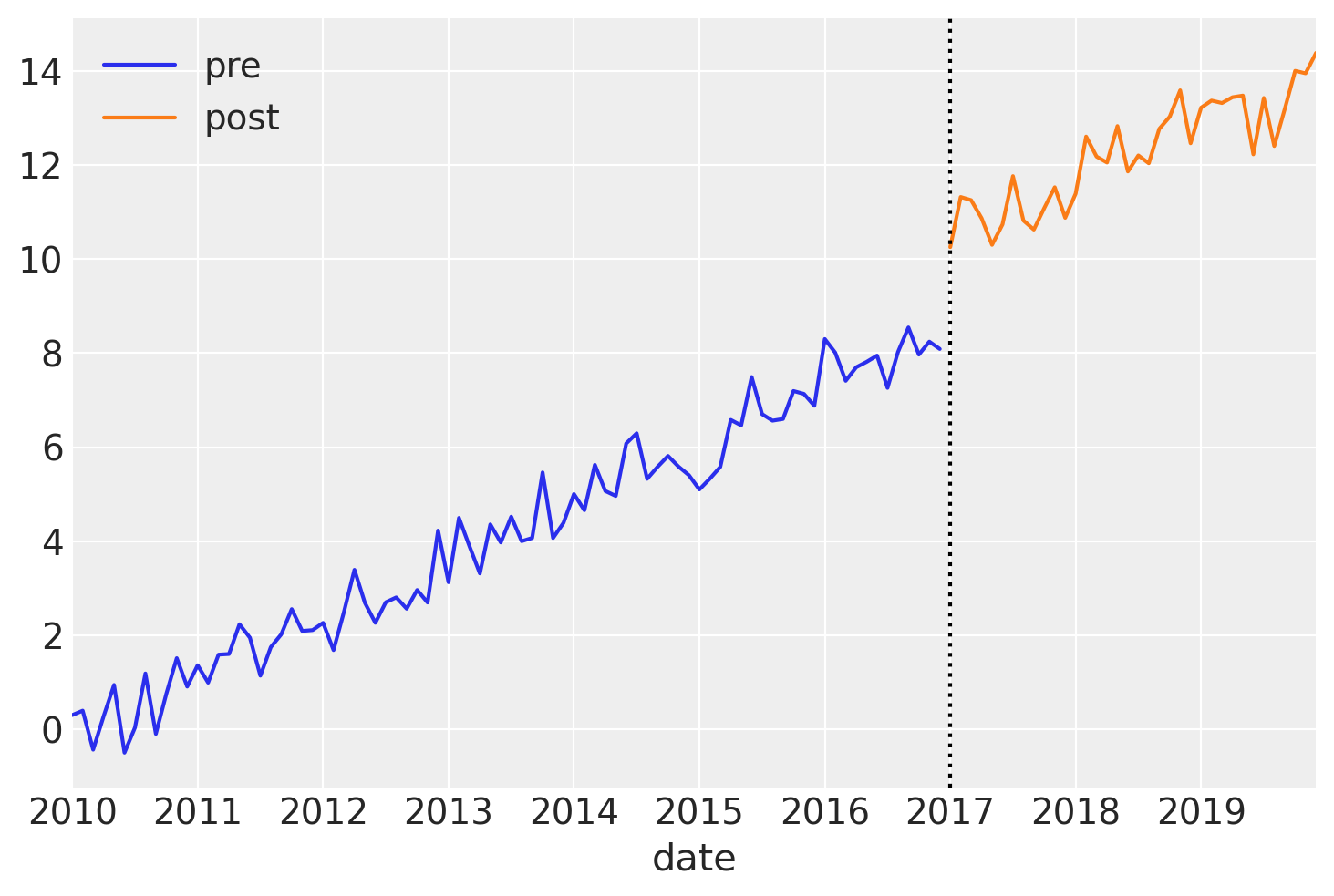
在这个简单的数据集中,我们有一个嘈杂的线性向上趋势,并且由于此数据是合成的,我们知道我们在干预时间结果中有一个阶跃增加,并且这种影响在一段时间内持续存在。
建模#
在这里,我们构建一个简单的线性模型。请记住,我们正在构建干预前数据的模型,目标是它可以合理地预测如果未应用干预会发生什么。换句话说,我们没有对干预后观察的任何方面进行建模,例如截距、斜率的变化或效应是瞬时的还是永久的。
with pm.Model() as model:
    # observed predictors and outcome
    time = pm.MutableData("time", pre["time"].to_numpy(), dims="obs_id")
    # priors
    beta0 = pm.Normal("beta0", 0, 1)
    beta1 = pm.Normal("beta1", 0, 0.2)
    # the actual linear model
    mu = pm.Deterministic("mu", beta0 + (beta1 * time), dims="obs_id")
    sigma = pm.HalfNormal("sigma", 2)
    # likelihood
    pm.Normal("obs", mu=mu, sigma=sigma, observed=pre["y"].to_numpy(), dims="obs_id")
pm.model_to_graphviz(model)

先验预测检查#
作为贝叶斯工作流的一部分,我们将绘制先验预测,以查看模型在观察到任何数据之前发现的结果。
with model:
    idata = pm.sample_prior_predictive(random_seed=RANDOM_SEED)

fig, ax = plt.subplots(figsize=figsize)

plot_xY(pre.index, idata.prior_predictive["obs"], ax)
format_x_axis(ax)
ax.plot(pre.index, pre["y"], label="observed")
ax.set(title="Prior predictive distribution in the pre intervention era")
plt.legend();
Sampling: [beta0, beta1, obs, sigma]
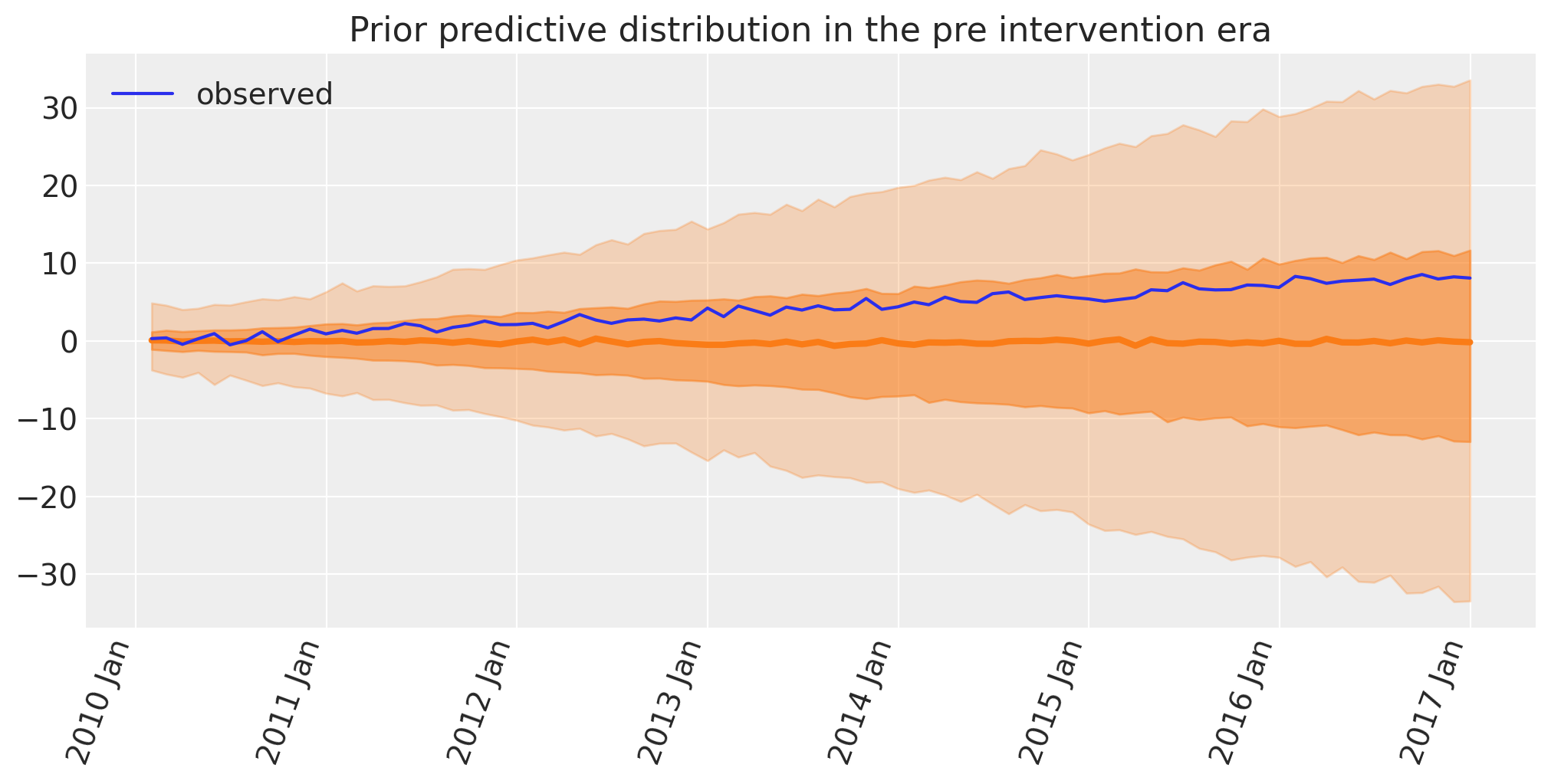
这似乎是合理的,因为截距和斜率的先验足够广泛,可以导致轻松包含实际数据的预测观察结果。这意味着选择的特定先验不会过度约束后验参数估计。
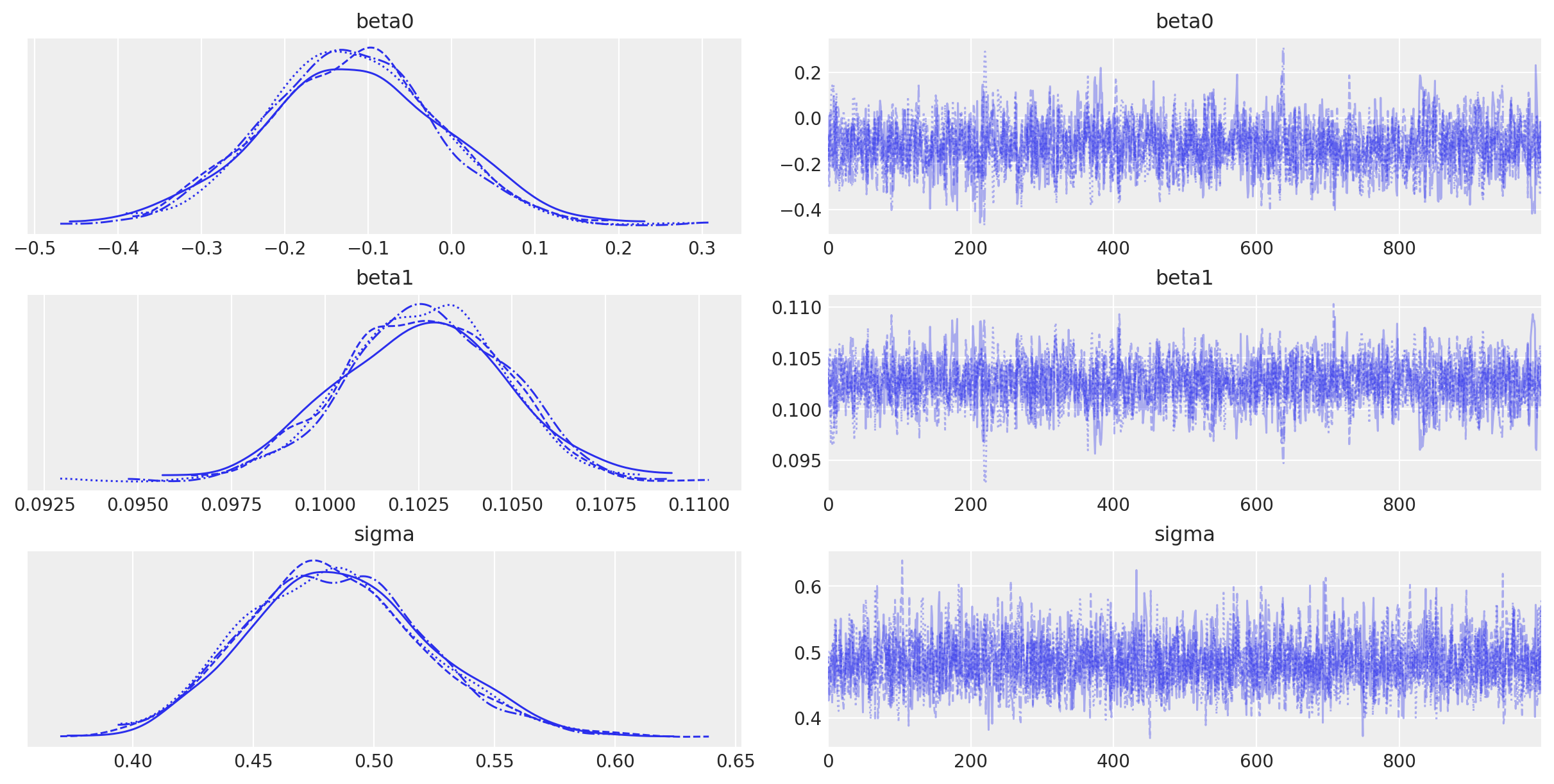
推断#
绘制后验分布的样本,并记住我们仅对干预前数据执行此操作。
with model:
    idata.extend(pm.sample(random_seed=RANDOM_SEED))
Auto-assigning NUTS sampler...
Initializing NUTS using jitter+adapt_diag...
Multiprocess sampling (4 chains in 4 jobs)
NUTS: [beta0, beta1, sigma]
Sampling 4 chains for 1_000 tune and 1_000 draw iterations (4_000 + 4_000 draws total) took 1 seconds.
az.plot_trace(idata, var_names=["~mu"]);
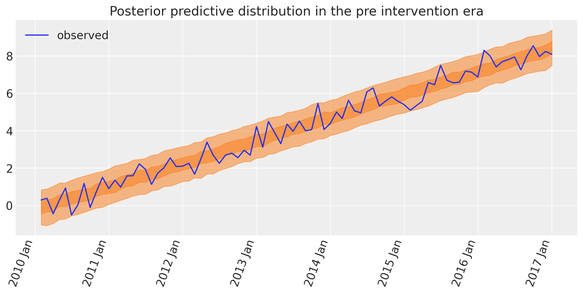
后验预测检查#
贝叶斯工作流的另一个重要方面是绘制模型的后验预测,使我们能够了解模型能够多好地回溯已经观察到的数据。正是在这一点上,我们可以决定模型是否过于简单(那么我们将在模型中构建更多复杂性)或者是否可以。
with model:
    idata.extend(pm.sample_posterior_predictive(idata, random_seed=RANDOM_SEED))

fig, ax = plt.subplots(figsize=figsize)

az.plot_hdi(pre.index, idata.posterior_predictive["obs"], hdi_prob=0.5, smooth=False)
az.plot_hdi(pre.index, idata.posterior_predictive["obs"], hdi_prob=0.95, smooth=False)
ax.plot(pre.index, pre["y"], label="observed")
format_x_axis(ax)
ax.set(title="Posterior predictive distribution in the pre intervention era")
plt.legend();
Sampling: [obs]
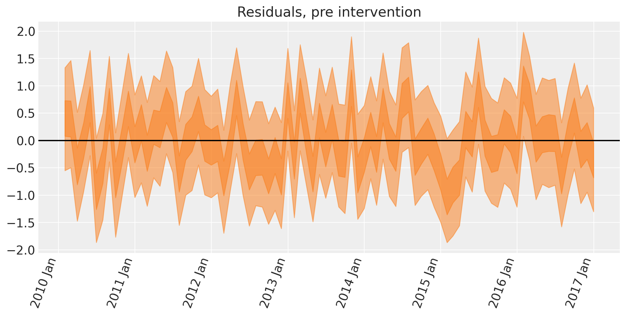
下一步不是绝对必要的,但我们可以计算模型回溯预测与数据之间的差异,以查看误差。这对于识别任何意外的回溯预测干预前数据的能力可能很有用。
显示代码单元格源代码
# convert outcome into an XArray object with a labelled dimension to help in the next step
y = xr.DataArray(pre["y"].to_numpy(), dims=["obs_id"])

# do the calculation by taking the difference
excess = y - idata.posterior_predictive["obs"]
fig, ax = plt.subplots(figsize=figsize)
# the transpose is to keep arviz happy, ordering the dimensions as (chain, draw, time)
az.plot_hdi(pre.index, excess.transpose(..., "obs_id"), hdi_prob=0.5, smooth=False)
az.plot_hdi(pre.index, excess.transpose(..., "obs_id"), hdi_prob=0.95, smooth=False)
format_x_axis(ax)
ax.axhline(y=0, color="k")
ax.set(title="Residuals, pre intervention");
反事实推断#
现在,我们将使用我们的模型来预测在没有干预的“如果?”情景中观察到的结果。
因此,我们使用来自post干预数据框的time数据更新模型,并运行后验预测抽样以预测我们在此反事实情景中将观察到的观察结果。我们也可以称其为“预测”。
with model:
    pm.set_data(
        {
            "time": post["time"].to_numpy(),
        }
    )
    counterfactual = pm.sample_posterior_predictive(
        idata, var_names=["obs"], random_seed=RANDOM_SEED
    )
Sampling: [obs]
显示代码单元格源代码
fig, ax = plt.subplots(figsize=figsize)

plot_xY(post.index, counterfactual.posterior_predictive["obs"], ax)
format_x_axis(ax, minor=False)
ax.plot(post.index, post["y"], label="observed")
ax.set(
    title="Counterfactual: Posterior predictive forecast of outcome if intervention not taken place"
)
plt.legend();
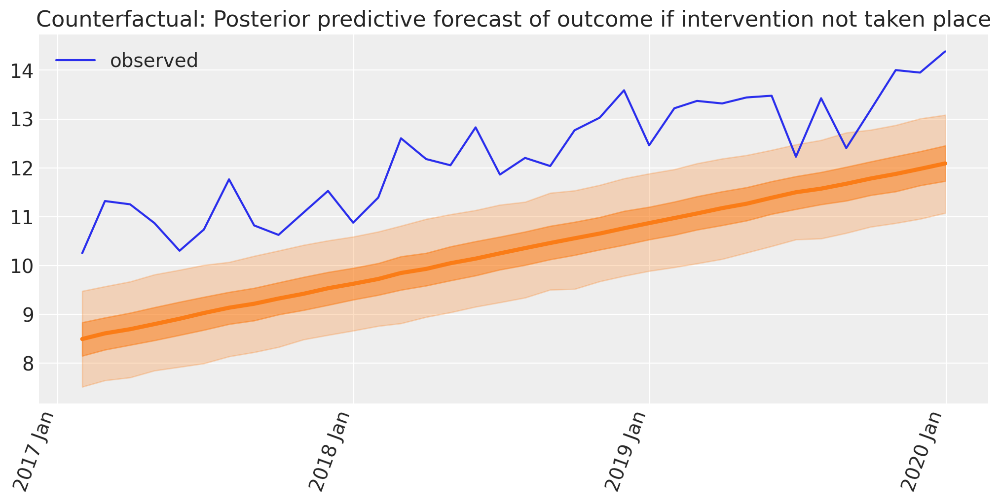
我们现在拥有计算因果影响所需的要素。这只是贝叶斯反事实预测与观察结果之间的差异。
自干预以来的因果影响#
现在,我们将使用反事实情景下预测的结果,并将其与观察到的结果进行比较,以得出我们的反事实估计。
# convert outcome into an XArray object with a labelled dimension to help in the next step
outcome = xr.DataArray(post["y"].to_numpy(), dims=["obs_id"])

# do the calculation by taking the difference
excess = outcome - counterfactual.posterior_predictive["obs"]
我们可以轻松地计算累积因果影响
# calculate the cumulative causal impact
cumsum = excess.cumsum(dim="obs_id")
显示代码单元格源代码
fig, ax = plt.subplots(2, 1, figsize=(figsize[0], 9), sharex=True)

# Plot the excess
# The transpose is to keep arviz happy, ordering the dimensions as (chain, draw, t)
plot_xY(post.index, excess.transpose(..., "obs_id"), ax[0])
format_x_axis(ax[0], minor=True)
ax[0].axhline(y=0, color="k")
ax[0].set(title="Causal impact, since intervention")

# Plot the cumulative excess
plot_xY(post.index, cumsum.transpose(..., "obs_id"), ax[1])
format_x_axis(ax[1], minor=False)
ax[1].axhline(y=0, color="k")
ax[1].set(title="Cumulative causal impact, since intervention");
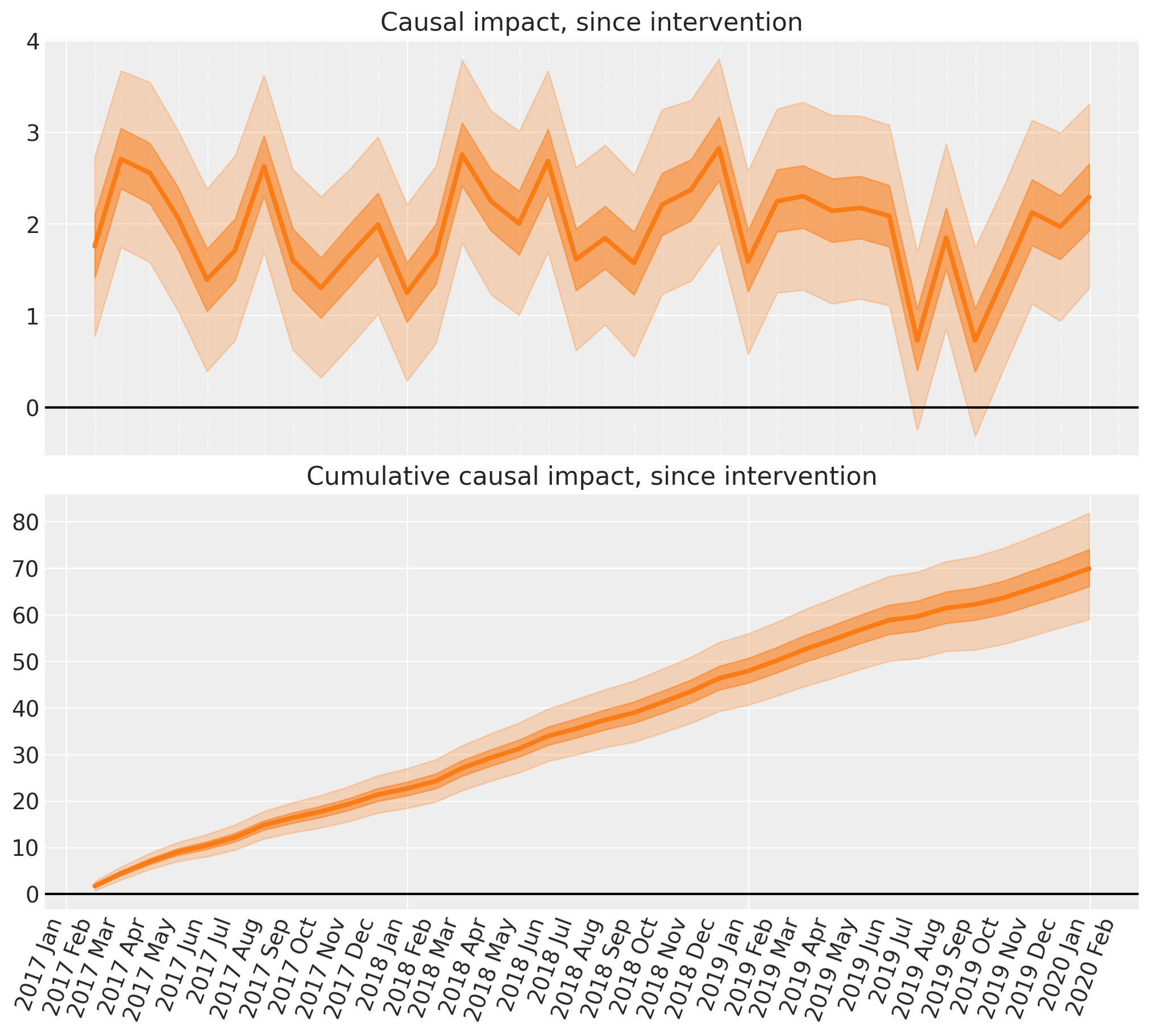
就这样 - 我们已经使用中断时间序列方法在 PyMC 中完成了一些贝叶斯反事实推断!在短短的几个步骤中,我们完成了
构建了一个简单的模型来预测时间序列。
根据干预前数据推断模型参数,运行先验和后验预测检查。我们注意到该模型非常好。
使用该模型创建了反事实预测,预测如果未发生干预,干预时间之后会发生什么。
通过将观察到的结果与我们在没有干预的情况下预期的反事实结果进行比较,计算了因果影响(和累积因果影响)。
在现实世界的环境中,中断时间序列方法当然可以通过多种方式变得更加复杂。例如,可能存在更多的时间结构,例如季节性。如果是这样,那么我们可能需要使用特定的时间序列模型,而不仅仅是线性回归模型。也可能存在其他信息丰富的预测变量需要纳入模型。此外,某些设计不仅由干预前和干预后时期(也称为 A/B 设计)组成,而且还可能涉及干预不活动、活动然后不活动的时期(也称为 ABA 设计)。
参考文献#
水印#
%load_ext watermark
%watermark -n -u -v -iv -w -p pytensor,aeppl,xarray
Last updated: Wed Feb 01 2023

Python implementation: CPython
Python version       : 3.11.0
IPython version      : 8.9.0

pytensor: 2.8.11
aeppl   : not installed
xarray  : 2023.1.0

pymc      : 5.0.1
xarray    : 2023.1.0
numpy     : 1.24.1
matplotlib: 3.6.3
arviz     : 0.14.0
pandas    : 1.5.3

Watermark: 2.3.1
许可声明#
本示例 галерея 中的所有笔记本均根据 MIT 许可证提供,该许可证允许修改和再分发用于任何用途,前提是保留版权和许可声明。
引用 PyMC 示例#
要引用此笔记本,请使用 Zenodo 为 pymc-examples 存储库提供的 DOI。
重要提示
许多笔记本都改编自其他来源:博客、书籍... 在这种情况下,您也应该引用原始来源。
另请记住引用您的代码使用的相关库。
这是一个 bibtex 中的引用模板
@incollection{citekey,
  author    = "<notebook authors, see above>",
  title     = "<notebook title>",
  editor    = "PyMC Team",
  booktitle = "PyMC examples",
  doi       = "10.5281/zenodo.5654871"
}
呈现后可能看起来像