


样本外预测#
import arviz as az
import matplotlib.pyplot as plt
import numpy as np
import pandas as pd
import pymc as pm
import seaborn as sns

from scipy.special import expit as inverse_logit
from sklearn.metrics import RocCurveDisplay, auc, roc_curve
RANDOM_SEED = 8927
rng = np.random.default_rng(RANDOM_SEED)
az.style.use("arviz-darkgrid")
生成示例数据#
我们想要拟合一个逻辑回归模型,其中两个数值特征之间存在乘法交互作用。
# Number of data points
n = 250
# Create features
x1 = rng.normal(loc=0.0, scale=2.0, size=n)
x2 = rng.normal(loc=0.0, scale=2.0, size=n)
# Define target variable
intercept = -0.5
beta_x1 = 1
beta_x2 = -1
beta_interaction = 2
z = intercept + beta_x1 * x1 + beta_x2 * x2 + beta_interaction * x1 * x2
p = inverse_logit(z)
# note binomial with n=1 is equal to a Bernoulli
y = rng.binomial(n=1, p=p, size=n)
df = pd.DataFrame(dict(x1=x1, x2=x2, y=y))
df.head()
| x1 | x2 | y | |
|---|---|---|---|
| 0 | -0.445284 | 1.381325 | 0 |
| 1 | 2.651317 | 0.800736 | 1 |
| 2 | -1.141940 | -0.128204 | 0 |
| 3 | 1.336498 | -0.931965 | 0 |
| 4 | 2.290762 | 3.400222 | 1 |
让我们对数据进行一些探索
sns.pairplot(data=df, kind="scatter");
/home/xian/mambaforge/envs/pymc/lib/python3.10/site-packages/seaborn/axisgrid.py:118: UserWarning: This figure was using constrained_layout, but that is incompatible with subplots_adjust and/or tight_layout; disabling constrained_layout.
  self._figure.tight_layout(*args, **kwargs)
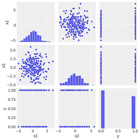
\(x_1\) 和 \(x_2\) 不相关。
\(x_1\) 和 \(x_2\) 似乎不能独立地分离 \(y\) 类。
\(y\) 的分布不是高度不平衡的。
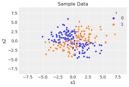
fig, ax = plt.subplots()
sns.scatterplot(x="x1", y="x2", data=df, hue="y")
ax.legend(title="y")
ax.set(title="Sample Data", xlim=(-9, 9), ylim=(-9, 9));
准备建模数据#
labels = ["Intercept", "x1", "x2", "x1:x2"]
df["Intercept"] = np.ones(len(df))
df["x1:x2"] = df["x1"] * df["x2"]
# reorder columns to be in the same order as labels
df = df[labels]
x = df.to_numpy()
现在我们进行训练-测试拆分。
indices = rng.permutation(x.shape[0])
train_prop = 0.7
train_size = int(train_prop * x.shape[0])
training_idx, test_idx = indices[:train_size], indices[train_size:]
x_train, x_test = x[training_idx, :], x[test_idx, :]
y_train, y_test = y[training_idx], y[test_idx]
定义和拟合模型#
我们现在在 PyMC 中指定模型。
coords = {"coeffs": labels}

with pm.Model(coords=coords) as model:
    # data containers
    X = pm.MutableData("X", x_train)
    y = pm.MutableData("y", y_train)
    # priors
    b = pm.Normal("b", mu=0, sigma=1, dims="coeffs")
    # linear model
    mu = pm.math.dot(X, b)
    # link function
    p = pm.Deterministic("p", pm.math.invlogit(mu))
    # likelihood
    pm.Bernoulli("obs", p=p, observed=y)

pm.model_to_graphviz(model)

with model:
    idata = pm.sample()
Auto-assigning NUTS sampler...
Initializing NUTS using jitter+adapt_diag...
Multiprocess sampling (4 chains in 4 jobs)
NUTS: [b]
Sampling 4 chains for 1_000 tune and 1_000 draw iterations (4_000 + 4_000 draws total) took 1 seconds.
az.plot_trace(idata, var_names="b", compact=False);
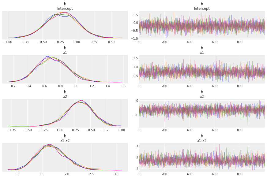
链看起来不错。
az.summary(idata, var_names="b")
| 均值 | 标准差 | hdi_3% | hdi_97% | mcse_均值 | mcse_标准差 | ess_bulk | ess_tail | r_hat | |
|---|---|---|---|---|---|---|---|---|---|
| b[截距] | -0.215 | 0.231 | -0.650 | 0.216 | 0.004 | 0.003 | 3037.0 | 2565.0 | 1.0 |
| b[x1] | 0.705 | 0.193 | 0.363 | 1.085 | 0.004 | 0.003 | 2296.0 | 2386.0 | 1.0 |
| b[x2] | -0.675 | 0.209 | -1.065 | -0.281 | 0.004 | 0.003 | 2761.0 | 2419.0 | 1.0 |
| b[x1:x2] | 1.698 | 0.303 | 1.114 | 2.240 | 0.007 | 0.005 | 2079.0 | 2325.0 | 1.0 |
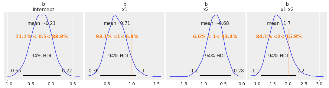
我们很好地恢复了这个模拟数据集的真实参数。
az.plot_posterior(
    idata, var_names=["b"], ref_val=[intercept, beta_x1, beta_x2, beta_interaction], figsize=(15, 4)
);
生成样本外预测#
现在我们在测试集上生成预测。
with model:
    pm.set_data({"X": x_test, "y": y_test})
    idata.extend(pm.sample_posterior_predictive(idata))
Sampling: [obs]
# Compute the point prediction by taking the mean and defining the category via a threshold.
p_test_pred = idata.posterior_predictive["obs"].mean(dim=["chain", "draw"])
y_test_pred = (p_test_pred >= 0.5).astype("int").to_numpy()
评估模型#
首先,让我们计算测试集上的准确率。
print(f"accuracy = {np.mean(y_test==y_test_pred): 0.3f}")
accuracy = 0.893
fpr, tpr, thresholds = roc_curve(
    y_true=y_test, y_score=p_test_pred, pos_label=1, drop_intermediate=False
)
roc_auc = auc(fpr, tpr)

fig, ax = plt.subplots()
roc_display = RocCurveDisplay(fpr=fpr, tpr=tpr, roc_auc=roc_auc)
roc_display = roc_display.plot(ax=ax, marker="o", markersize=4)
ax.set(title="ROC");

该模型表现如预期(我们当然知道数据生成过程,这在实际应用中几乎从未发生)。
模型决策边界#
最后,我们将描述和绘制模型决策边界,这是定义为以下内容的空间
\[\mathcal{B} = \{(x_1, x_2) \in \mathbb{R}^2 \: | \: p(x_1, x_2) = 0.5\}\]
其中 \(p\) 表示模型输出的属于 \(y=1\) 类的概率。 为了使这个集合显式化,我们只需根据模型参数化写出条件
\[0.5 = \frac{1}{1 + \exp(-(\beta_0 + \beta_1 x_1 + \beta_2 x_2 + \beta_{12} x_1x_2))}\]
这意味着
\[0 = \beta_0 + \beta_1 x_1 + \beta_2 x_2 + \beta_{12} x_1x_2\]
求解 \(x_2\) 我们得到公式
\[x_2 = - \frac{\beta_0 + \beta_1 x_1}{\beta_2 + \beta_{12}x_1}\]
请注意,这条曲线是以奇点 \(x_1 = - \beta_2 / \beta_{12}\) 为中心的双曲线。
现在让我们使用网格绘制模型决策边界
def make_grid():
    x1_grid = np.linspace(start=-9, stop=9, num=300)
    x2_grid = x1_grid
    x1_mesh, x2_mesh = np.meshgrid(x1_grid, x2_grid)
    x_grid = np.stack(arrays=[x1_mesh.flatten(), x2_mesh.flatten()], axis=1)
    return x1_grid, x2_grid, x_grid


x1_grid, x2_grid, x_grid = make_grid()

with model:
    # Create features on the grid.
    x_grid_ext = np.hstack(
        (
            np.ones((x_grid.shape[0], 1)),
            x_grid,
            (x_grid[:, 0] * x_grid[:, 1]).reshape(-1, 1),
        )
    )
    # set the observed variables
    pm.set_data({"X": x_grid_ext})
    # calculate pushforward values of `p`
    ppc_grid = pm.sample_posterior_predictive(idata, var_names=["p"])
Sampling: []
# grid of predictions
grid_df = pd.DataFrame(x_grid, columns=["x1", "x2"])
grid_df["p"] = ppc_grid.posterior_predictive.p.mean(dim=["chain", "draw"])
p_grid = grid_df.pivot(index="x2", columns="x1", values="p").to_numpy()
现在我们在网格上计算模型决策边界以用于可视化目的。
def calc_decision_boundary(idata, x1_grid):
    # posterior mean of coefficients
    intercept = idata.posterior["b"].sel(coeffs="Intercept").mean().data
    b1 = idata.posterior["b"].sel(coeffs="x1").mean().data
    b2 = idata.posterior["b"].sel(coeffs="x2").mean().data
    b1b2 = idata.posterior["b"].sel(coeffs="x1:x2").mean().data
    # decision boundary equation
    return -(intercept + b1 * x1_grid) / (b2 + b1b2 * x1_grid)
我们最终得到了图和测试集上的预测
fig, ax = plt.subplots()

# data
sns.scatterplot(
    x=x_test[:, 1].flatten(),
    y=x_test[:, 2].flatten(),
    hue=y_test,
    ax=ax,
)

# decision boundary
ax.plot(x1_grid, calc_decision_boundary(idata, x1_grid), color="black", linestyle=":")

# grid of predictions
ax.contourf(x1_grid, x2_grid, p_grid, alpha=0.3)

ax.legend(title="y", loc="center left", bbox_to_anchor=(1, 0.5))
ax.set(title="Model Decision Boundary", xlim=(-9, 9), ylim=(-9, 9), xlabel="x1", ylabel="x2");

请注意,我们已经通过使用后验样本的均值计算了模型决策边界。 但是,如果我们使用完整分布,我们可以生成更好(且信息量更大!)的图(与其他指标(如准确率和 AUC)类似)。
参考文献#
水印#
%load_ext watermark
%watermark -n -u -v -iv -w -p pytensor
Last updated: Wed Dec 06 2023

Python implementation: CPython
Python version       : 3.10.8
IPython version      : 8.4.0

pytensor: 2.18.1

pymc      : 5.10.0
seaborn   : 0.12.2
pandas    : 1.4.3
matplotlib: 3.5.2
arviz     : 0.14.0
numpy     : 1.24.2

Watermark: 2.3.1
许可声明#
此示例库中的所有笔记本均在 MIT 许可证 下提供,该许可证允许修改和再分发以用于任何用途,前提是保留版权和许可证声明。
引用 PyMC 示例#
要引用此笔记本,请使用 Zenodo 为 pymc-examples 存储库提供的 DOI。
重要
许多笔记本都改编自其他来源:博客、书籍……在这种情况下,您也应该引用原始来源。
另请记住引用您的代码使用的相关库。
这是一个 bibtex 中的引用模板
@incollection{citekey,
  author    = "<notebook authors, see above>",
  title     = "<notebook title>",
  editor    = "PyMC Team",
  booktitle = "PyMC examples",
  doi       = "10.5281/zenodo.5654871"
}
一旦渲染,它可能看起来像