


GLM:使用自定义似然函数的稳健回归进行异常值分类#
使用 PyMC 进行稳健回归,通过 Hogg 2010 信号与噪声方法进行异常值检测。
建模概念
此模型使用自定义似然函数作为两个似然函数的混合,一个用于主要数据生成函数(我们关心的线性模型),另一个用于异常值。
该模型不进行边缘化,因此为我们提供了每个数据点的异常值分类
数据集很小且硬编码到此 Notebook 中。它在 x 和 y 中都包含错误,但我们在此处仅处理 y 中的错误。
补充方法
这是一种与 Student-T 稳健回归互补的方法,如示例 generalized_linear_models/GLM-robust 中所示,并且也对该方法进行了比较
另请参阅 Dan FM 的 gist,他在快速的 Twitter 对话后发布了该 gist - 他的“Hogg improved”模型使用相同的模型结构,并巧妙地对异常值类别进行了边缘化,但在使用
pm.Deterministic<- 这真的很好 在采样期间也观察到了它似然评估本质上是“数据分析秘籍:将模型拟合到数据”中的公式 17 的副本 - Hogg et al. [2010]
该模型专门改编自 Jake Vanderplas 和 Brigitta Sipocz 在 AstroML 书籍中的 实现 [Željko Ivezić et al., 2014, Vanderplas et al., 2012]
设置#
安装说明#
有关依赖项和编写 notebook 的环境的完整详细信息,请参阅原始项目 README。有关执行此 notebook 的环境的摘要,请参阅 “Watermark” 部分。
注意
此 notebook 使用的库不是 PyMC 依赖项,因此需要专门安装才能运行此 notebook。打开下面的下拉菜单以获取更多指导。
额外依赖项安装说明
为了运行此 notebook(本地或在 binder 上),您不仅需要安装可用的 PyMC 以及所有可选依赖项,还需要安装一些额外的依赖项。有关安装 PyMC 本身的建议,请参阅 安装
您可以使用首选的软件包管理器安装这些依赖项,我们在此处提供 pip 和 conda 命令作为示例。
$ pip install seaborn
请注意,如果您想(或需要)从 notebook 内部而不是命令行安装软件包,则可以通过运行 pip 命令的变体来安装软件包
import sys
!{sys.executable} -m pip install seaborn
您不应运行 !pip install,因为它可能会将软件包安装在不同的环境中,即使已安装,也无法从 Jupyter notebook 中使用。
另一种选择是使用 conda
$ conda install seaborn
当使用 conda 安装 scientific python 软件包时,我们建议使用 conda forge
%matplotlib inline
%config InlineBackend.figure_format = 'retina'
导入#
import arviz as az
import matplotlib.pyplot as plt
import numpy as np
import pandas as pd
import pymc as pm
import seaborn as sns

from matplotlib.lines import Line2D
from scipy import stats
az.style.use("arviz-darkgrid")
加载数据#
我们将使用 Hogg 2010 数据,该数据可在 https://github.com/astroML/astroML/blob/master/astroML/datasets/hogg2010test.py 获取
它是一个非常小的数据集,为了方便起见,它在下面进行了硬编码
# cut & pasted directly from the fetch_hogg2010test() function
# identical to the original dataset as hardcoded in the Hogg 2010 paper

dfhogg = pd.DataFrame(
    np.array(
        [
            [1, 201, 592, 61, 9, -0.84],
            [2, 244, 401, 25, 4, 0.31],
            [3, 47, 583, 38, 11, 0.64],
            [4, 287, 402, 15, 7, -0.27],
            [5, 203, 495, 21, 5, -0.33],
            [6, 58, 173, 15, 9, 0.67],
            [7, 210, 479, 27, 4, -0.02],
            [8, 202, 504, 14, 4, -0.05],
            [9, 198, 510, 30, 11, -0.84],
            [10, 158, 416, 16, 7, -0.69],
            [11, 165, 393, 14, 5, 0.30],
            [12, 201, 442, 25, 5, -0.46],
            [13, 157, 317, 52, 5, -0.03],
            [14, 131, 311, 16, 6, 0.50],
            [15, 166, 400, 34, 6, 0.73],
            [16, 160, 337, 31, 5, -0.52],
            [17, 186, 423, 42, 9, 0.90],
            [18, 125, 334, 26, 8, 0.40],
            [19, 218, 533, 16, 6, -0.78],
            [20, 146, 344, 22, 5, -0.56],
        ]
    ),
    columns=["id", "x", "y", "sigma_y", "sigma_x", "rho_xy"],
)

dfhogg["id"] = dfhogg["id"].apply(lambda x: "p{}".format(int(x)))
dfhogg.set_index("id", inplace=True)
dfhogg.head()
| x | y | sigma_y | sigma_x | rho_xy | |
|---|---|---|---|---|---|
| id | |||||
| p1 | 201.0 | 592.0 | 61.0 | 9.0 | -0.84 |
| p2 | 244.0 | 401.0 | 25.0 | 4.0 | 0.31 |
| p3 | 47.0 | 583.0 | 38.0 | 11.0 | 0.64 |
| p4 | 287.0 | 402.0 | 15.0 | 7.0 | -0.27 |
| p5 | 203.0 | 495.0 | 21.0 | 5.0 | -0.33 |
1. 基本 EDA#
探索性数据分析
注意
这非常基础,因此我们可以快速进入
pymc3部分数据集包含 x 和 y 中的错误,但我们在此处仅处理 y 中的错误。
有关更多详细信息,请参阅 Hogg et al. [2010]
with plt.rc_context({"figure.constrained_layout.use": False}):
    gd = sns.jointplot(
        x="x",
        y="y",
        data=dfhogg,
        kind="scatter",
        height=6,
        marginal_kws={"bins": 12, "kde": True, "kde_kws": {"cut": 1}},
        joint_kws={"edgecolor": "w", "linewidth": 1.2, "s": 80},
    )

_ = gd.ax_joint.errorbar(
    "x", "y", "sigma_y", "sigma_x", fmt="none", ecolor="#4878d0", data=dfhogg, zorder=10
)

for idx, r in dfhogg.iterrows():
    _ = gd.ax_joint.annotate(
        text=idx,
        xy=(r["x"], r["y"]),
        xycoords="data",
        xytext=(10, 10),
        textcoords="offset points",
        color="#999999",
        zorder=1,
    )


_ = gd.fig.suptitle(
    (
        "Original datapoints in Hogg 2010 dataset\n"
        + "showing marginal distributions and errors sigma_x, sigma_y"
    ),
    y=1.05,
);
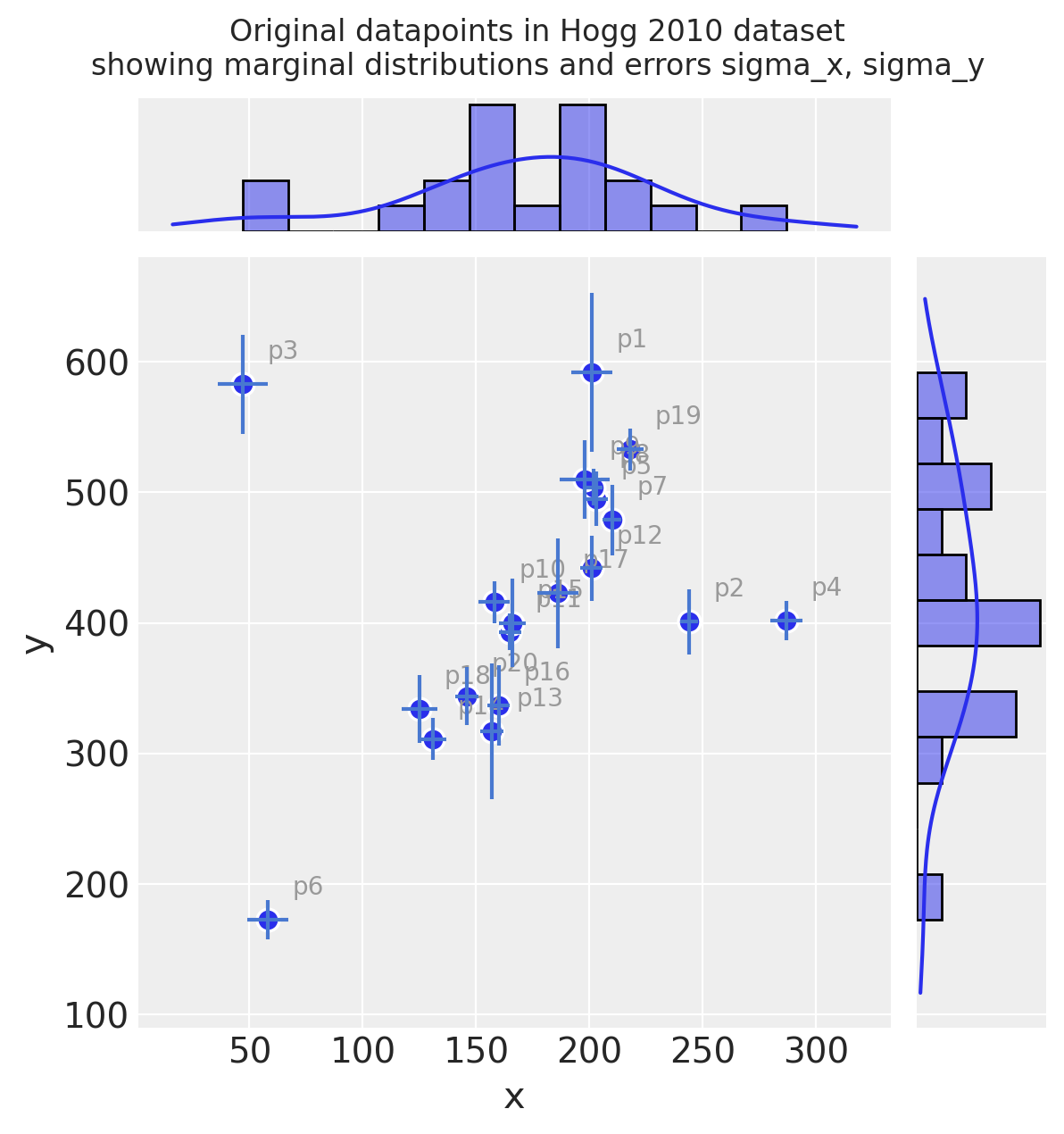
观察:
即使仅凭肉眼判断,您也可以看到这些观测值主要落在具有正梯度的直线上/周围
看起来其中一些数据点可能是该直线的异常值
测量误差(独立于 x 和 y)在观测值之间变化
2. 基本特征工程#
2.1 转换和标准化数据集#
将输入值标准化为线性模型是一种常见的做法,因为这会导致系数位于相同的范围内并且更直接可比。例如,这在 Gelman [2008] 中指出
因此,按照 Gelman 上述论文,我们将在此处除以 2 个标准差
由于此模型非常简单,因此我们直接进行标准化,而不是使用例如
scikit-learnFunctionTransformer暂时忽略
rho_xy
关于缩放输出特征 y 和测量误差 sigma_y 的附加说明
这是非常规的 - 通常您不会缩放输出特征
但是,在 Hogg 模型中,我们拟合了一个由 Normals 组成的自定义两部分似然函数,该函数通过允许异常值拟合到它们自己的 Normal 分布来鼓励全局最小化的对数损失。此异常值分布使用从
sigma_y的偏移sigma_y_out指定的标准差来指定此偏移值具有要求以与
y的标准差相同的比例重新声明sigma_y的效果
标准化(均值居中并除以 2 个标准差)
dfhoggs = (dfhogg[["x", "y"]] - dfhogg[["x", "y"]].mean(0)) / (2 * dfhogg[["x", "y"]].std(0))
dfhoggs["sigma_x"] = dfhogg["sigma_x"] / (2 * dfhogg["x"].std())
dfhoggs["sigma_y"] = dfhogg["sigma_y"] / (2 * dfhogg["y"].std())
with plt.rc_context({"figure.constrained_layout.use": False}):
    gd = sns.jointplot(
        x="x",
        y="y",
        data=dfhoggs,
        kind="scatter",
        height=6,
        marginal_kws={"bins": 12, "kde": True, "kde_kws": {"cut": 1}},
        joint_kws={"edgecolor": "w", "linewidth": 1, "s": 80},
    )
gd.ax_joint.errorbar("x", "y", "sigma_y", "sigma_x", fmt="none", ecolor="#4878d0", data=dfhoggs)
gd.fig.suptitle(
    (
        "Quick view to confirm action of\n"
        + "standardizing datapoints in Hogg 2010 dataset\n"
        + "showing marginal distributions and errors sigma_x, sigma_y"
    ),
    y=1.08,
);

3. 没有异常值校正的简单线性模型#
3.1 指定模型#
在我们进行更高级的操作之前,我想演示具有 Normal 似然函数的简单线性模型的拟合。先验也是正态分布的,因此它的行为类似于具有岭回归(L2 范数)的 OLS。
注意:数据集还具有可用的 sigma_x 和 rho_xy,但对于此练习,我们选择仅使用 sigma_y
其中
\(\beta\) = \(\{1, \beta_{j \in X_{j}}\}\) <— \(X_{j}\) 中的线性系数,在本例中为
1 + x\(\sigma\) = 误差项 <— 在本例中,我们将其设置为非合并 \(\sigma_{i}\):每个数据点的测量误差
sigma_y
coords = {"coefs": ["intercept", "slope"], "datapoint_id": dfhoggs.index}
with pm.Model(coords=coords) as mdl_ols:
    # Define weakly informative Normal priors to give Ridge regression
    beta = pm.Normal("beta", mu=0, sigma=10, dims="coefs")

    # Define linear model
    y_est = beta[0] + beta[1] * dfhoggs["x"]

    # Define Normal likelihood
    pm.Normal("y", mu=y_est, sigma=dfhoggs["sigma_y"], observed=dfhoggs["y"], dims="datapoint_id")

pm.model_to_graphviz(mdl_ols)

3.2 拟合模型#
请注意,我们在此处有意遗漏了先验预测检查的步骤。
3.2.1 样本后验#
with mdl_ols:
    trc_ols = pm.sample(
        tune=5000,
        draws=500,
        chains=4,
        cores=4,
        init="advi+adapt_diag",
        n_init=50000,
    )
Sampling 4 chains for 5_000 tune and 500 draw iterations (20_000 + 2_000 draws total) took 1 seconds.
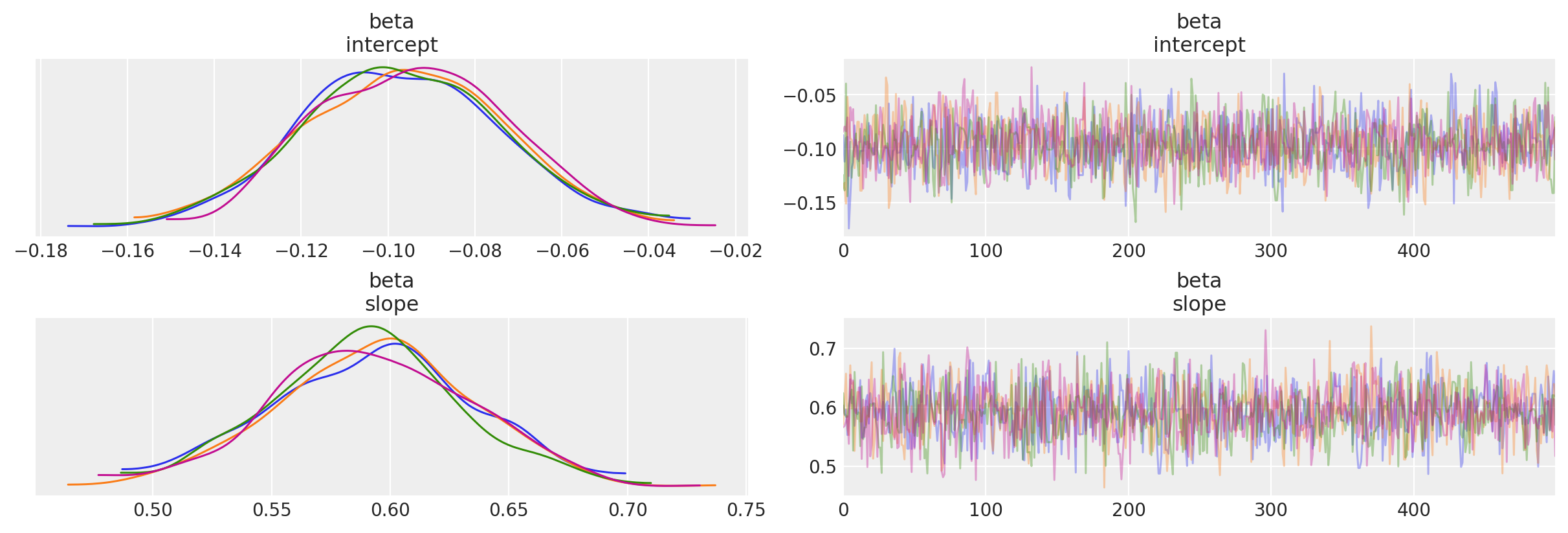
3.2.2 查看诊断#
注意:我们将说明此 OLS 拟合,并在最终比较图中将其与数据点进行比较
迹图
_ = az.plot_trace(trc_ols, compact=False)
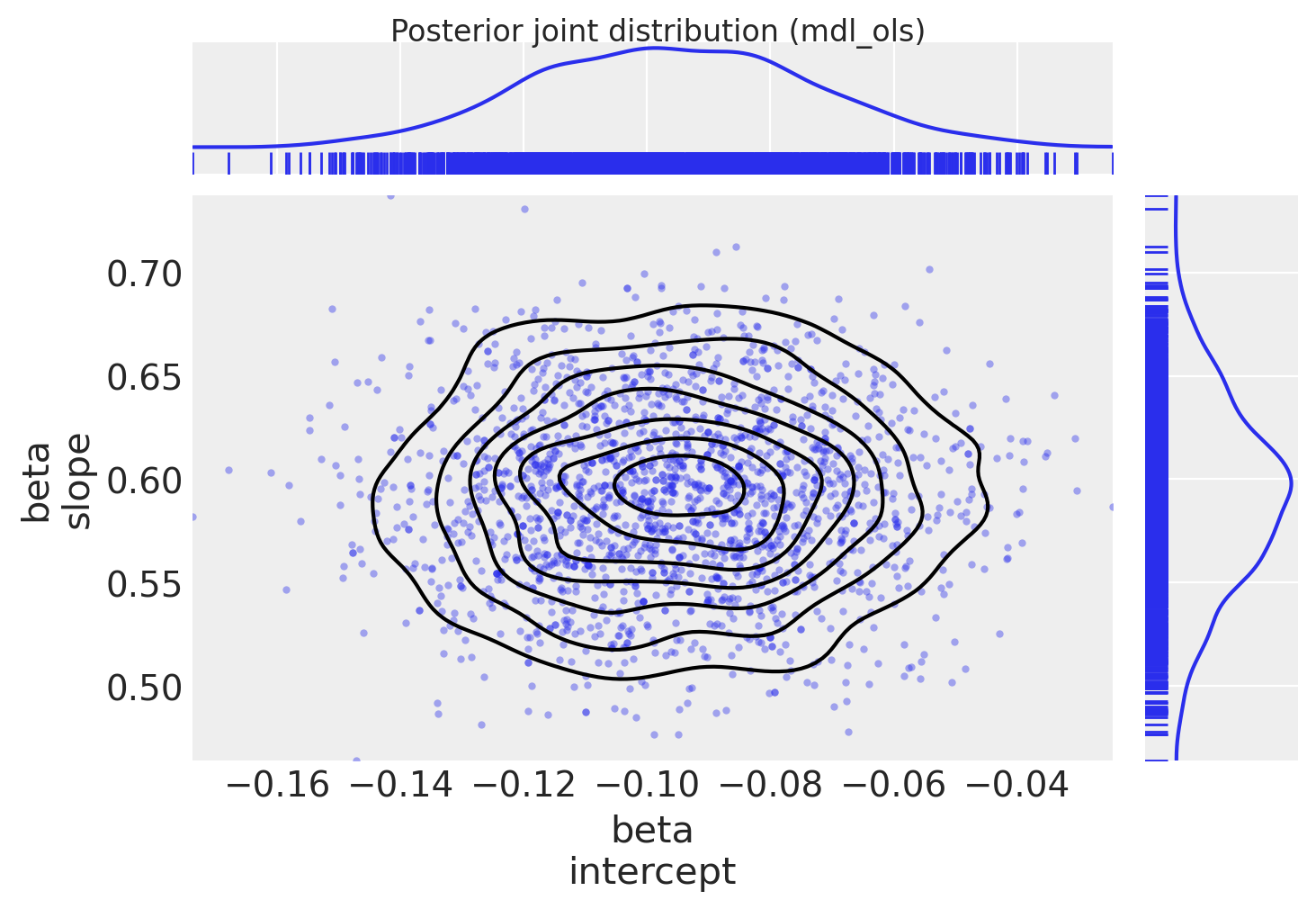
绘制后验联合分布(由于模型只有 2 个系数,我们可以轻松地将其视为 2D 联合分布)
marginal_kwargs = {"kind": "kde", "rug": True, "color": "C0"}
ax = az.plot_pair(
    trc_ols,
    var_names="beta",
    marginals=True,
    kind=["scatter", "kde"],
    scatter_kwargs={"color": "C0", "alpha": 0.4},
    marginal_kwargs=marginal_kwargs,
)
fig = ax[0, 0].get_figure()
fig.suptitle("Posterior joint distribution (mdl_ols)", y=1.02);
4. 具有稳健 Student-T 似然函数的简单线性模型#
我添加了这简短的部分,以便直接比较 Thomas Wiecki 的 notebook 中示例的基于 Student-T 的方法,该 notebook 位于 PyMC3 文档中
我们没有为似然函数使用正态分布,而是使用了具有更肥尾的 Student-T 分布。从理论上讲,这允许异常值在似然估计中具有较小的影响。此方法不生成内点/异常值标志(它对这种分类进行边缘化),但它比下面的信号与噪声模型更简单且运行速度更快,因此进行比较似乎是值得的。
4.1 指定模型#
在此修改中,我们允许似然函数对异常值更稳健(具有更肥的尾部)
其中
\(\beta\) = \(\{1, \beta_{j \in X_{j}}\}\) <— \(X_{j}\) 中的线性系数,在本例中为
1 + x\(\sigma\) = 误差项 <— 在本例中,我们将其设置为非合并 \(\sigma_{i}\):每个数据点的测量误差
sigma_y\(\nu\) = 自由度 <— 允许 pdf 具有肥尾,从而减少异常值数据点的影响
注意:数据集还具有可用的 sigma_x 和 rho_xy,但对于此练习,我选择仅使用 sigma_y
with pm.Model(coords=coords) as mdl_studentt:
    # define weakly informative Normal priors to give Ridge regression
    beta = pm.Normal("beta", mu=0, sigma=10, dims="coefs")

    # define linear model
    y_est = beta[0] + beta[1] * dfhoggs["x"]

    # define prior for StudentT degrees of freedom
    # InverseGamma has nice properties:
    # it's continuous and has support x ∈ (0, inf)
    nu = pm.InverseGamma("nu", alpha=1, beta=1)

    # define Student T likelihood
    pm.StudentT(
        "y", mu=y_est, sigma=dfhoggs["sigma_y"], nu=nu, observed=dfhoggs["y"], dims="datapoint_id"
    )

pm.model_to_graphviz(mdl_studentt)

4.2 拟合模型#
4.2.1 样本后验#
with mdl_studentt:
    trc_studentt = pm.sample(
        tune=5000,
        draws=500,
        chains=4,
        cores=4,
        init="advi+adapt_diag",
        n_init=50000,
    )
Sampling 4 chains for 5_000 tune and 500 draw iterations (20_000 + 2_000 draws total) took 2 seconds.
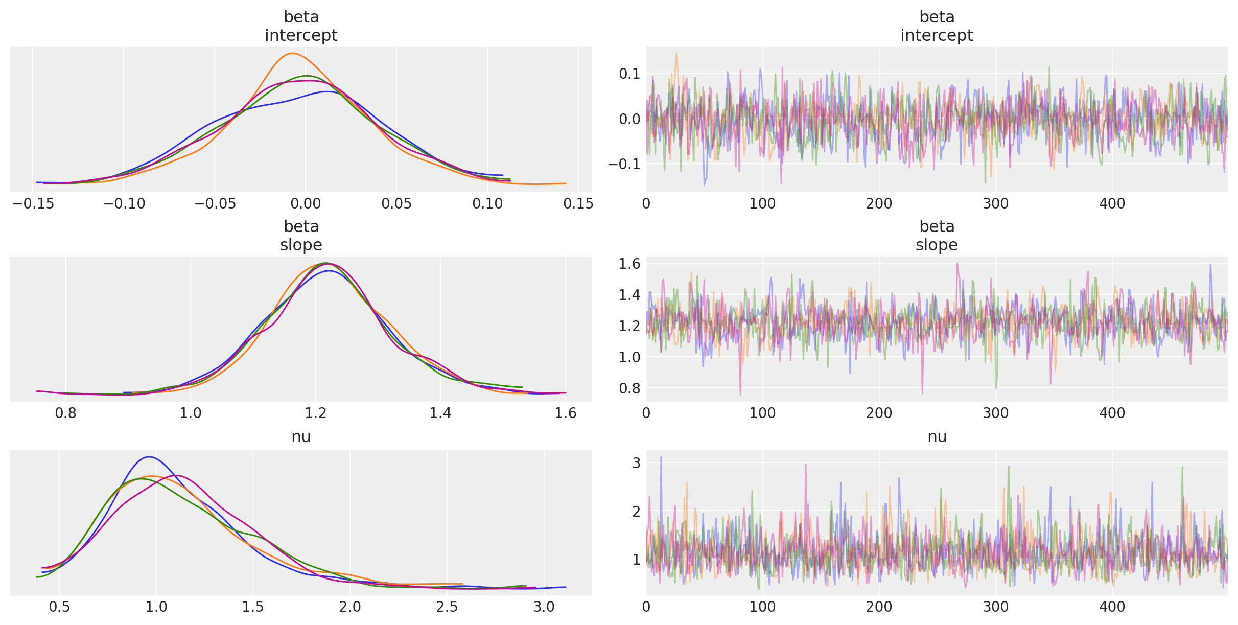
4.2.2 查看诊断#
注意:我们将说明此 StudentT 拟合,并在最终比较图中将其与数据点进行比较
迹图
_ = az.plot_trace(trc_studentt, compact=False);
绘制后验联合分布
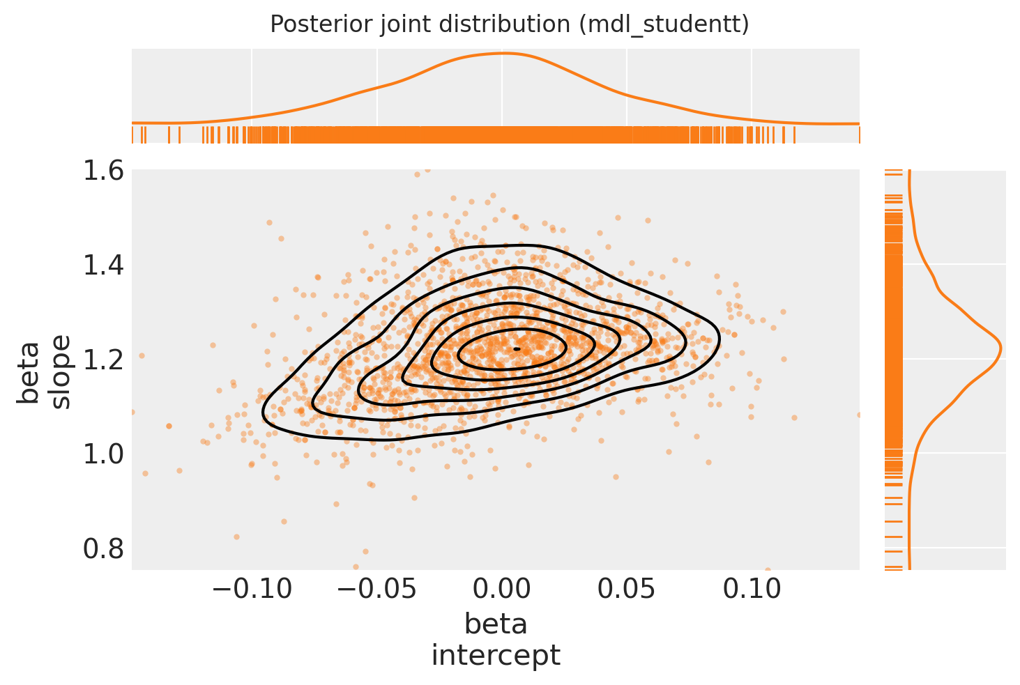
marginal_kwargs["color"] = "C1"
ax = az.plot_pair(
    trc_studentt,
    var_names="beta",
    kind=["scatter", "kde"],
    divergences=True,
    marginals=True,
    marginal_kwargs=marginal_kwargs,
    scatter_kwargs={"color": "C1", "alpha": 0.4},
)
ax[0, 0].get_figure().suptitle("Posterior joint distribution (mdl_studentt)");
4.2.3 查看从 OLS 到 StudentT 的后验联合分布的偏移#
marginal_kwargs["rug"] = False
marginal_kwargs["color"] = "C0"
ax = az.plot_pair(
    trc_ols,
    var_names="beta",
    kind=["scatter", "kde"],
    divergences=True,
    figsize=[12, 12],
    marginals=True,
    marginal_kwargs=marginal_kwargs,
    scatter_kwargs={"color": "C0", "alpha": 0.4},
    kde_kwargs={"contour_kwargs": {"colors": "C0"}},
)

marginal_kwargs["color"] = "C1"
az.plot_pair(
    trc_studentt,
    var_names="beta",
    kind=["scatter", "kde"],
    divergences=True,
    marginals=True,
    marginal_kwargs=marginal_kwargs,
    scatter_kwargs={"color": "C1", "alpha": 0.4},
    kde_kwargs={"contour_kwargs": {"colors": "C1"}},
    ax=ax,
)

ax[0, 0].get_figure().suptitle(
    "Posterior joint distributions\n(showing general movement from OLS to StudentT)"
);
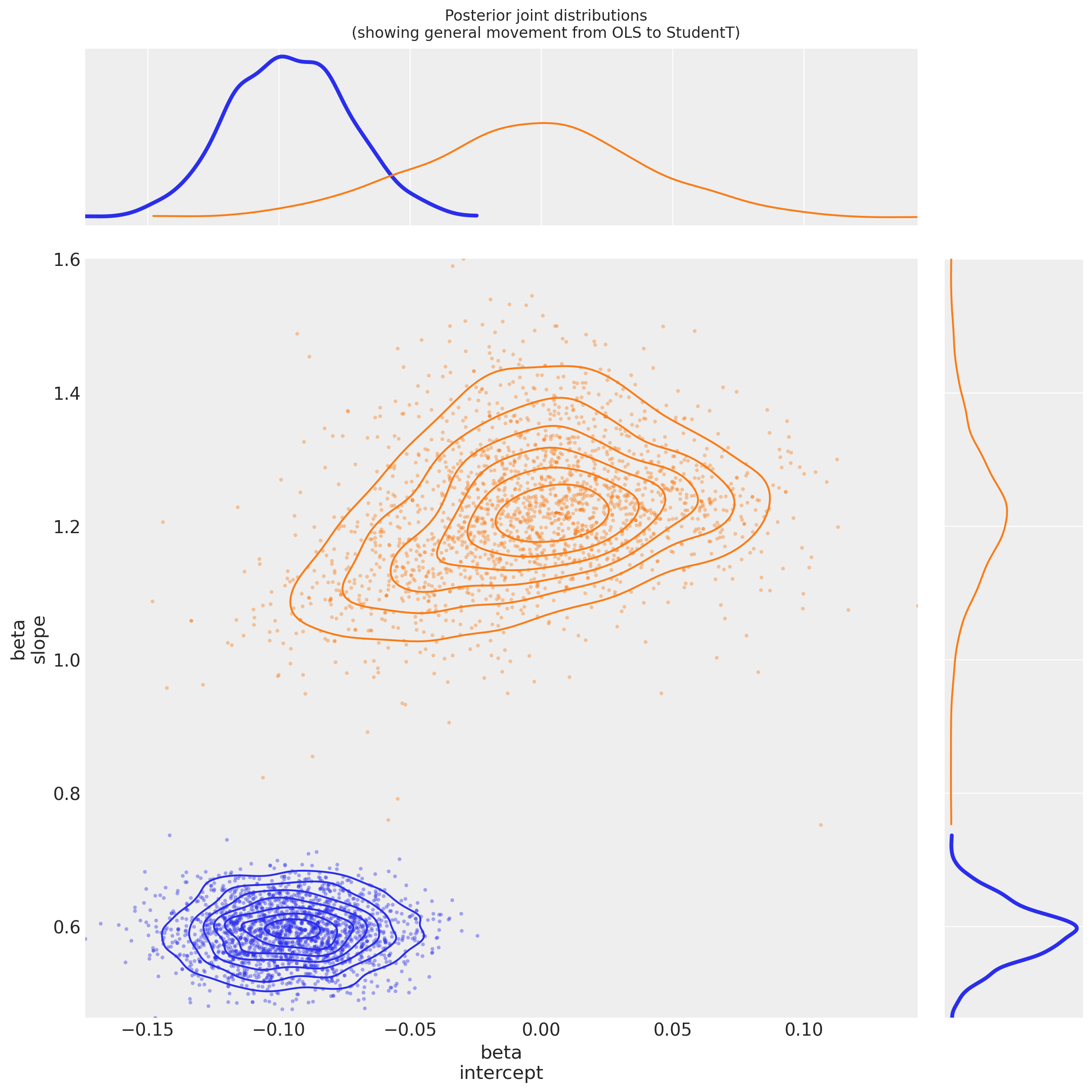
观察
与 OLS 回归相比,
beta参数似乎具有更大的方差这是由于 \(\nu\) 似乎收敛到值
nu ~ 1,表明肥尾似然函数比细尾似然函数更适合参数
beta[intercept]已移动到更接近 \(0\) 的位置,这很有趣:如果理论关系y ~ f(x)没有偏移,那么对于此均值居中的数据集,截距应该确实是 \(0\):它很容易被 OLS 模型中的异常值推离轨道。参数
beta[slope]也相应地变得更大:可能更接近理论函数f(x)
5. 具有自定义似然函数以区分异常值的线性模型:Hogg 方法#
请阅读论文 (Hogg 2010) 和 Jake Vanderplas 的代码,以获取有关建模技术的更完整信息。
总体思路是创建一个“混合”模型,使数据点可以通过以下方式描述:
提出的(线性)模型(因此数据点是内点),或
第二个模型,为方便起见,我们还建议它是线性的,但允许它具有不同的均值和方差(因此数据点是异常值)
5.1 指定模型#
似然函数在两个似然函数的混合上进行评估,一个用于“内点”,一个用于“异常值”。伯努利分布用于将 N 中的数据点随机分配到内点组或异常值组,我们像往常一样对模型进行采样以推断稳健的模型参数和内点/异常值标志
其中
\(B_{i}\) 是伯努利分布 \(B_{i} \in \{0_{(inlier)},1_{(outlier)}\}\)
\(\mu_{in} = \beta^{T} \vec{x}_{i}\) 与内点的先前相同,其中 \(\beta\) = \(\{1, \beta_{j \in X_{j}}\}\) <— \(X_{j}\) 中的线性系数,在本例中为
1 + x\(\sigma_{in}\) = 噪声项 <— 在本例中,我们将其设置为非合并 \(\sigma_{i}\):每个数据点的测量误差
sigma_y\(\mu_{out}\) <— 是异常值的随机合并变量
\(\sigma_{out}\) = 附加噪声项 <— 是异常值的随机非合并变量
此 notebook 使用 Potential() 类与 logp 结合使用,以创建似然函数并构建此模型,其中未观察到特征,此处为伯努利切换变量。
未讨论 Potential 的用法。还有其他资源可供参考,以了解有关 Potential 用法的详细信息
Discourse 和 Cross Validated 上的工作示例。
以及 pymc3 移植的 CamDP 的黑客概率编程和贝叶斯方法,第 5 章损失函数,示例:优化“The Price is Right”的展示
使用它的其他示例,请在左侧边栏上搜索
pymc3.Potential标签
with pm.Model(coords=coords) as mdl_hogg:
    # state input data as Theano shared vars
    tsv_x = pm.ConstantData("tsv_x", dfhoggs["x"], dims="datapoint_id")
    tsv_y = pm.ConstantData("tsv_y", dfhoggs["y"], dims="datapoint_id")
    tsv_sigma_y = pm.ConstantData("tsv_sigma_y", dfhoggs["sigma_y"], dims="datapoint_id")

    # weakly informative Normal priors (L2 ridge reg) for inliers
    beta = pm.Normal("beta", mu=0, sigma=10, dims="coefs")

    # linear model for mean for inliers
    y_est_in = beta[0] + beta[1] * tsv_x  # dims="obs_id"

    # very weakly informative mean for all outliers
    y_est_out = pm.Normal("y_est_out", mu=0, sigma=10, initval=pm.floatX(0.0))

    # very weakly informative prior for additional variance for outliers
    sigma_y_out = pm.HalfNormal("sigma_y_out", sigma=10, initval=pm.floatX(1.0))

    # create in/outlier distributions to get a logp evaluated on the observed y
    # this is not strictly a pymc3 likelihood, but behaves like one when we
    # evaluate it within a Potential (which is minimised)
    inlier_logp = pm.logp(pm.Normal.dist(mu=y_est_in, sigma=tsv_sigma_y), tsv_y)
    outlier_logp = pm.logp(pm.Normal.dist(mu=y_est_out, sigma=tsv_sigma_y + sigma_y_out), tsv_y)

    # frac_outliers only needs to span [0, .5]
    # testval for is_outlier initialised in order to create class asymmetry
    frac_outliers = pm.Uniform("frac_outliers", lower=0.0, upper=0.5)
    is_outlier = pm.Bernoulli(
        "is_outlier",
        p=frac_outliers,
        initval=(np.random.rand(tsv_x.eval().shape[0]) < 0.4) * 1,
        dims="datapoint_id",
    )

    # non-sampled Potential evaluates the Normal.dist.logp's
    potential = pm.Potential(
        "obs",
        ((1 - is_outlier) * inlier_logp).sum() + (is_outlier * outlier_logp).sum(),
    )
5.2 拟合模型#
5.2.1 样本后验#
请注意,pm.sample 方便且自动地创建复合采样过程以
使用离散采样器对伯努利变量(类
is_outlier)进行采样使用连续采样器对连续变量进行采样
进一步注意
这也意味着我们无法使用 ADVI 进行初始化,因此将使用
jitter+adapt_diag进行初始化为了将
kwargs传递给特定的步进器,请将它们包装在寻址到步进器的名称(小写)的 dict 中,例如nuts={'target_accept': 0.85}
with mdl_hogg:
    trc_hogg = pm.sample(
        tune=10000,
        draws=500,
        chains=4,
        cores=4,
        init="jitter+adapt_diag",
        nuts={"target_accept": 0.99},
    )
Sampling 4 chains for 10_000 tune and 500 draw iterations (40_000 + 2_000 draws total) took 27 seconds.
/Users/benjamv/mambaforge/envs/pymc_env/lib/python3.10/site-packages/arviz/stats/diagnostics.py:584: RuntimeWarning: invalid value encountered in scalar divide
  (between_chain_variance / within_chain_variance + num_samples - 1) / (num_samples)
5.2.2 查看诊断#
我们将在最终比较图中说明此模型拟合并将其与数据点进行比较
rvs = ["beta", "y_est_out", "sigma_y_out", "frac_outliers"]
_ = az.plot_trace(trc_hogg, var_names=rvs, compact=False);
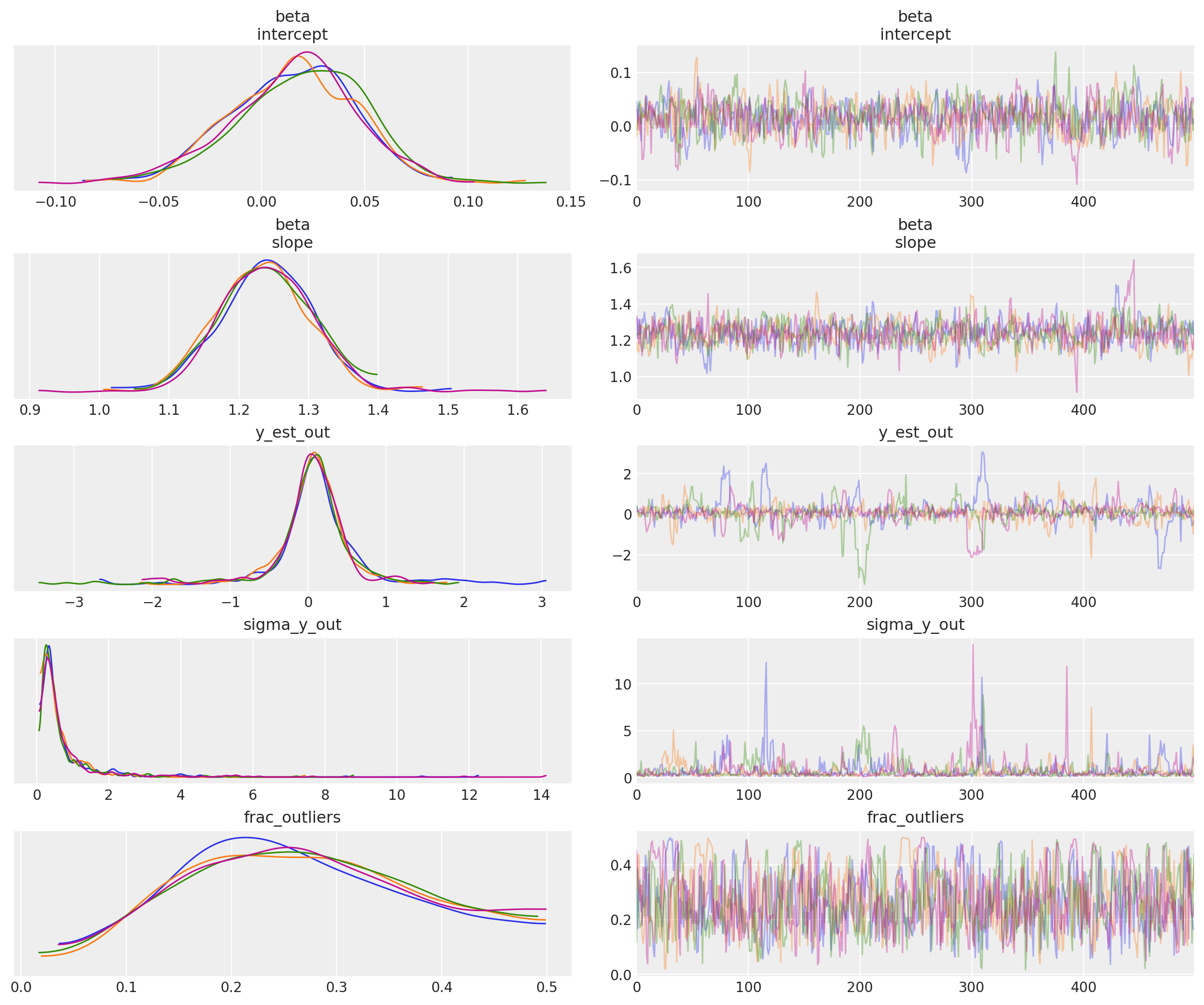
观察
在默认
target_accept = 0.8时,存在许多发散,表明这不是一个特别稳定的模型但是,在
target_accept = 0.9(并将tune从 5000 增加到 10000)时,迹线显示的发散较少,并且看起来行为稍好。内点模型
beta参数和异常值模型参数y_est_out(均值)的迹线看起来已合理收敛异常值模型参数
y_sigma_out(附加的合并方差)的迹线偶尔会变得有点疯狂有趣的是,
frac_outliers非常分散:这是一个非常平坦的分布:表明存在一些数据点,它们的内点/异常值状态是主观的实际上,正如 Thomas 在他的 v2.0 Notebook 中指出的那样,由于我们明确地将潜在标签(内点/异常值)建模为二元选择,因此采样器可能会出现问题 - 将此模型重写为边缘混合模型会更好。
简单迹线摘要,包括 rhat
az.summary(trc_hogg, var_names=rvs)
| 均值 | 标准差 | hdi_3% | hdi_97% | mcse_mean | mcse_sd | ess_bulk | ess_tail | r_hat | |
|---|---|---|---|---|---|---|---|---|---|
| beta[intercept] | 0.016 | 0.031 | -0.044 | 0.069 | 0.001 | 0.001 | 795.0 | 747.0 | 1.00 |
| beta[slope] | 1.239 | 0.068 | 1.124 | 1.365 | 0.003 | 0.002 | 764.0 | 845.0 | 1.01 |
| y_est_out | 0.073 | 0.540 | -0.977 | 1.108 | 0.032 | 0.024 | 433.0 | 295.0 | 1.01 |
| sigma_y_out | 0.724 | 0.992 | 0.073 | 2.095 | 0.051 | 0.036 | 429.0 | 423.0 | 1.01 |
| frac_outliers | 0.268 | 0.109 | 0.084 | 0.472 | 0.005 | 0.004 | 554.0 | 656.0 | 1.00 |
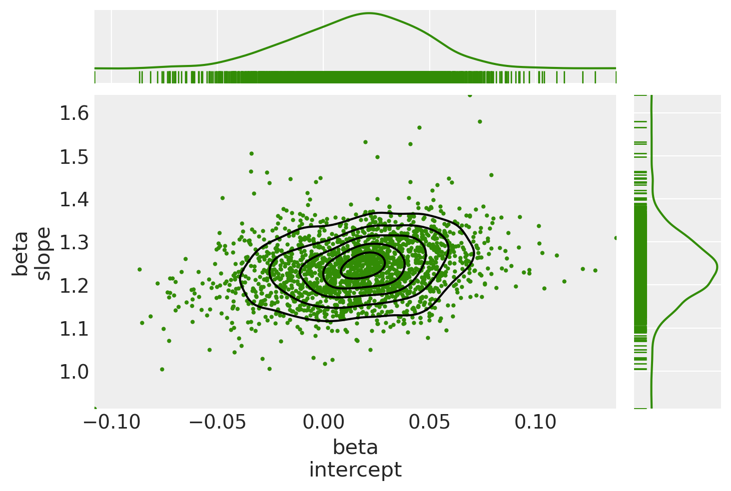
绘制后验联合分布
(在这种情况下,这是一个特别有用的诊断,我们看到了迹线中的许多发散:也许模型规范导致了奇怪的行为)
marginal_kwargs["color"] = "C2"
marginal_kwargs["rug"] = True
x = az.plot_pair(
    data=trc_hogg,
    var_names="beta",
    kind=["kde", "scatter"],
    divergences=True,
    marginals=True,
    marginal_kwargs=marginal_kwargs,
    scatter_kwargs={"color": "C2"},
)
ax[0, 0].get_figure().suptitle("Posterior joint distribution (mdl_hogg)");
5.2.3 查看从 OLS 到 StudentT 到 Hogg 的后验联合分布的偏移#
kde_kwargs = {"contour_kwargs": {"colors": "C0", "zorder": 4}, "contourf_kwargs": {"alpha": 0}}
marginal_kwargs["rug"] = False
marginal_kwargs["color"] = "C0"
ax = az.plot_pair(
    trc_ols,
    var_names="beta",
    kind="kde",
    divergences=True,
    marginals=True,
    marginal_kwargs={"color": "C0"},
    kde_kwargs=kde_kwargs,
    figsize=(8, 8),
)

marginal_kwargs["color"] = "C1"
kde_kwargs["contour_kwargs"]["colors"] = "C1"
az.plot_pair(
    trc_studentt,
    var_names="beta",
    kind="kde",
    divergences=True,
    marginals=True,
    marginal_kwargs=marginal_kwargs,
    kde_kwargs=kde_kwargs,
    ax=ax,
)

marginal_kwargs["color"] = "C2"
kde_kwargs["contour_kwargs"]["colors"] = "C2"
az.plot_pair(
    data=trc_hogg,
    var_names="beta",
    kind="kde",
    divergences=True,
    marginals=True,
    marginal_kwargs=marginal_kwargs,
    kde_kwargs=kde_kwargs,
    ax=ax,
    show=True,
)
ax[0, 0].get_figure().suptitle(
    "Posterior joint distributions" + "\nOLS, StudentT, and Hogg (inliers)"
);
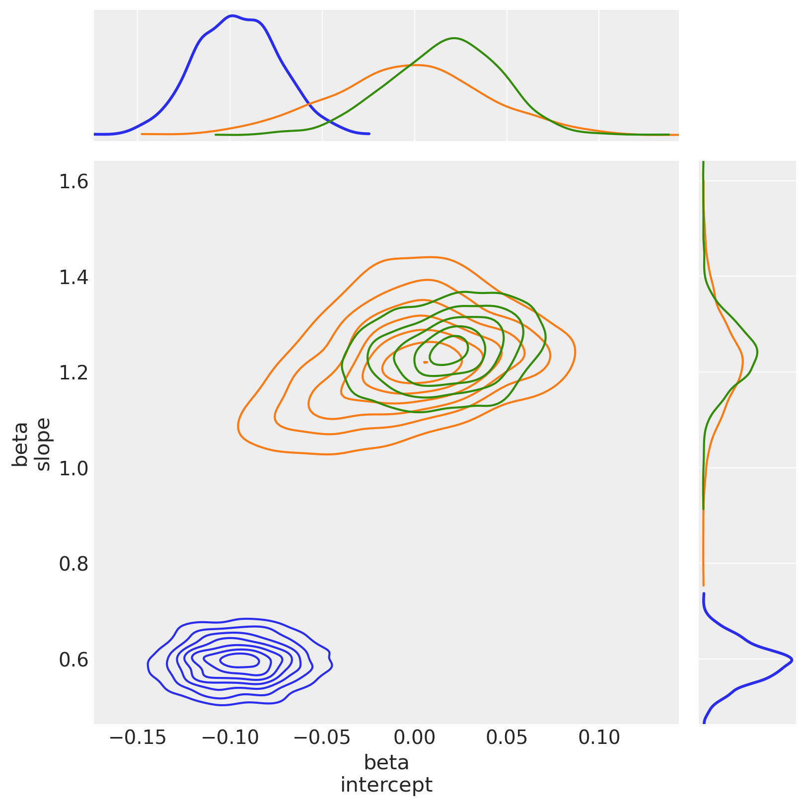
观察
hogg_inlier和studentt模型收敛到b0_intercept和b1_slope的相似范围,表明(未显示的)hogg_outlier模型可能执行与studentt模型的肥尾相似的工作:允许更大的对数概率远离数据点中的主要线性分布正如预期的那样,(由于它是 Normal)
hogg_inlier后验具有更细的尾部和更多的概率质量集中在中心值附近在
b0_intercept上,hogg_inlier模型似乎也比ols和studentt模型都更远,这表明异常值确实扭曲了该特定维度
5.3 声明异常值#
5.3.1 查看内点/异常值预测的范围#
在迹线的每个步骤中,每个数据点都可以是内点或异常值。我们希望数据点花费不等的时间处于一种状态或另一种状态,因此让我们看一下 20 个数据点中每个数据点的状态的简单计数。
dfm_outlier_results = trc_hogg.posterior.is_outlier.to_dataframe().reset_index()

with plt.rc_context({"figure.constrained_layout.use": False}):
    gd = sns.catplot(
        y="datapoint_id",
        x="is_outlier",
        data=dfm_outlier_results,
        kind="point",
        join=False,
        height=6,
        aspect=2,
    )
_ = gd.fig.axes[0].set(xlim=(-0.05, 1.05), xticks=np.arange(0, 1.1, 0.1))
_ = gd.fig.axes[0].axvline(x=0, color="b", linestyle=":")
_ = gd.fig.axes[0].axvline(x=1, color="r", linestyle=":")
_ = gd.fig.axes[0].yaxis.grid(True, linestyle="-", which="major", color="w", alpha=0.4)
_ = gd.fig.suptitle(
    ("For each datapoint, distribution of outlier classification " + "over the trace"),
    y=1.04,
    fontsize=16,
)
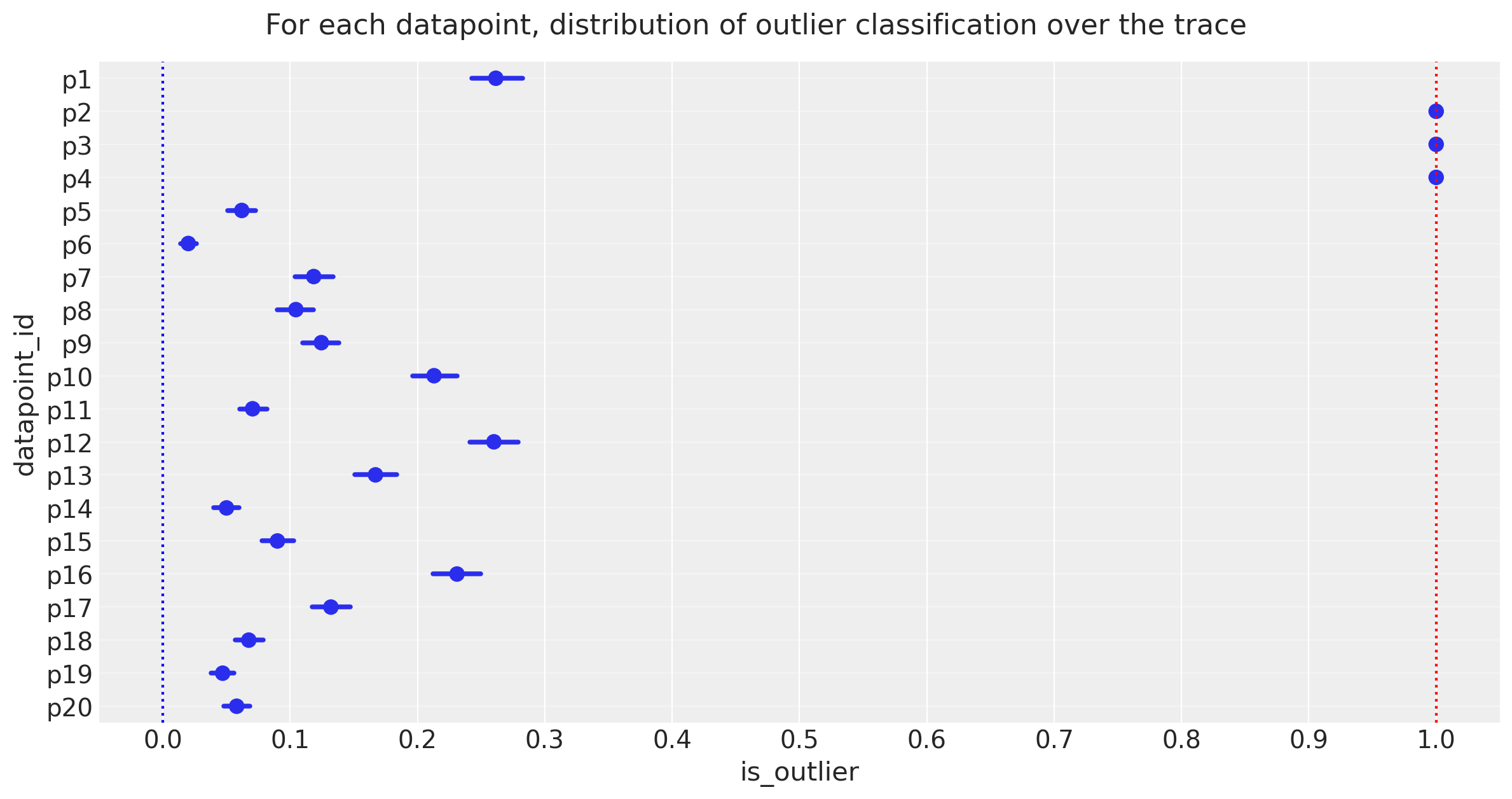
观察:
上面的图显示了迹线中每个数据点被标记为异常值的样本比例,以百分比表示。
3 个点 [p2、p3、p4] 有 >=95% 的时间作为异常值
请注意
frac_outliers ~ 0.27的平均后验值,对应于大约 20 个数据点中的 5 或 6 个:我们可能会调查数据点[p1、 p12、 p16],看看它们是否倾向于成为异常值
我们选择的 95% 截止值是主观且任意的,但我现在更喜欢它,因此让我们声明这 3 个为异常值,看看它与 Jake Vanderplas 的异常值相比如何,后者以略有不同的方式声明为均值高于 0.68 的点。
5.3.2 声明异常值#
注意
我将声明异常值是在 5 分位数截止值处值为 == 1 的数据点,即在从 5 到 100 的百分位数中,它们的值为 1。
自己尝试将截止值更改为更大的值,这将导致异常值状态的客观排名。
cutoff = 0.05
dfhoggs["classed_as_outlier"] = (
    trc_hogg.posterior["is_outlier"].quantile(cutoff, dim=("chain", "draw")) == 1
)
dfhoggs["classed_as_outlier"].value_counts()
False    17
True      3
Name: classed_as_outlier, dtype: int64
还添加了要调查的点的标志。将使用它来注释最终图
dfhoggs["annotate_for_investigation"] = (
    trc_hogg.posterior["is_outlier"].quantile(0.75, dim=("chain", "draw")) == 1
)
dfhoggs["annotate_for_investigation"].value_counts()
False    15
True      5
Name: annotate_for_investigation, dtype: int64
5.4 OLS 与 StudentT 与 Hogg “信号与噪声”的后验预测图#
import xarray as xr

x = xr.DataArray(np.linspace(-3, 3, 10), dims="plot_dim")

# evaluate outlier posterior distribution for plotting
trc_hogg.posterior["outlier_mean"] = trc_hogg.posterior["y_est_out"].broadcast_like(x)

# evaluate model (inlier) posterior distributions for all 3 models
lm = lambda beta, x: beta.sel(coefs="intercept") + beta.sel(coefs="slope") * x

trc_ols.posterior["y_mean"] = lm(trc_ols.posterior["beta"], x)
trc_studentt.posterior["y_mean"] = lm(trc_studentt.posterior["beta"], x)
trc_hogg.posterior["y_mean"] = lm(trc_hogg.posterior["beta"], x)
with plt.rc_context({"figure.constrained_layout.use": False}):
    gd = sns.FacetGrid(
        dfhoggs,
        height=7,
        hue="classed_as_outlier",
        hue_order=[True, False],
        palette="Set1",
        legend_out=False,
    )

# plot hogg outlier posterior distribution
outlier_mean = az.extract(trc_hogg, var_names="outlier_mean", num_samples=400)
gd.ax.plot(x, outlier_mean, color="C3", linewidth=0.5, alpha=0.2, zorder=1)

# plot the 3 model (inlier) posterior distributions
y_mean = az.extract(trc_ols, var_names="y_mean", num_samples=200)
gd.ax.plot(x, y_mean, color="C0", linewidth=0.5, alpha=0.2, zorder=2)

y_mean = az.extract(trc_studentt, var_names="y_mean", num_samples=200)
gd.ax.plot(x, y_mean, color="C1", linewidth=0.5, alpha=0.2, zorder=3)

y_mean = az.extract(trc_hogg, var_names="y_mean", num_samples=200)
gd.ax.plot(x, y_mean, color="C2", linewidth=0.5, alpha=0.2, zorder=4)

# add legend for regression lines plotted above
line_legend = plt.legend(
    [
        Line2D([0], [0], color="C3"),
        Line2D([0], [0], color="C2"),
        Line2D([0], [0], color="C1"),
        Line2D([0], [0], color="C0"),
    ],
    ["Hogg Inlier", "Hogg Outlier", "Student-T", "OLS"],
    loc="lower right",
    title="Posterior Predictive",
)
gd.ax.add_artist(line_legend)

# plot points
_ = gd.map(
    plt.errorbar,
    "x",
    "y",
    "sigma_y",
    "sigma_x",
    marker="o",
    ls="",
    markeredgecolor="w",
    markersize=10,
    zorder=5,
).add_legend()
gd.ax.legend(loc="upper left", title="Outlier Classification")

# annotate the potential outliers
for idx, r in dfhoggs.loc[dfhoggs["annotate_for_investigation"]].iterrows():
    _ = gd.ax.annotate(
        text=idx,
        xy=(r["x"], r["y"]),
        xycoords="data",
        xytext=(7, 7),
        textcoords="offset points",
        color="k",
        zorder=4,
    )

## create xlims ylims for plotting
x_ptp = np.ptp(dfhoggs["x"].values) / 3.3
y_ptp = np.ptp(dfhoggs["y"].values) / 3.3
xlims = (dfhoggs["x"].min() - x_ptp, dfhoggs["x"].max() + x_ptp)
ylims = (dfhoggs["y"].min() - y_ptp, dfhoggs["y"].max() + y_ptp)
gd.ax.set(ylim=ylims, xlim=xlims)
gd.fig.suptitle(
    (
        "Standardized datapoints in Hogg 2010 dataset, showing "
        "posterior predictive fit for 3 models:\nOLS, StudentT and Hogg "
        '"Signal vs Noise" (inlier vs outlier, custom likelihood)'
    ),
    y=1.04,
    fontsize=14,
);
观察:
后验预测拟合为
用绿色表示的OLS 模型如预期所示,似乎不能很好地拟合我们的大部分数据点,而是被异常值所扭曲
用橙色表示的 Student-T 模型确实似乎很好地拟合了数据点的“主轴”,忽略了异常值
用两部分展示Hogg 信噪比模型
蓝色表示的内点很好地拟合了数据点的“主轴”,忽略了异常值
红色表示的异常值具有非常大的方差,并且为“异常值”点分配了比蓝色内点模型更高的对数似然
我们看到 Hogg 信噪比模型也给出了关于哪些数据点是异常值的具体估计
用蓝色表示的 17 个“内点”,以及
用红色表示的 3 个“异常值”数据点。
从简单的目视检查来看,分类似乎是合理的,并且与 Jake Vanderplas 的发现一致。
我已经注释了这些红色和最外层的内点,以帮助进行目视调查
总而言之
Hogg 信噪比模型的表现如承诺的那样,产生了稳健的回归估计和内点/异常值的显式标记,但是
Hogg 信噪比模型相当复杂,虽然回归看起来很稳健,但迹图显示出许多发散,并且该模型可能不稳定
如果您只是想要一个稳健的回归,而不需要内点/异常值标记,那么 Student-T 模型可能是一个很好的折衷方案,它提供了一个简单的模型、快速抽样和非常相似的估计。
参考文献#
Željko Ivezić, Andrew J. Connolly, Jacob T. VanderPlas, 和 Alexander Gray. 天文学中的统计学、数据挖掘和机器学习:调查数据分析的实用 Python 指南。普林斯顿大学出版社, 2014. ISBN 9781400848911. doi:10.1515/9781400848911。
J.T. Vanderplas, A.J. Connolly, Ž. Ivezić, 和 A. Gray. 天体测量学导论:天体物理学的机器学习。在 智能数据理解会议 (CIDU), 47–54. 10月. 2012. doi:10.1109/CIDU.2012.6382200。
Andrew Gelman. 通过除以两个标准差来缩放回归输入。医学统计, 27(15):2865–2873, 2008. doi:10.1002/sim.3107。
水印#
%load_ext watermark
%watermark -n -u -v -iv -w -p theano,xarray
Last updated: Sun Feb 05 2023

Python implementation: CPython
Python version       : 3.10.9
IPython version      : 8.9.0

theano: not installed
xarray: 2023.1.0

numpy     : 1.24.1
arviz     : 0.14.0
pandas    : 1.5.3
pymc      : 5.0.1
seaborn   : 0.12.2
scipy     : 1.10.0
matplotlib: 3.6.3
xarray    : 2023.1.0

Watermark: 2.3.1
许可声明#
本示例库中的所有笔记本均根据 MIT 许可证 提供,该许可证允许修改和再分发以用于任何用途,前提是保留版权和许可声明。
引用 PyMC 示例#
要引用此笔记本,请使用 Zenodo 为 pymc-examples 存储库提供的 DOI。
重要提示
许多笔记本都改编自其他来源:博客、书籍…… 在这种情况下,您也应该引用原始来源。
还请记住引用您的代码使用的相关库。
这是一个 bibtex 中的引用模板
@incollection{citekey,
  author    = "<notebook authors, see above>",
  title     = "<notebook title>",
  editor    = "PyMC Team",
  booktitle = "PyMC examples",
  doi       = "10.5281/zenodo.5654871"
}
渲染后可能看起来像