


滚动回归#
配对交易是一种在算法交易中著名的技术,它将两只股票相互对立进行操作。
为了使这种方法有效,股票必须是相关的(协整的)。
一个常见的例子是黄金(GLD)的价格和金矿开采业务(GFI)的价格。
import os
import warnings

import arviz as az
import matplotlib.pyplot as plt
import matplotlib.ticker as mticker
import numpy as np
import pandas as pd
import pymc as pm
import xarray as xr

from matplotlib import MatplotlibDeprecationWarning

warnings.filterwarnings(action="ignore", category=MatplotlibDeprecationWarning)
RANDOM_SEED = 8927
rng = np.random.default_rng(RANDOM_SEED)
%config InlineBackend.figure_format = 'retina'
az.style.use("arviz-darkgrid")
让我们加载 GFI 和 GLD 的价格。
# from pandas_datareader import data
# prices = data.GoogleDailyReader(symbols=['GLD', 'GFI'], end='2014-8-1').read().loc['Open', :, :]
try:
    prices = pd.read_csv(os.path.join("..", "data", "stock_prices.csv")).dropna()
except FileNotFoundError:
    prices = pd.read_csv(pm.get_data("stock_prices.csv")).dropna()

prices["Date"] = pd.DatetimeIndex(prices["Date"])
prices = prices.set_index("Date")
prices_zscored = (prices - prices.mean()) / prices.std()
prices.head()
| GFI | GLD | |
|---|---|---|
| 日期 | ||
| 2010-01-04 | 13.55 | 109.82 |
| 2010-01-05 | 13.51 | 109.88 |
| 2010-01-06 | 13.70 | 110.71 |
| 2010-01-07 | 13.63 | 111.07 |
| 2010-01-08 | 13.72 | 111.52 |
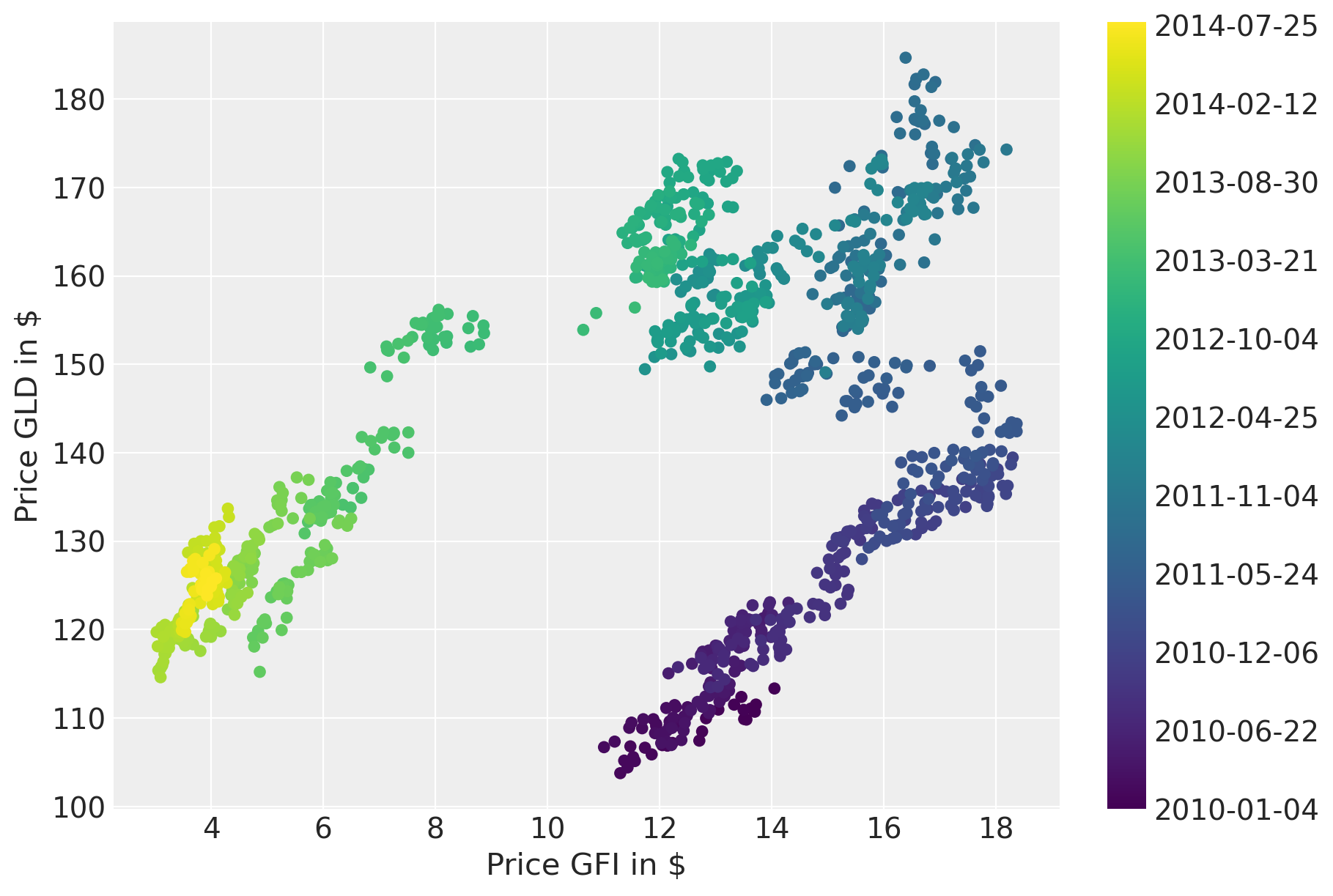
绘制价格随时间变化的图表表明存在很强的相关性。但是,相关性似乎随时间而变化。
fig = plt.figure(figsize=(9, 6))
ax = fig.add_subplot(111, xlabel=r"Price GFI in \$", ylabel=r"Price GLD in \$")
colors = np.linspace(0, 1, len(prices))
mymap = plt.get_cmap("viridis")
sc = ax.scatter(prices.GFI, prices.GLD, c=colors, cmap=mymap, lw=0)
ticks = colors[:: len(prices) // 10]
ticklabels = [str(p.date()) for p in prices[:: len(prices) // 10].index]
cb = plt.colorbar(sc, ticks=ticks)
cb.ax.set_yticklabels(ticklabels);
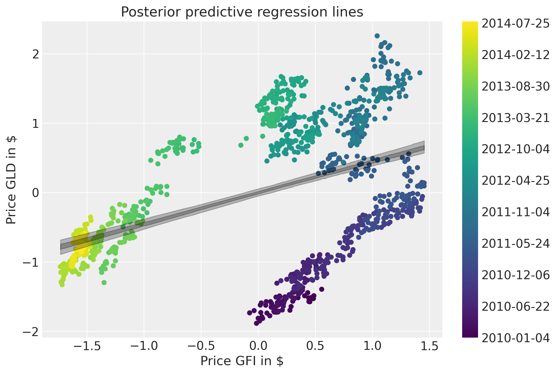
一种朴素的方法是估计一个线性模型并忽略时间域。
with pm.Model() as model:  # model specifications in PyMC are wrapped in a with-statement
    # Define priors
    sigma = pm.HalfCauchy("sigma", beta=10)
    alpha = pm.Normal("alpha", mu=0, sigma=20)
    beta = pm.Normal("beta", mu=0, sigma=20)

    mu = pm.Deterministic("mu", alpha + beta * prices_zscored.GFI.to_numpy())

    # Define likelihood
    likelihood = pm.Normal("y", mu=mu, sigma=sigma, observed=prices_zscored.GLD.to_numpy())

    # Inference
    trace_reg = pm.sample(tune=2000)
Sampling 4 chains for 2_000 tune and 1_000 draw iterations (8_000 + 4_000 draws total) took 1 seconds.
后验预测图显示了拟合效果有多差。
fig = plt.figure(figsize=(9, 6))
ax = fig.add_subplot(
    111,
    xlabel=r"Price GFI in \$",
    ylabel=r"Price GLD in \$",
    title="Posterior predictive regression lines",
)
sc = ax.scatter(prices_zscored.GFI, prices_zscored.GLD, c=colors, cmap=mymap, lw=0)

xi = xr.DataArray(prices_zscored.GFI.values)
az.plot_hdi(
    xi,
    trace_reg.posterior.mu,
    color="k",
    hdi_prob=0.95,
    ax=ax,
    fill_kwargs={"alpha": 0.25},
    smooth=False,
)
az.plot_hdi(
    xi,
    trace_reg.posterior.mu,
    color="k",
    hdi_prob=0.5,
    ax=ax,
    fill_kwargs={"alpha": 0.25},
    smooth=False,
)

cb = plt.colorbar(sc, ticks=ticks)
cb.ax.set_yticklabels(ticklabels);
滚动回归#
接下来,我们将构建一个改进的模型,该模型将允许回归系数随时间变化。具体来说,我们将假设截距和斜率随时间进行随机游走。这个想法类似于 case_studies/stochastic_volatility。
首先,让我们为 \(\sigma_\alpha^2\) 和 \(\sigma_\beta^2\) 定义超先验。此参数可以解释为回归系数的波动率。
with pm.Model(coords={"time": prices.index.values}) as model_randomwalk:
    # std of random walk
    sigma_alpha = pm.Exponential("sigma_alpha", 50.0)
    sigma_beta = pm.Exponential("sigma_beta", 50.0)

    alpha = pm.GaussianRandomWalk(
        "alpha", sigma=sigma_alpha, init_dist=pm.Normal.dist(0, 10), dims="time"
    )
    beta = pm.GaussianRandomWalk(
        "beta", sigma=sigma_beta, init_dist=pm.Normal.dist(0, 10), dims="time"
    )
给定系数和数据执行回归,并通过似然函数链接到数据。
with model_randomwalk:
    # Define regression
    regression = alpha + beta * prices_zscored.GFI.values

    # Assume prices are Normally distributed, the mean comes from the regression.
    sd = pm.HalfNormal("sd", sigma=0.1)
    likelihood = pm.Normal("y", mu=regression, sigma=sd, observed=prices_zscored.GLD.to_numpy())
推断。尽管这是一个相当复杂的模型,但 NUTS 可以很好地处理它。
with model_randomwalk:
    trace_rw = pm.sample(tune=2000, target_accept=0.9)
Sampling 4 chains for 2_000 tune and 1_000 draw iterations (8_000 + 4_000 draws total) took 383 seconds.
增加树深度确实有帮助,但它使采样非常慢。但是,结果看起来与这次运行相同。
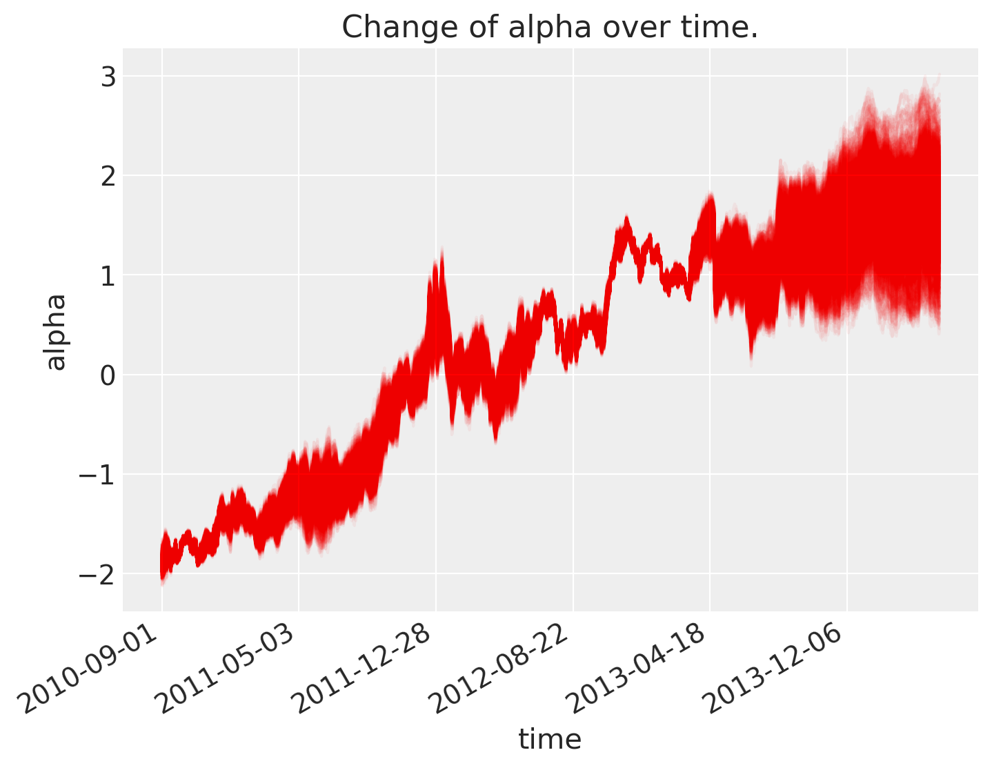
结果分析#
如下所示,截距 \(\alpha\) 随时间变化。
fig = plt.figure(figsize=(8, 6), constrained_layout=False)
ax = plt.subplot(111, xlabel="time", ylabel="alpha", title="Change of alpha over time.")
ax.plot(az.extract(trace_rw, var_names="alpha"), "r", alpha=0.05)

ticks_changes = mticker.FixedLocator(ax.get_xticks().tolist())
ticklabels_changes = [str(p.date()) for p in prices[:: len(prices) // 7].index]
ax.xaxis.set_major_locator(ticks_changes)
ax.set_xticklabels(ticklabels_changes)

fig.autofmt_xdate()
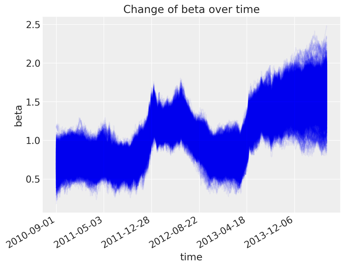
斜率也是如此。
fig = plt.figure(figsize=(8, 6), constrained_layout=False)
ax = fig.add_subplot(111, xlabel="time", ylabel="beta", title="Change of beta over time")
ax.plot(az.extract(trace_rw, var_names="beta"), "b", alpha=0.05)

ax.xaxis.set_major_locator(ticks_changes)
ax.set_xticklabels(ticklabels_changes)

fig.autofmt_xdate()
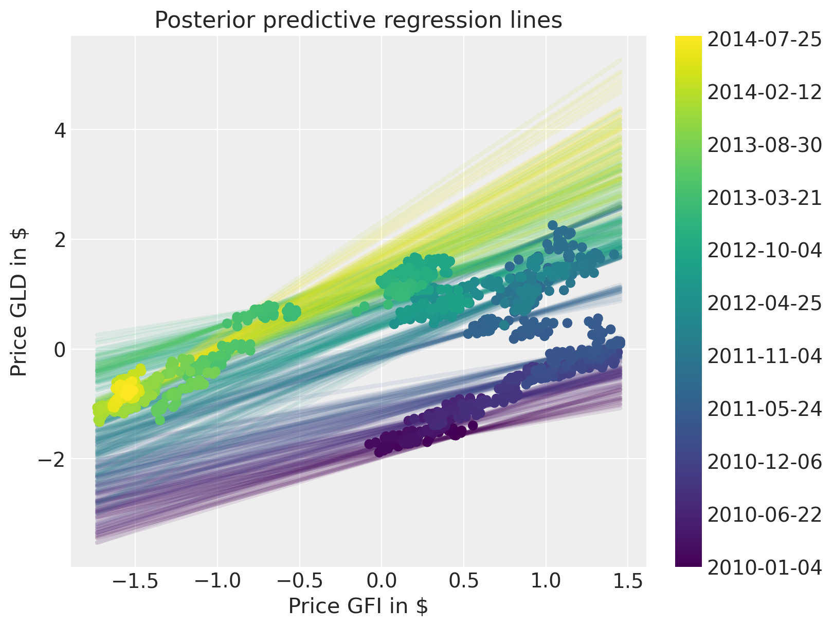
后验预测图表明,我们更好地捕捉了回归随时间的变化。请注意,我们应该使用收益率而不是价格。该模型仍然可以相同地工作,但可视化效果不会那么清晰。
fig = plt.figure(figsize=(8, 6))
ax = fig.add_subplot(
    111,
    xlabel=r"Price GFI in \$",
    ylabel=r"Price GLD in \$",
    title="Posterior predictive regression lines",
)

colors = np.linspace(0, 1, len(prices))
colors_sc = np.linspace(0, 1, len(prices.index.values[::50]))

xi = xr.DataArray(np.linspace(prices_zscored.GFI.min(), prices_zscored.GFI.max(), 50))

for i, time in enumerate(prices.index.values[::50]):
    sel_trace = az.extract(trace_rw).sel(time=time)
    regression_line = sel_trace["alpha"] + sel_trace["beta"] * xi
    ax.plot(
        xi,
        regression_line.T[:, 0::200],
        color=mymap(colors_sc[i]),
        alpha=0.1,
        zorder=10,
        linewidth=3,
    )

sc = ax.scatter(
    prices_zscored.GFI, prices_zscored.GLD, label="data", cmap=mymap, c=colors, zorder=11
)

cb = plt.colorbar(sc, ticks=ticks)
cb.ax.set_yticklabels(ticklabels);
水印#
%load_ext watermark
%watermark -n -u -v -iv -w -p pytensor,aeppl,xarray
Last updated: Sun Feb 05 2023

Python implementation: CPython
Python version       : 3.10.9
IPython version      : 8.9.0

pytensor: 2.8.11
aeppl   : not installed
xarray  : 2023.1.0

arviz     : 0.14.0
xarray    : 2023.1.0
numpy     : 1.24.1
matplotlib: 3.6.3
pymc      : 5.0.1
pandas    : 1.5.3

Watermark: 2.3.1
许可声明#
本示例 галерея 中的所有笔记本均根据 MIT 许可证 提供,该许可证允许修改和再分发以用于任何用途,前提是保留版权和许可声明。
引用 PyMC 示例#
要引用此笔记本,请使用 Zenodo 为 pymc-examples 仓库提供的 DOI。
重要提示
许多笔记本改编自其他来源:博客、书籍……在这种情况下,您也应该引用原始来源。
另请记住引用您的代码使用的相关库。
这是一个 bibtex 引用模板
@incollection{citekey,
  author    = "<notebook authors, see above>",
  title     = "<notebook title>",
  editor    = "PyMC Team",
  booktitle = "PyMC examples",
  doi       = "10.5281/zenodo.5654871"
}
渲染后可能看起来像这样