


使用 Euler-Maruyama 方案推断 SDE 的参数#
本笔记本源自为艾克斯-马赛大学系统神经科学研究所理论神经科学组准备的演示文稿。
import warnings

import arviz as az
import matplotlib.pyplot as plt
import numpy as np
import pymc as pm
import pytensor.tensor as pt
import scipy as sp

# Ignore UserWarnings
warnings.filterwarnings("ignore", category=UserWarning)

RANDOM_SEED = 8927
np.random.seed(RANDOM_SEED)
%config InlineBackend.figure_format = 'retina'
az.style.use("arviz-darkgrid")
示例模型#
这是一个标量线性 SDE 的符号形式
\( dX_t = \lambda X_t + \sigma^2 dW_t \)
使用 Euler-Maruyama 方案离散化。
我们可以从此过程中模拟数据,然后尝试恢复参数。
# parameters
lam = -0.78
s2 = 5e-3
N = 200
dt = 1e-1

# time series
x = 0.1
x_t = []

# simulate
for i in range(N):
    x += dt * lam * x + np.sqrt(dt) * s2 * np.random.randn()
    x_t.append(x)

x_t = np.array(x_t)

# z_t noisy observation
z_t = x_t + np.random.randn(x_t.size) * 5e-3
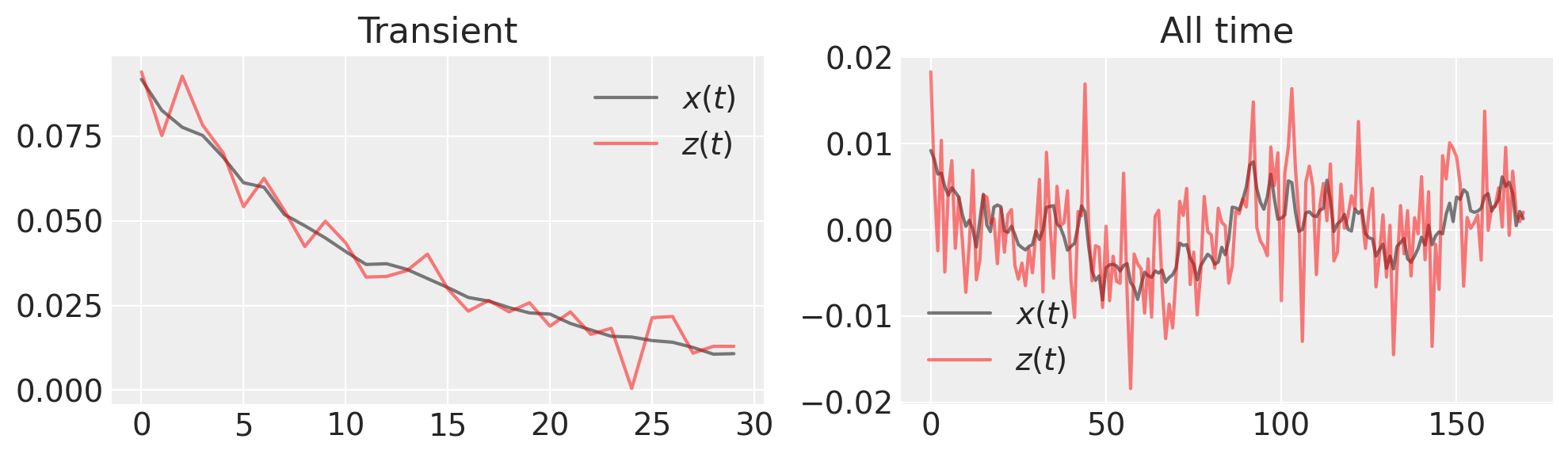
fig, (ax1, ax2) = plt.subplots(1, 2, figsize=(10, 3))

ax1.plot(x_t[:30], "k", label="$x(t)$", alpha=0.5)
ax1.plot(z_t[:30], "r", label="$z(t)$", alpha=0.5)
ax1.set_title("Transient")
ax1.legend()

ax2.plot(x_t[30:], "k", label="$x(t)$", alpha=0.5)
ax2.plot(z_t[30:], "r", label="$z(t)$", alpha=0.5)
ax2.set_title("All time")
ax2.legend()

plt.tight_layout()
我们想要进行的推断是什么?由于我们对生成的时间序列进行了噪声观测,我们需要估计 \(x(t)\) 和 \(\lambda\)。
我们需要提供一个 SDE 函数,该函数返回漂移系数和扩散系数。
def lin_sde(x, lam, s2):
    return lam * x, s2
概率模型由漂移参数 lam、扩散系数 s、潜在 Euler-Maruyama 过程 xh 和描述噪声观测 zh 的似然函数组成。我们将假设我们知道观测噪声。
with pm.Model() as model:
    # uniform prior, but we know it must be negative
    l = pm.HalfCauchy("l", beta=1)
    s = pm.Uniform("s", 0.005, 0.5)

    # "hidden states" following a linear SDE distribution
    # parametrized by time step (det. variable) and lam (random variable)
    xh = pm.EulerMaruyama("xh", dt=dt, sde_fn=lin_sde, sde_pars=(-l, s**2), shape=N, initval=x_t)

    # predicted observation
    zh = pm.Normal("zh", mu=xh, sigma=5e-3, observed=z_t)
一旦模型构建完成,我们就执行推断,此处通过 nutpie 中实现的 NUTS 算法进行推断,这将非常快。
with model:
    trace = pm.sample(nuts_sampler="nutpie", random_seed=RANDOM_SEED, target_accept=0.99)
采样器进度
链总数:4
活跃链:0
已完成链:4
正在采样
预计完成时间:now
| 进度 | 抽取 | 发散 | 步长 | 梯度/抽取 |
|---|---|---|---|---|
| 2000 | 0 | 0.06 | 255 | |
| 2000 | 0 | 0.06 | 127 | |
| 2000 | 0 | 0.07 | 255 | |
| 2000 | 0 | 0.06 | 191 |
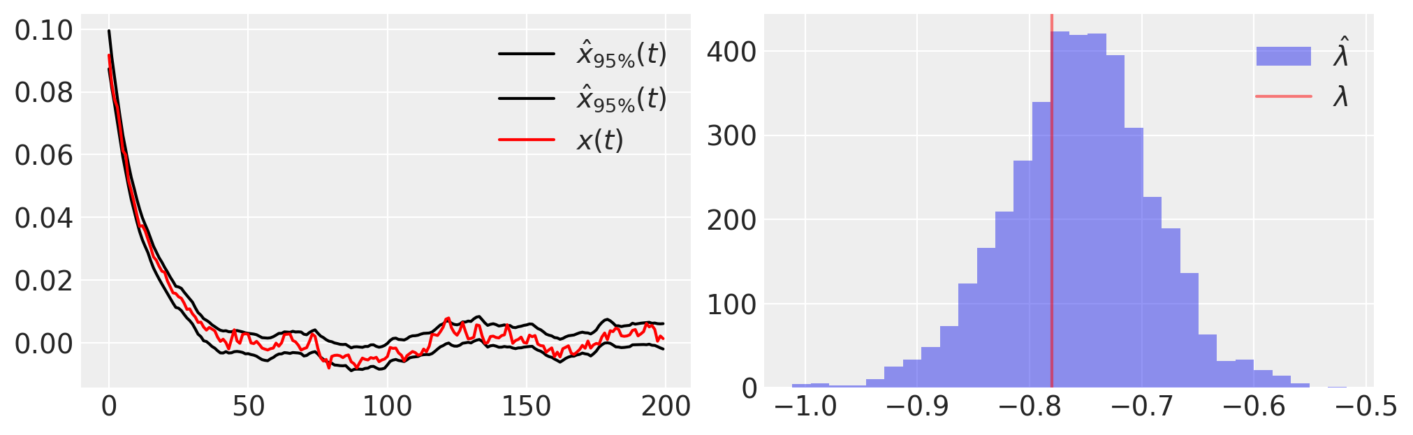
接下来,我们绘制后验样本的一些基本统计信息,
plt.figure(figsize=(10, 3))
plt.subplot(121)
plt.plot(
    trace.posterior.quantile((0.025, 0.975), dim=("chain", "draw"))["xh"].values.T,
    "k",
    label=r"$\hat{x}_{95\%}(t)$",
)
plt.plot(x_t, "r", label="$x(t)$")
plt.legend()

plt.subplot(122)
plt.hist(-1 * az.extract(trace.posterior)["l"], 30, label=r"$\hat{\lambda}$", alpha=0.5)
plt.axvline(lam, color="r", label=r"$\lambda$", alpha=0.5)
plt.legend();
模型可以精确拟合数据,但仍然可能是错误的;我们需要使用后验预测检查来评估,在我们的拟合模型下,数据是否合理。
换句话说,我们
假设模型是正确的
模拟新的观测值
检查新的观测值是否与原始数据拟合
# generate trace from posterior
with model:
    pm.sample_posterior_predictive(trace, extend_inferencedata=True)
Sampling: [zh]
plt.figure(figsize=(10, 3))
plt.plot(
    trace.posterior_predictive.quantile((0.025, 0.975), dim=("chain", "draw"))["zh"].values.T,
    "k",
    label=r"$z_{95\% PP}(t)$",
)
plt.plot(z_t, "r", label="$z(t)$")
plt.legend();
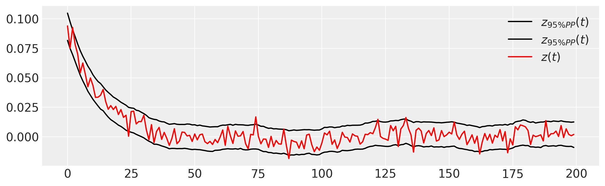
请注意,初始条件也被估计,并且大多数观测数据 \(z(t)\) 位于 PPC 的 95% 区间内。
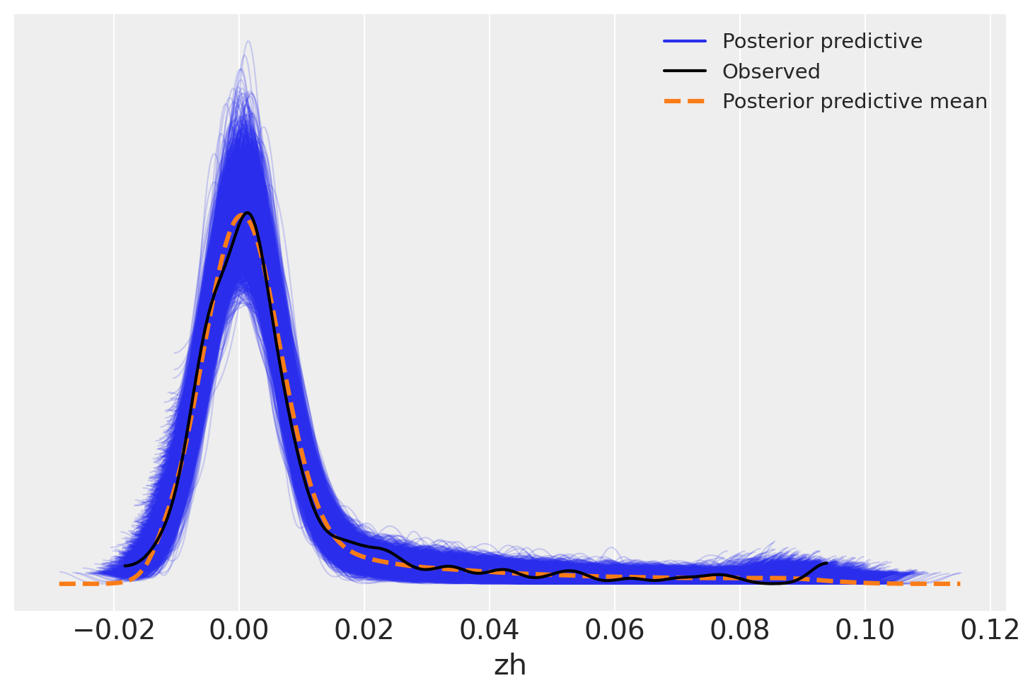
另一种方法是查看数据抽样分布相对于观测数据的抽取结果。这也显示了在观测范围内的良好拟合——后验预测均值几乎完美地跟踪了数据。
az.plot_ppc(trace)
<Axes: xlabel='zh'>
参考文献#
%load_ext watermark
%watermark -n -u -v -iv -w
Last updated: Tue Sep 24 2024

Python implementation: CPython
Python version       : 3.12.5
IPython version      : 8.27.0

matplotlib: 3.9.2
pytensor  : 2.25.4
numpy     : 1.26.4
arviz     : 0.19.0
pymc      : 5.16.2
scipy     : 1.14.1

Watermark: 2.4.3