


差异中的差异#
import arviz as az
import matplotlib.pyplot as plt
import numpy as np
import pandas as pd
import pymc as pm
import seaborn as sns
%config InlineBackend.figure_format = 'retina'
RANDOM_SEED = 8927
rng = np.random.default_rng(RANDOM_SEED)
az.style.use("arviz-darkgrid")
简介#
本笔记本简要概述了因果推断中差异中的差异方法,并展示了如何在贝叶斯框架下使用 PyMC 进行此类分析的实际示例。虽然笔记本提供了该方法的高级概述,但我建议查阅两本关于因果推断的优秀教科书。《The Effect》 [Huntington-Klein, 2021] 和 《Causal Inference: The Mixtape》 [Cunningham, 2021] 都有专门章节介绍差异中的差异。
如果出现以下情况,差异中的差异 将是进行因果推断的好方法
您想了解治疗/干预的因果影响
您有治疗前和治疗后措施
您同时拥有治疗组和对照组
治疗不是通过随机化分配的,也就是说,您处于 准实验 设置中。
否则,可能会有更适合您使用的方法。
请注意,我们希望估计治疗的因果影响涉及 反事实思考。这是因为我们正在询问“如果 没有进行治疗,治疗组的治疗后结果会怎样?”,但我们永远无法观察到这一点。
示例#
Card 和 Krueger [1993] 的一项研究给出了一个经典示例。这项研究考察了提高最低工资对快餐业就业的影响。这是一个准实验设置,因为干预(提高最低工资)不是随机应用于不同的地理单位(例如,州)。干预于 1992 年 4 月应用于新泽西州。如果他们仅在新泽西州测量了干预前和干预后的就业率,那么他们将无法控制随时间变化的遗漏变量(例如,季节性影响),这些变量可能为就业率的变化提供替代的因果解释。但是,通过选择对照州(宾夕法尼亚州),人们可以推断出宾夕法尼亚州就业的变化将与反事实相匹配 - 如果新泽西州没有接受干预,将会发生什么?
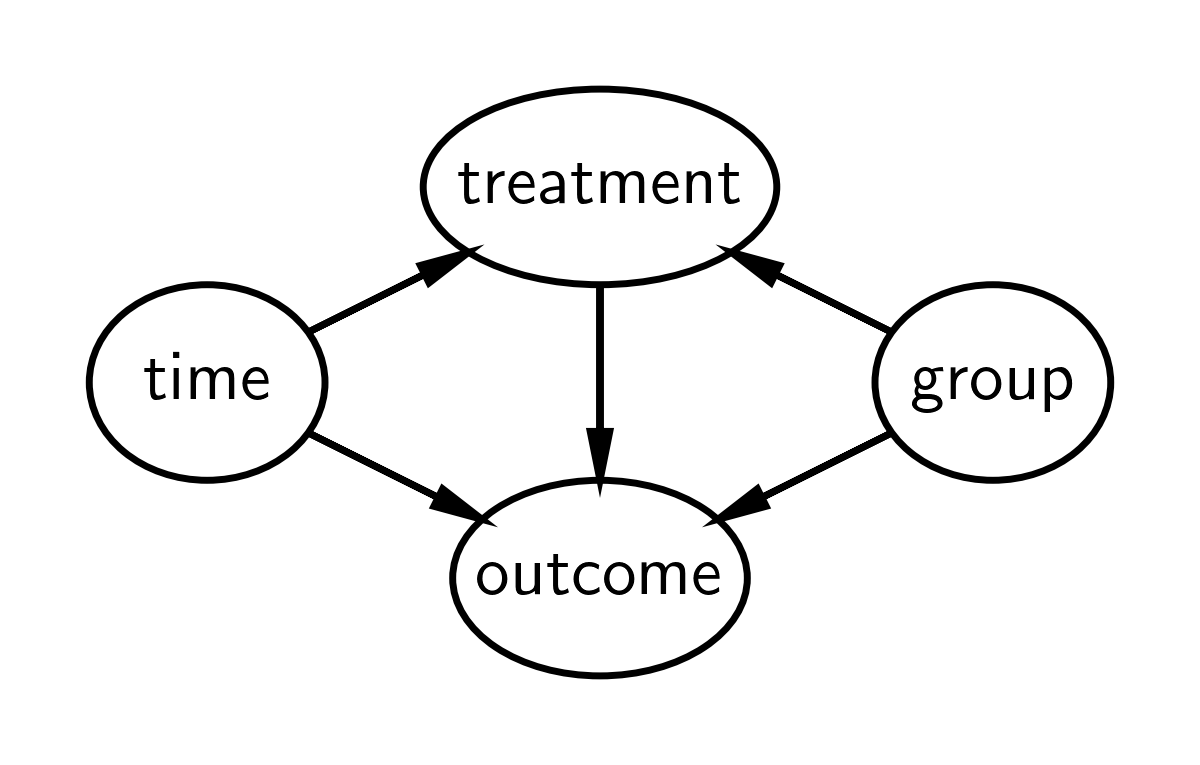
因果 DAG#
差异中的差异的因果 DAG 如下所示。它表示
观察的治疗状态受组和时间因果关系影响。请注意,治疗和组是不同的事物。组是实验组或对照组,但实验组仅在干预时间后才被“治疗”,因此治疗状态取决于组和时间。
测量的结果受时间、组和治疗的因果关系影响。
不考虑其他因果影响。
我们主要对治疗对结果的影响以及这种影响如何随时间变化(治疗前到治疗后)感兴趣。如果我们只关注治疗组的治疗、时间和结果(即没有对照组),那么我们将无法将结果的变化归因于治疗,而是归因于随着时间的推移发生在治疗组的任何其他因素。换句话说,治疗将完全由时间决定,因此无法区分治疗前和治疗后结果指标的变化是由治疗还是时间引起的。
但是,通过添加对照组,我们可以比较对照组的时间变化和治疗组的时间变化。差异中的差异方法中的关键假设之一是平行趋势假设 - 即两组随时间以相似的方式变化。换句话说,如果 对照组和治疗组随时间以相似的方式变化,那么我们可以相当确信,组之间随时间变化的差异是由于治疗造成的。
定义差异中的差异模型#
注意: 我定义的这个模型与其他来源中可能找到的模型略有不同。这是为了方便稍后在本笔记本中进行反事实推断,并强调关于连续时间趋势的假设。
首先,让我们定义一个 Python 函数来计算结果的期望值
def outcome(t, control_intercept, treat_intercept_delta, trend, Δ, group, treated):
    return control_intercept + (treat_intercept_delta * group) + (t * trend) + (Δ * treated * group)
但我们应该用数学符号更仔细地看一下这个问题。第 \(i^{th}\) 个观测值的期望值是 \(\mu_i\),其定义为
其中有以下参数
\(\beta_c\) 是对照组的截距
\(\beta_{\Delta}\) 是治疗组截距与对照组截距的偏差
\(\Delta\) 是治疗的因果影响
\(\mathrm{trend}\) 是斜率,模型的一个核心假设是两组的斜率相同
以及以下观测数据
\(t_i\) 是时间,为了方便起见,将其缩放,使干预前测量时间为 \(t=0\),干预后测量时间为 \(t=1\)
\(\mathrm{group}_i\) 是对照组 (\(g=0\)) 或治疗组 (\(g=1\)) 的虚拟变量
\(\mathrm{treated}_i\) 是未治疗或已治疗的二元指标变量。这是时间和组的函数:\(\mathrm{treated}_i = f(t_i, \mathrm{group}_i)\)。
我们可以通过查看上面的 DAG 并编写一个 Python 函数来定义此函数,从而强调治疗在因果关系上受时间和组影响的后一点。
def is_treated(t, intervention_time, group):
    return (t > intervention_time) * group
可视化差异中的差异模型#
通常,一张图片胜过千言万语,因此如果上面的描述令人困惑,那么我建议在从下面的图中获得更多视觉直觉后重新阅读。
# true parameters
control_intercept = 1
treat_intercept_delta = 0.25
trend = 1
Δ = 0.5
intervention_time = 0.5
显示代码单元格源
fig, ax = plt.subplots()
ti = np.linspace(-0.5, 1.5, 1000)
ax.plot(
    ti,
    outcome(
        ti,
        control_intercept,
        treat_intercept_delta,
        trend,
        Δ=0,
        group=1,
        treated=is_treated(ti, intervention_time, group=1),
    ),
    color="blue",
    label="counterfactual",
    ls=":",
)
ax.plot(
    ti,
    outcome(
        ti,
        control_intercept,
        treat_intercept_delta,
        trend,
        Δ,
        group=1,
        treated=is_treated(ti, intervention_time, group=1),
    ),
    color="blue",
    label="treatment group",
)
ax.plot(
    ti,
    outcome(
        ti,
        control_intercept,
        treat_intercept_delta,
        trend,
        Δ,
        group=0,
        treated=is_treated(ti, intervention_time, group=0),
    ),
    color="C1",
    label="control group",
)
ax.axvline(x=intervention_time, ls="-", color="r", label="treatment time", lw=3)
t = np.array([0, 1])
ax.plot(
    t,
    outcome(
        t,
        control_intercept,
        treat_intercept_delta,
        trend,
        Δ,
        group=1,
        treated=is_treated(t, intervention_time, group=1),
    ),
    "o",
    color="blue",
)
ax.plot(
    t,
    outcome(
        t,
        control_intercept,
        treat_intercept_delta,
        trend,
        Δ=0,
        group=0,
        treated=is_treated(t, intervention_time, group=0),
    ),
    "o",
    color="C1",
)
ax.set(
    xlabel="time",
    ylabel="metric",
    xticks=t,
    xticklabels=["pre", "post"],
    title="Difference in Differences",
)
ax.legend();
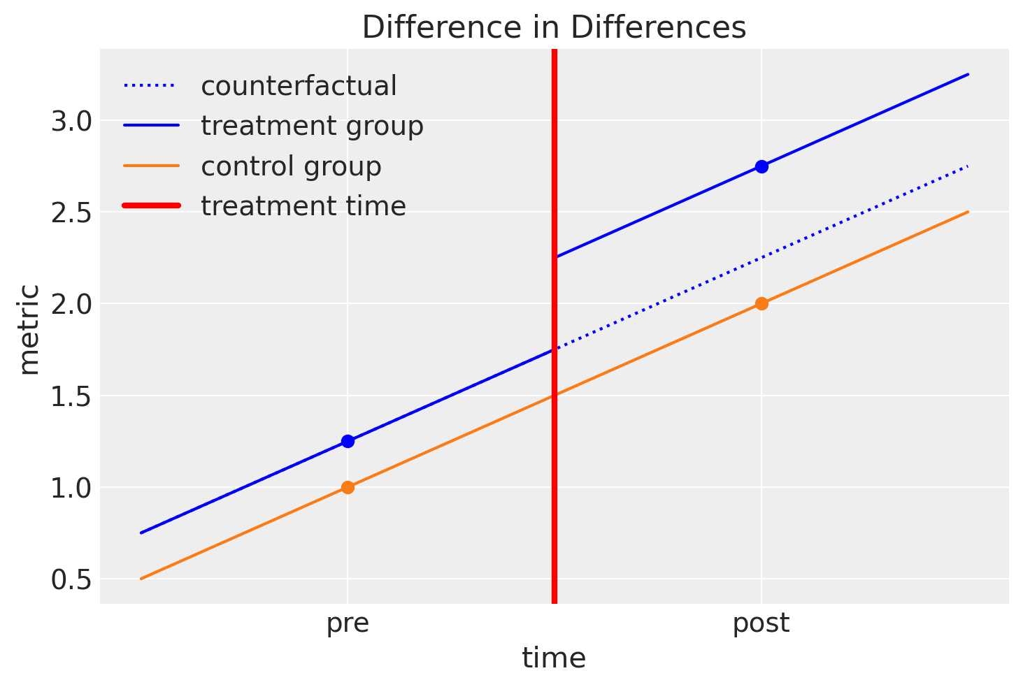
因此,我们可以通过查看此图来总结差异中差异的直觉
我们假设治疗组和对照组随着时间的推移以类似的方式演变。
我们可以轻松地估计对照组从治疗前到治疗后的斜率。
我们可以进行反事实思考,并可以问:“如果 治疗组没有接受治疗,治疗组的治疗后结果会怎样?”
如果我们能够回答这个问题并估计这个反事实量,那么我们可以问:“治疗的因果影响是什么?” 我们可以通过将治疗组的观察到的治疗后结果与反事实量进行比较来回答这个问题。
我们可以从视觉上思考这个问题,并用另一种方式陈述……通过查看对照组的治疗前/后差异,我们可以将对照组和治疗组的治疗前/后差异的任何差异归因于治疗的因果效应。这就是该方法被称为差异中的差异的原因。
生成合成数据集#
df = pd.DataFrame(
    {
        "group": [0, 0, 1, 1] * 10,
        "t": [0.0, 1.0, 0.0, 1.0] * 10,
        "unit": np.concatenate([[i] * 2 for i in range(20)]),
    }
)

df["treated"] = is_treated(df["t"], intervention_time, df["group"])

df["y"] = outcome(
    df["t"],
    control_intercept,
    treat_intercept_delta,
    trend,
    Δ,
    df["group"],
    df["treated"],
)
df["y"] += rng.normal(0, 0.1, df.shape[0])
df.head()
| 组 | t | 单位 | 已治疗 | y | |
|---|---|---|---|---|---|
| 0 | 0 | 0.0 | 0 | 0 | 0.977736 |
| 1 | 0 | 1.0 | 0 | 0 | 2.132566 |
| 2 | 1 | 0.0 | 1 | 0 | 1.192903 |
| 3 | 1 | 1.0 | 1 | 1 | 2.816825 |
| 4 | 0 | 0.0 | 2 | 0 | 1.114538 |
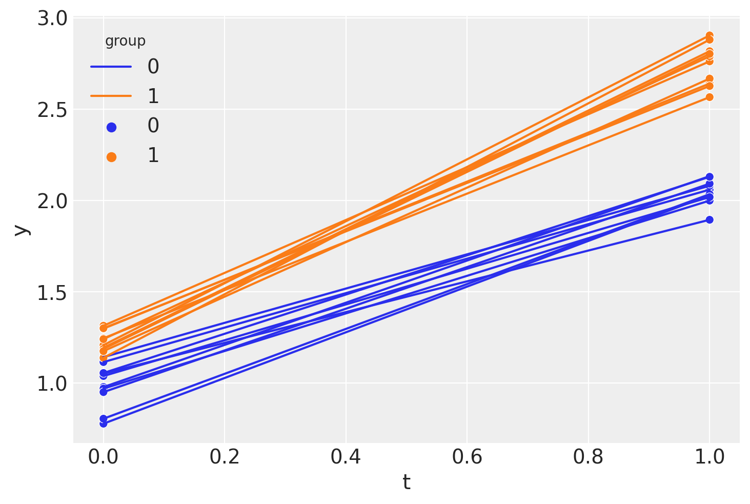
因此,我们看到我们有 面板数据,只有两个时间点:干预前 (\(t=0\)) 和干预后 (\(t=1\)) 测量时间。
sns.lineplot(df, x="t", y="y", hue="group", units="unit", estimator=None)
sns.scatterplot(df, x="t", y="y", hue="group");
如果需要,我们可以像这样(在非回归方法中)计算差异中差异的点估计。
diff_control = (
    df.loc[(df["t"] == 1) & (df["group"] == 0)]["y"].mean()
    - df.loc[(df["t"] == 0) & (df["group"] == 0)]["y"].mean()
)
print(f"Pre/post difference in control group = {diff_control:.2f}")

diff_treat = (
    df.loc[(df["t"] == 1) & (df["group"] == 1)]["y"].mean()
    - df.loc[(df["t"] == 0) & (df["group"] == 1)]["y"].mean()
)

print(f"Pre/post difference in treatment group = {diff_treat:.2f}")

diff_in_diff = diff_treat - diff_control
print(f"Difference in differences = {diff_in_diff:.2f}")
Pre/post difference in control group = 1.06
Pre/post difference in treatment group = 1.52
Difference in differences = 0.46
但是等等,我们是贝叶斯主义者!让我们进行贝叶斯分析…
贝叶斯差异中的差异#
PyMC 模型#
对于那些已经精通 PyMC 的人来说,您可以看到这个模型非常简单。我们只有几个组件
定义数据节点。这是可选的,但在稍后我们运行后验预测检验和反事实推断时很有用
定义先验
使用我们已在上面定义的
outcome函数评估模型期望定义正态似然分布。
with pm.Model() as model:
    # data
    t = pm.MutableData("t", df["t"].values, dims="obs_idx")
    treated = pm.MutableData("treated", df["treated"].values, dims="obs_idx")
    group = pm.MutableData("group", df["group"].values, dims="obs_idx")
    # priors
    _control_intercept = pm.Normal("control_intercept", 0, 5)
    _treat_intercept_delta = pm.Normal("treat_intercept_delta", 0, 1)
    _trend = pm.Normal("trend", 0, 5)
    _Δ = pm.Normal("Δ", 0, 1)
    sigma = pm.HalfNormal("sigma", 1)
    # expectation
    mu = pm.Deterministic(
        "mu",
        outcome(t, _control_intercept, _treat_intercept_delta, _trend, _Δ, group, treated),
        dims="obs_idx",
    )
    # likelihood
    pm.Normal("obs", mu, sigma, observed=df["y"].values, dims="obs_idx")
pm.model_to_graphviz(model)

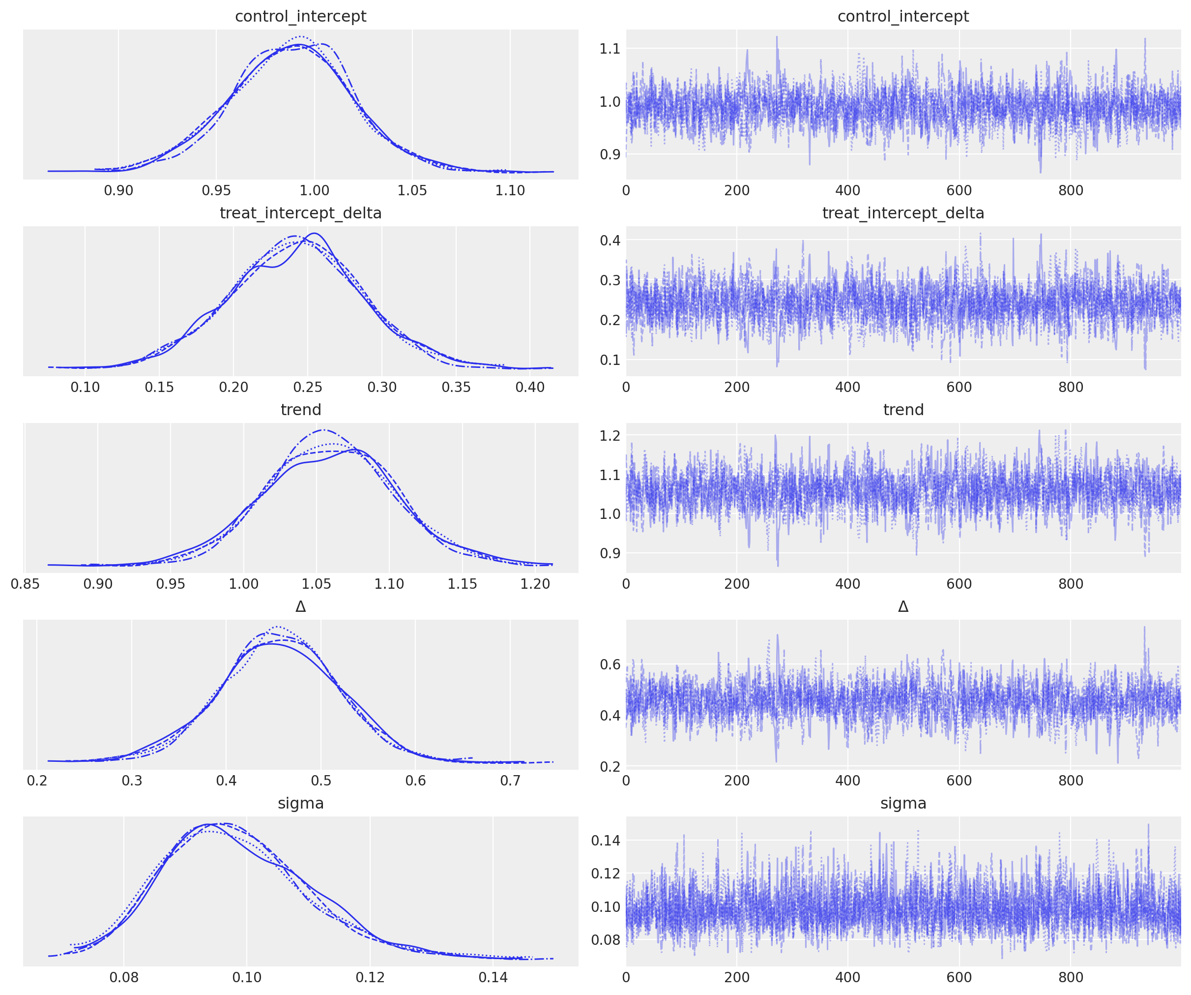
推断#
with model:
    idata = pm.sample()
Auto-assigning NUTS sampler...
Initializing NUTS using jitter+adapt_diag...
Multiprocess sampling (4 chains in 4 jobs)
NUTS: [control_intercept, treat_intercept_delta, trend, Δ, sigma]
Sampling 4 chains for 1_000 tune and 1_000 draw iterations (4_000 + 4_000 draws total) took 2 seconds.
az.plot_trace(idata, var_names="~mu");
后验预测#
注意:从技术上讲,我们正在对 \(\mu\) 进行“前推预测”,因为这是其输入的确定性函数。如果我们生成预测的观测值 - 这些观测值将基于我们为数据指定的正态似然分布而具有随机性,那么后验预测将是一个更合适的标签。尽管如此,本节仍称为“后验预测”,以强调我们正在遵循贝叶斯工作流程这一事实。
# pushforward predictions for control group
with model:
    group_control = [0] * len(ti)  # must be integers
    treated = [0] * len(ti)  # must be integers
    pm.set_data({"t": ti, "group": group_control, "treated": treated})
    ppc_control = pm.sample_posterior_predictive(idata, var_names=["mu"])

# pushforward predictions for treatment group
with model:
    group = [1] * len(ti)  # must be integers
    pm.set_data(
        {
            "t": ti,
            "group": group,
            "treated": is_treated(ti, intervention_time, group),
        }
    )
    ppc_treatment = pm.sample_posterior_predictive(idata, var_names=["mu"])

# counterfactual: what do we predict of the treatment group (after the intervention) if
# they had _not_ been treated?
t_counterfactual = np.linspace(intervention_time, 1.5, 100)
with model:
    group = [1] * len(t_counterfactual)  # must be integers
    pm.set_data(
        {
            "t": t_counterfactual,
            "group": group,
            "treated": [0] * len(t_counterfactual),  # THIS IS OUR COUNTERFACTUAL
        }
    )
    ppc_counterfactual = pm.sample_posterior_predictive(idata, var_names=["mu"])
Sampling: []
Sampling: []
Sampling: []
总结#
我们可以绘制我们在下面学到的内容
显示代码单元格源
ax = sns.scatterplot(df, x="t", y="y", hue="group")

az.plot_hdi(
    ti,
    ppc_control.posterior_predictive["mu"],
    smooth=False,
    ax=ax,
    color="blue",
    fill_kwargs={"label": "control HDI"},
)
az.plot_hdi(
    ti,
    ppc_treatment.posterior_predictive["mu"],
    smooth=False,
    ax=ax,
    color="C1",
    fill_kwargs={"label": "treatment HDI"},
)
az.plot_hdi(
    t_counterfactual,
    ppc_counterfactual.posterior_predictive["mu"],
    smooth=False,
    ax=ax,
    color="C2",
    fill_kwargs={"label": "counterfactual"},
)
ax.axvline(x=intervention_time, ls="-", color="r", label="treatment time", lw=3)
ax.set(
    xlabel="time",
    ylabel="metric",
    xticks=[0, 1],
    xticklabels=["pre", "post"],
    title="Difference in Differences",
)
ax.legend();
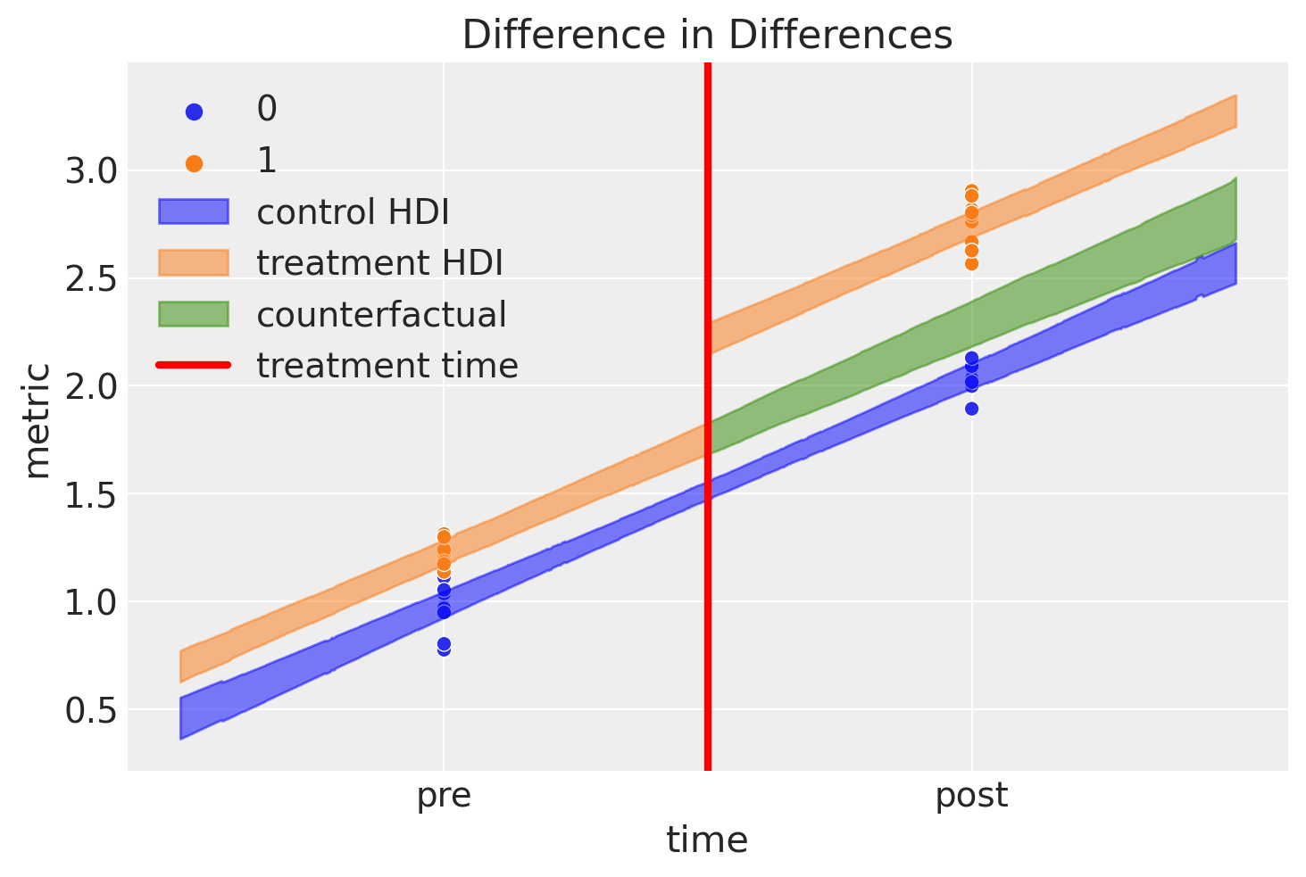
这是一个很棒的图,但这里发生了很多事情,所以让我们过一遍
蓝色阴影区域表示对照组期望值的可信区域
橙色阴影区域表示治疗组的类似区域。我们可以看到结果在干预后立即跳跃。
绿色阴影区域是一些非常新颖且不错的东西。这表示我们对如果 治疗组从未接受治疗的期望的反事实推断。根据定义,我们从未对干预后未接受治疗的治疗组中的项目进行任何观察。尽管如此,通过笔记本顶部描述的模型和概述的贝叶斯推断方法,我们可以推理此类假设 问题。
这种反事实期望与观察值(治疗条件下的治疗后值)之间的差异代表了我们推断出的治疗的因果影响。让我们更详细地看一下后验分布
ax = az.plot_posterior(idata.posterior["Δ"], ref_val=Δ, figsize=(10, 3))
ax.set(title=r"Posterior distribution of causal impact of treatment, $\Delta$");
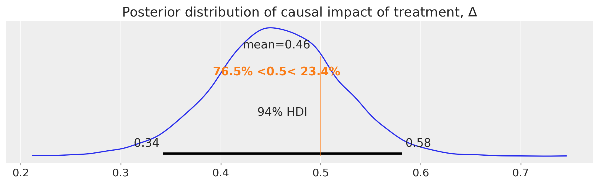
就这样,我们使用差异中的差异方法获得了对我们估计的因果影响的完整后验分布。
总结#
当然,在实际应用中使用差异中的差异方法时,还需要进行更多的尽职调查。鼓励读者查看引言中列出的教科书以及一篇有用的综述论文 [Wing et al., 2018],其中更详细地介绍了重要的背景问题。此外,Bertrand et al. [2004] 对该方法持怀疑态度,并为他们强调的一些问题提出了解决方案。
参考文献#
Nick Huntington-Klein. The effect: An introduction to research design and causality. Chapman and Hall/CRC, 2021.
Scott Cunningham. Causal inference: The Mixtape. Yale University Press, 2021.
David Card 和 Alan B Krueger. Minimum wages and employment: a case study of the fast food industry in new jersey and pennsylvania. 1993.
Coady Wing, Kosali Simon, 和 Ricardo A Bello-Gomez. Designing difference in difference studies: best practices for public health policy research. Annu Rev Public Health, 39(1):453–469, 2018.
Marianne Bertrand, Esther Duflo, 和 Sendhil Mullainathan. How much should we trust differences-in-differences estimates? The Quarterly journal of economics, 119(1):249–275, 2004.
水印#
%load_ext watermark
%watermark -n -u -v -iv -w -p pytensor,aeppl,xarray
Last updated: Wed Feb 01 2023

Python implementation: CPython
Python version       : 3.11.0
IPython version      : 8.9.0

pytensor: 2.8.11
aeppl   : not installed
xarray  : 2023.1.0

arviz     : 0.14.0
pymc      : 5.0.1
pandas    : 1.5.3
matplotlib: 3.6.3
numpy     : 1.24.1
seaborn   : 0.12.2

Watermark: 2.3.1
许可声明#
本示例库中的所有笔记本均根据 MIT 许可证 提供,该许可证允许修改和再分发以用于任何用途,前提是保留版权和许可声明。
引用 PyMC 示例#
要引用此笔记本,请使用 Zenodo 为 pymc-examples 存储库提供的 DOI。
重要提示
许多笔记本都改编自其他来源:博客、书籍……在这种情况下,您也应该引用原始来源。
还请记住引用您的代码使用的相关库。
这是一个 bibtex 中的引用模板
@incollection{citekey,
  author    = "<notebook authors, see above>",
  title     = "<notebook title>",
  editor    = "PyMC Team",
  booktitle = "PyMC examples",
  doi       = "10.5281/zenodo.5654871"
}
渲染后可能看起来像