


样条#
简介#
通常,我们想要拟合的模型不是 \(x\) 和 \(y\) 之间的一条完美直线。相反,模型的参数预计会随着 \(x\) 而变化。 有多种方法可以处理这种情况,其中一种是拟合样条。 样条拟合实际上是多个单独曲线(分段多项式)的总和,每个曲线都拟合到 \(x\) 的不同部分,这些曲线在其边界处连接在一起,通常称为节点。
样条实际上是多条单独的线,每条线都拟合到 \(x\) 的不同部分,这些线在其边界处连接在一起,通常称为节点。
下面是如何使用 PyMC 拟合样条的完整工作示例。 数据和模型取自 Statistical Rethinking 2e,作者是 Richard McElreath [McElreath,2018]。
有关这种非线性建模方法的更多信息,我建议从 Bayesian Modeling and Computation in Python 第 5 章 开始阅读 [Martin等,2021]。
from pathlib import Path

import arviz as az
import matplotlib.pyplot as plt
import numpy as np
import pandas as pd
import pymc as pm

from patsy import build_design_matrices, dmatrix
%matplotlib inline
%config InlineBackend.figure_format = "retina"

seed = sum(map(ord, "splines"))
rng = np.random.default_rng(seed)
az.style.use("arviz-darkgrid")
樱花数据#
此示例的数据是每年樱花树开花的日数(doy,代表“一年中的天数”)(year)。 为了方便起见,缺少 doy 的年份被删除(这通常是处理缺失数据的一个坏主意!)。
try:
    blossom_data = pd.read_csv(Path("..", "data", "cherry_blossoms.csv"), sep=";")
except FileNotFoundError:
    blossom_data = pd.read_csv(pm.get_data("cherry_blossoms.csv"), sep=";")


blossom_data.dropna().describe()
| year | doy | temp | temp_upper | temp_lower | |
|---|---|---|---|---|---|
| count | 787.000000 | 787.00000 | 787.000000 | 787.000000 | 787.000000 |
| mean | 1533.395172 | 104.92122 | 6.100356 | 6.937560 | 5.263545 |
| std | 291.122597 | 6.25773 | 0.683410 | 0.811986 | 0.762194 |
| min | 851.000000 | 86.00000 | 4.690000 | 5.450000 | 2.610000 |
| 25% | 1318.000000 | 101.00000 | 5.625000 | 6.380000 | 4.770000 |
| 50% | 1563.000000 | 105.00000 | 6.060000 | 6.800000 | 5.250000 |
| 75% | 1778.500000 | 109.00000 | 6.460000 | 7.375000 | 5.650000 |
| max | 1980.000000 | 124.00000 | 8.300000 | 12.100000 | 7.740000 |
blossom_data = blossom_data.dropna(subset=["doy"]).reset_index(drop=True)
blossom_data.head(n=10)
| year | doy | temp | temp_upper | temp_lower | |
|---|---|---|---|---|---|
| 0 | 812 | 92.0 | NaN | NaN | NaN |
| 1 | 815 | 105.0 | NaN | NaN | NaN |
| 2 | 831 | 96.0 | NaN | NaN | NaN |
| 3 | 851 | 108.0 | 7.38 | 12.10 | 2.66 |
| 4 | 853 | 104.0 | NaN | NaN | NaN |
| 5 | 864 | 100.0 | 6.42 | 8.69 | 4.14 |
| 6 | 866 | 106.0 | 6.44 | 8.11 | 4.77 |
| 7 | 869 | 95.0 | NaN | NaN | NaN |
| 8 | 889 | 104.0 | 6.83 | 8.48 | 5.19 |
| 9 | 891 | 109.0 | 6.98 | 8.96 | 5.00 |
删除包含缺失数据的行后,有 827 年的数据记录了树木开花的天数。
blossom_data.shape
(827, 5)
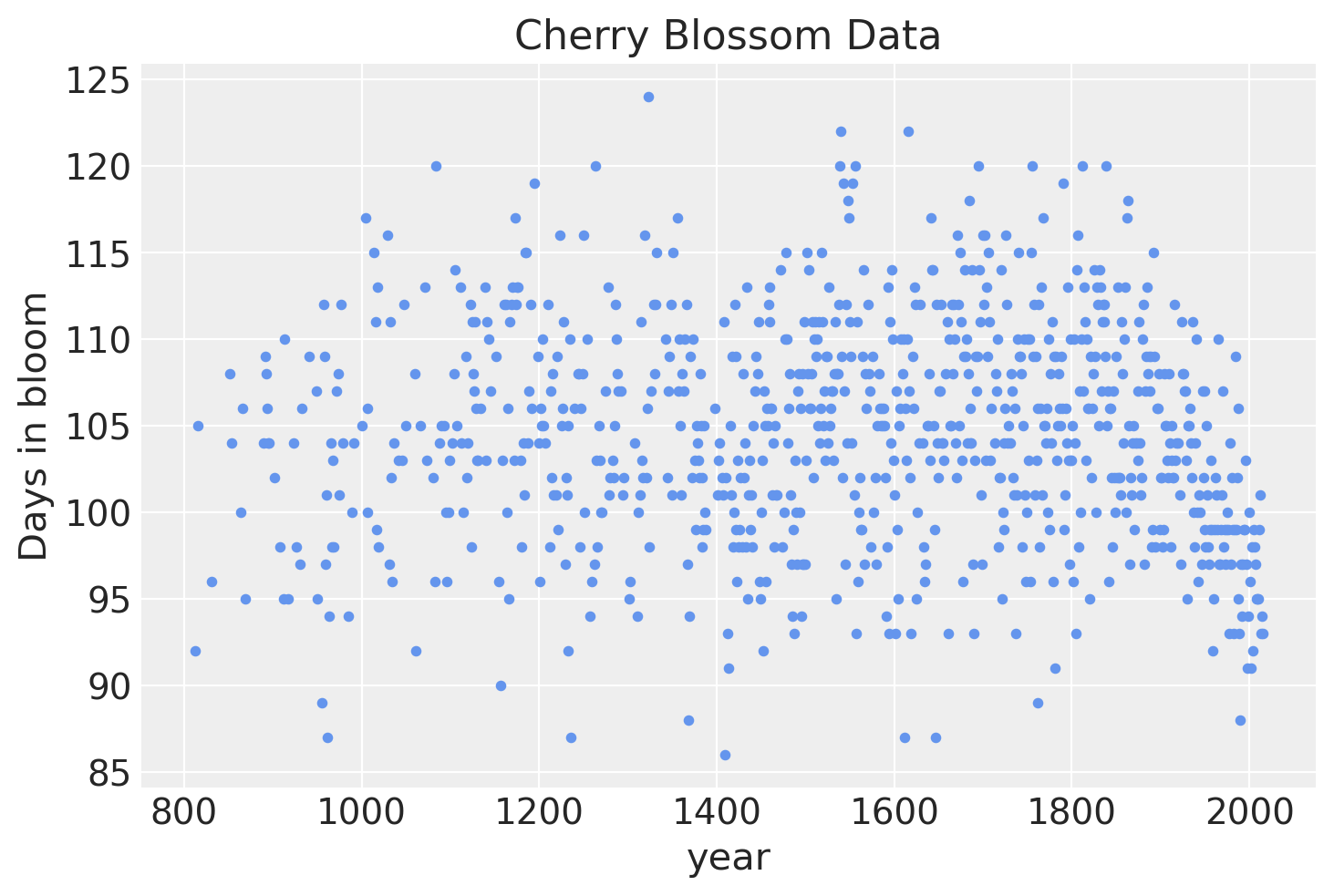
如果我们可视化数据,很明显,每年的变化很大,但有一些证据表明开花天数随时间呈非线性趋势。
blossom_data.plot.scatter(
    "year",
    "doy",
    color="cornflowerblue",
    s=10,
    title="Cherry Blossom Data",
    ylabel="Days in bloom",
);
模型#
我们将拟合以下模型。
\(D \sim \mathcal{N}(\mu, \sigma)\)
\(\quad \mu = a + Bw\)
\(\qquad a \sim \mathcal{N}(100, 10)\)
\(\qquad w \sim \mathcal{N}(0, 10)\)
\(\quad \sigma \sim \text{Exp}(1)\)
开花天数 \(D\) 将被建模为正态分布,均值为 \(\mu\),标准差为 \(\sigma\)。 反过来,均值将是一个线性模型,由 y 轴截距 \(a\) 和由基 \(B\) 定义的样条乘以模型参数 \(w\) 组成,其中每个基区域都有一个变量。 两者都具有相对较弱的正态先验。
准备样条#
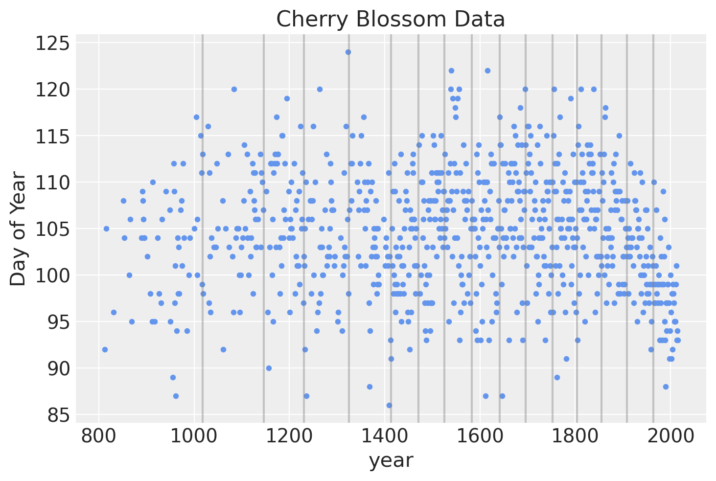
样条将有 15 个节点,将年份分成 16 个部分(包括覆盖我们有数据之前的年份和之后的年份的区域)。 节点是样条的边界,之所以这样命名,是因为各个线将如何在这些边界处连接在一起,形成一条连续且平滑的曲线。 节点将在年份上不均匀分布,以便每个区域具有相同比例的数据。
num_knots = 15
knot_list = np.percentile(blossom_data.year, np.linspace(0, 100, num_knots + 2))[1:-1]
knot_list
array([1017.625, 1146.5  , 1230.875, 1325.   , 1413.25 , 1471.   ,
       1525.375, 1583.   , 1641.625, 1696.25 , 1751.875, 1803.5  ,
       1855.125, 1908.75 , 1963.375])
下面是节点在数据上的位置图。
blossom_data.plot.scatter(
    "year",
    "doy",
    color="cornflowerblue",
    s=10,
    title="Cherry Blossom Data",
    ylabel="Day of Year",
)
for knot in knot_list:
    plt.gca().axvline(knot, color="grey", alpha=0.4)
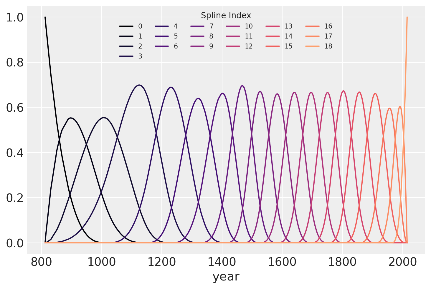
我们可以使用 patsy 来创建矩阵 \(B\),它将是回归的 b 样条基。 次数设置为 3 以创建三次 b 样条。
B = dmatrix(
    "bs(year, knots=knots, degree=3, include_intercept=True) - 1",
    {"year": blossom_data.year.values, "knots": knot_list},
)
B
显示代码单元格输出
DesignMatrix with shape (827, 19)
  Columns:
    ['bs(year, knots=knots, degree=3, include_intercept=True)[0]',
     'bs(year, knots=knots, degree=3, include_intercept=True)[1]',
     'bs(year, knots=knots, degree=3, include_intercept=True)[2]',
     'bs(year, knots=knots, degree=3, include_intercept=True)[3]',
     'bs(year, knots=knots, degree=3, include_intercept=True)[4]',
     'bs(year, knots=knots, degree=3, include_intercept=True)[5]',
     'bs(year, knots=knots, degree=3, include_intercept=True)[6]',
     'bs(year, knots=knots, degree=3, include_intercept=True)[7]',
     'bs(year, knots=knots, degree=3, include_intercept=True)[8]',
     'bs(year, knots=knots, degree=3, include_intercept=True)[9]',
     'bs(year, knots=knots, degree=3, include_intercept=True)[10]',
     'bs(year, knots=knots, degree=3, include_intercept=True)[11]',
     'bs(year, knots=knots, degree=3, include_intercept=True)[12]',
     'bs(year, knots=knots, degree=3, include_intercept=True)[13]',
     'bs(year, knots=knots, degree=3, include_intercept=True)[14]',
     'bs(year, knots=knots, degree=3, include_intercept=True)[15]',
     'bs(year, knots=knots, degree=3, include_intercept=True)[16]',
     'bs(year, knots=knots, degree=3, include_intercept=True)[17]',
     'bs(year, knots=knots, degree=3, include_intercept=True)[18]']
  Terms:
    'bs(year, knots=knots, degree=3, include_intercept=True)' (columns 0:19)
  (to view full data, use np.asarray(this_obj))
b 样条基绘制在下方,显示样条每个片段的域。 每条曲线的高度表示相应的模型协变量(每个样条区域一个)对模型在该区域的推断的影响程度。 重叠区域表示节点,显示了如何形成从一个区域到下一个区域的平滑过渡。
spline_df = (
    pd.DataFrame(B)
    .assign(year=blossom_data.year.values)
    .melt("year", var_name="spline_i", value_name="value")
)

color = plt.cm.magma(np.linspace(0, 0.80, len(spline_df.spline_i.unique())))

fig = plt.figure()
for i, c in enumerate(color):
    subset = spline_df.query(f"spline_i == {i}")
    subset.plot("year", "value", c=c, ax=plt.gca(), label=i)
plt.legend(title="Spline Index", loc="upper center", fontsize=8, ncol=6);
拟合模型#
最后,可以使用 PyMC 构建模型。 图形图显示了模型参数的组织结构(请注意,这需要安装 python-graphviz,我建议在 conda 虚拟环境中执行此操作)。
COORDS = {"splines": np.arange(B.shape[1])}
with pm.Model(coords=COORDS) as spline_model:
    a = pm.Normal("a", 100, 5)
    w = pm.Normal("w", mu=0, sigma=3, size=B.shape[1], dims="splines")

    mu = pm.Deterministic(
        "mu",
        a + pm.math.dot(np.asarray(B, order="F"), w.T),
    )
    sigma = pm.Exponential("sigma", 1)

    D = pm.Normal("D", mu=mu, sigma=sigma, observed=blossom_data.doy)
pm.model_to_graphviz(spline_model)

with spline_model:
    idata = pm.sample_prior_predictive()
    idata.extend(
        pm.sample(
            nuts_sampler="nutpie",
            draws=1000,
            tune=1000,
            random_seed=rng,
            chains=4,
        )
    )
    pm.sample_posterior_predictive(idata, extend_inferencedata=True)
Sampling: [D, a, sigma, w]
/Users/alex_andorra/tptm_alex/pymc/pymc/pytensorf.py:1057: FutureWarning: compile_pymc was renamed to compile. Old name will be removed in a future release of PyMC
  warnings.warn(
/Users/alex_andorra/tptm_alex/pymc/pymc/pytensorf.py:1057: FutureWarning: compile_pymc was renamed to compile. Old name will be removed in a future release of PyMC
  warnings.warn(
采样器进度
总链数: 4
活动链数: 0
完成链数: 4
正在采样
预计完成时间: now
| 进度 | 抽取 | 发散 | 步长 | 梯度/抽取 |
|---|---|---|---|---|
| 2000 | 0 | 0.53 | 7 | |
| 2000 | 0 | 0.52 | 15 | |
| 2000 | 0 | 0.52 | 15 | |
| 2000 | 0 | 0.51 | 15 |
Sampling: [D]
分析#
现在我们可以分析模型后验的抽取结果。
参数估计#
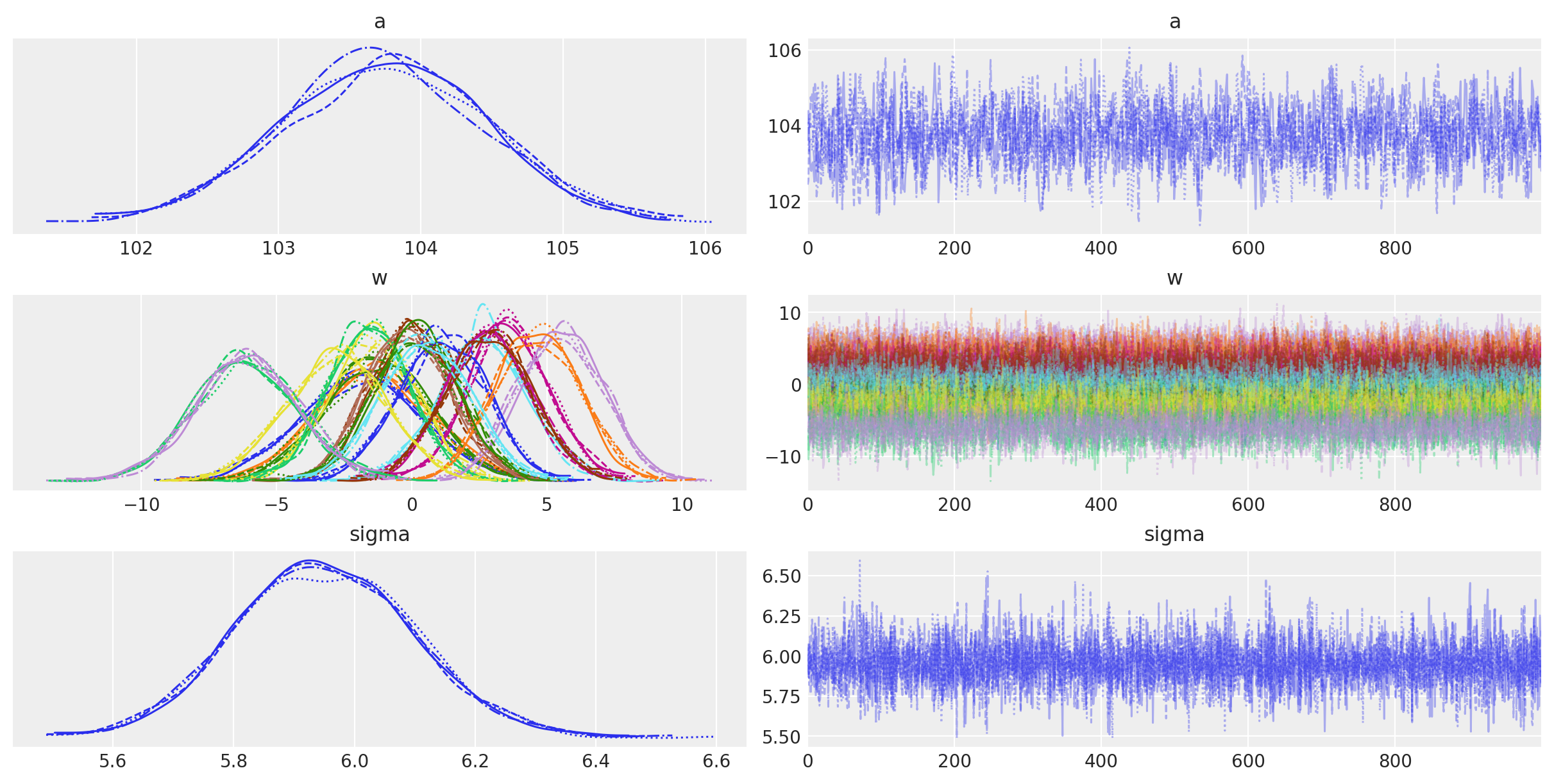
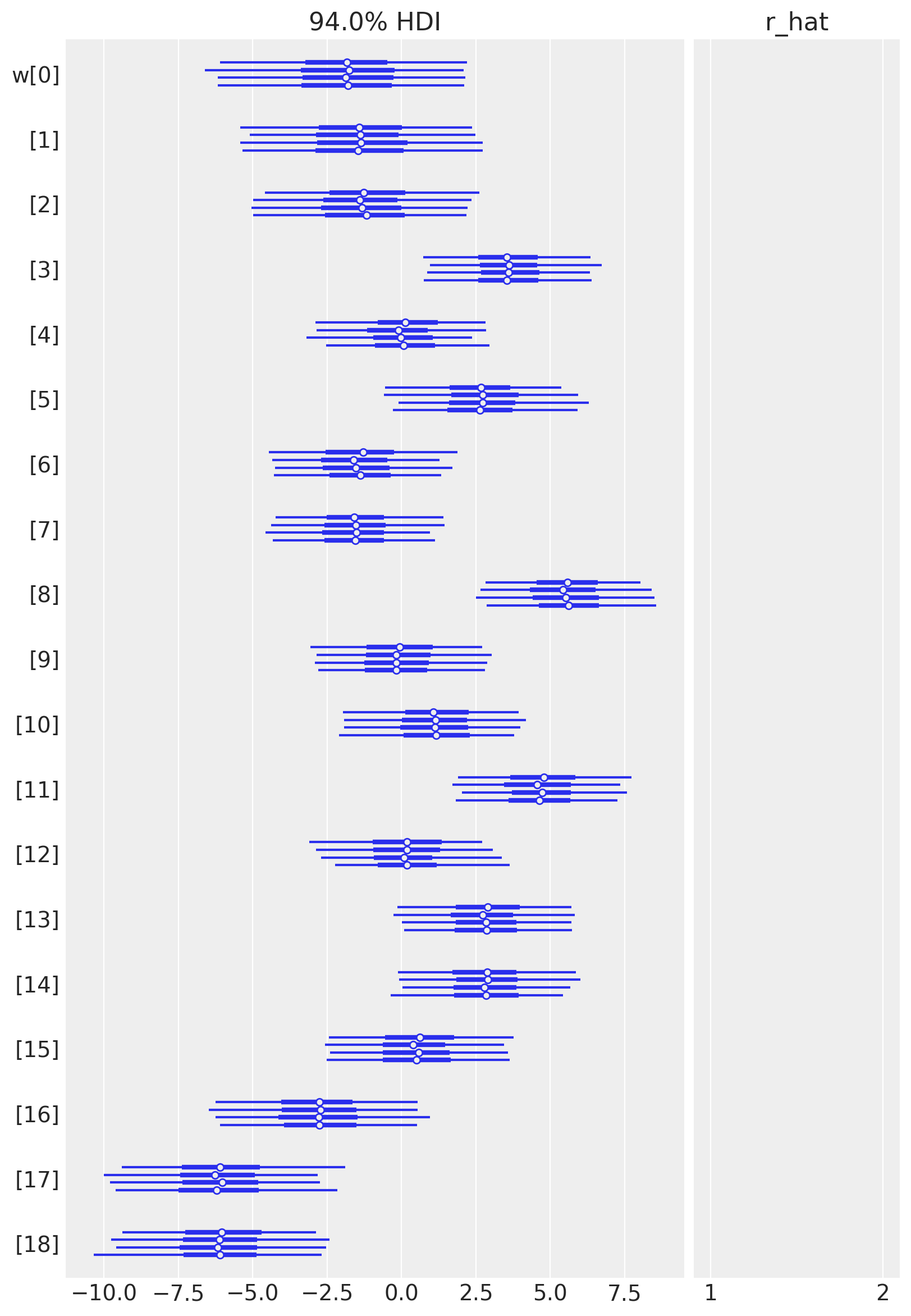
下表总结了模型参数的后验分布。 \(a\) 和 \(\sigma\) 的后验分布非常窄,而 \(w\) 的后验分布则更宽。 这可能是因为所有数据点都用于估计 \(a\) 和 \(\sigma\),而只有一部分数据点用于 \(w\) 的每个值。 (对这些进行分层建模,允许信息共享并在样条上添加正则化可能会很有趣。) 有效样本大小和 \(\widehat{R}\) 值看起来都不错,表明模型已收敛并从后验分布中良好采样。
az.summary(idata, var_names=["a", "w", "sigma"])
| mean | sd | hdi_3% | hdi_97% | mcse_mean | mcse_sd | ess_bulk | ess_tail | r_hat | |
|---|---|---|---|---|---|---|---|---|---|
| a | 103.743 | 0.733 | 102.370 | 105.147 | 0.021 | 0.015 | 1276.0 | 2009.0 | 1.0 |
| w[0] | -1.827 | 2.251 | -6.169 | 2.267 | 0.029 | 0.028 | 5907.0 | 3251.0 | 1.0 |
| w[1] | -1.397 | 2.129 | -5.272 | 2.697 | 0.034 | 0.027 | 3952.0 | 3177.0 | 1.0 |
| w[2] | -1.294 | 1.953 | -5.002 | 2.329 | 0.036 | 0.026 | 2938.0 | 2630.0 | 1.0 |
| w[3] | 3.610 | 1.492 | 0.879 | 6.559 | 0.028 | 0.020 | 2866.0 | 3473.0 | 1.0 |
| w[4] | 0.037 | 1.515 | -2.648 | 3.062 | 0.029 | 0.020 | 2736.0 | 3097.0 | 1.0 |
| w[5] | 2.685 | 1.673 | -0.436 | 5.924 | 0.031 | 0.022 | 2929.0 | 3015.0 | 1.0 |
| w[6] | -1.479 | 1.596 | -4.494 | 1.409 | 0.032 | 0.022 | 2569.0 | 3082.0 | 1.0 |
| w[7] | -1.578 | 1.505 | -4.573 | 1.134 | 0.029 | 0.022 | 2660.0 | 2458.0 | 1.0 |
| w[8] | 5.536 | 1.545 | 2.757 | 8.435 | 0.030 | 0.021 | 2690.0 | 2868.0 | 1.0 |
| w[9] | -0.126 | 1.565 | -2.918 | 2.900 | 0.030 | 0.022 | 2637.0 | 2754.0 | 1.0 |
| w[10] | 1.120 | 1.614 | -1.962 | 4.012 | 0.030 | 0.021 | 2910.0 | 2822.0 | 1.0 |
| w[11] | 4.663 | 1.542 | 1.739 | 7.449 | 0.029 | 0.020 | 2844.0 | 3233.0 | 1.0 |
| w[12] | 0.147 | 1.587 | -2.901 | 3.083 | 0.033 | 0.023 | 2385.0 | 3011.0 | 1.0 |
| w[13] | 2.820 | 1.555 | -0.152 | 5.696 | 0.028 | 0.020 | 3130.0 | 3304.0 | 1.0 |
| w[14] | 2.839 | 1.577 | -0.085 | 5.838 | 0.030 | 0.021 | 2800.0 | 2889.0 | 1.0 |
| w[15] | 0.509 | 1.642 | -2.515 | 3.596 | 0.033 | 0.024 | 2445.0 | 2960.0 | 1.0 |
| w[16] | -2.807 | 1.859 | -6.355 | 0.548 | 0.033 | 0.024 | 3207.0 | 3229.0 | 1.0 |
| w[17] | -6.127 | 1.951 | -9.550 | -2.197 | 0.036 | 0.025 | 2959.0 | 2921.0 | 1.0 |
| w[18] | -6.111 | 1.911 | -9.586 | -2.420 | 0.030 | 0.022 | 4173.0 | 2946.0 | 1.0 |
| sigma | 5.951 | 0.148 | 5.664 | 6.224 | 0.002 | 0.001 | 6452.0 | 2891.0 | 1.0 |
模型参数的迹图看起来不错(同质且没有趋势迹象),进一步表明链已收敛和混合。
az.plot_trace(idata, var_names=["a", "w", "sigma"]);
az.plot_forest(idata, var_names=["w"], combined=False, r_hat=True);
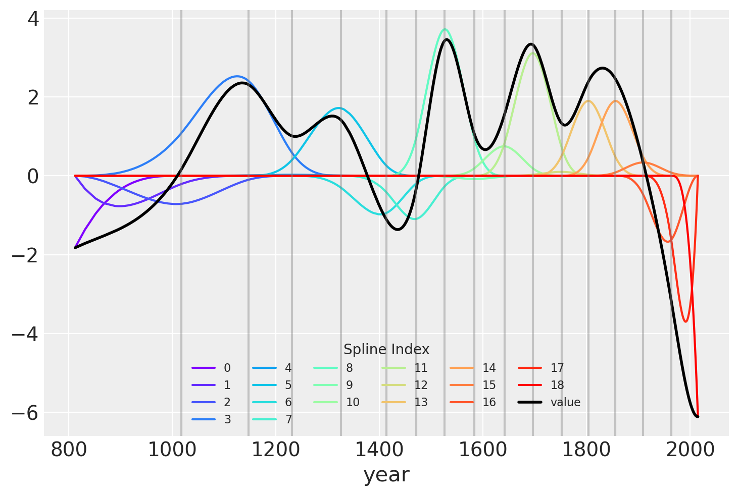
拟合样条值的另一种可视化方法是将它们与基矩阵相乘后绘制出来。 节点边界再次显示为垂直线,但现在样条基与 \(w\) 的值(表示为彩虹色曲线)相乘。 \(B\) 和 \(w\) 的点积(线性模型中的实际计算)以黑色显示。
wp = idata.posterior["w"].mean(("chain", "draw")).values

spline_df = (
    pd.DataFrame(B * wp.T)
    .assign(year=blossom_data.year.values)
    .melt("year", var_name="spline_i", value_name="value")
)

spline_df_merged = (
    pd.DataFrame(np.dot(B, wp.T))
    .assign(year=blossom_data.year.values)
    .melt("year", var_name="spline_i", value_name="value")
)


color = plt.cm.rainbow(np.linspace(0, 1, len(spline_df.spline_i.unique())))
fig = plt.figure()
for i, c in enumerate(color):
    subset = spline_df.query(f"spline_i == {i}")
    subset.plot("year", "value", c=c, ax=plt.gca(), label=i)
spline_df_merged.plot("year", "value", c="black", lw=2, ax=plt.gca())
plt.legend(title="Spline Index", loc="lower center", fontsize=8, ncol=6)

for knot in knot_list:
    plt.gca().axvline(knot, color="grey", alpha=0.4)
模型预测#
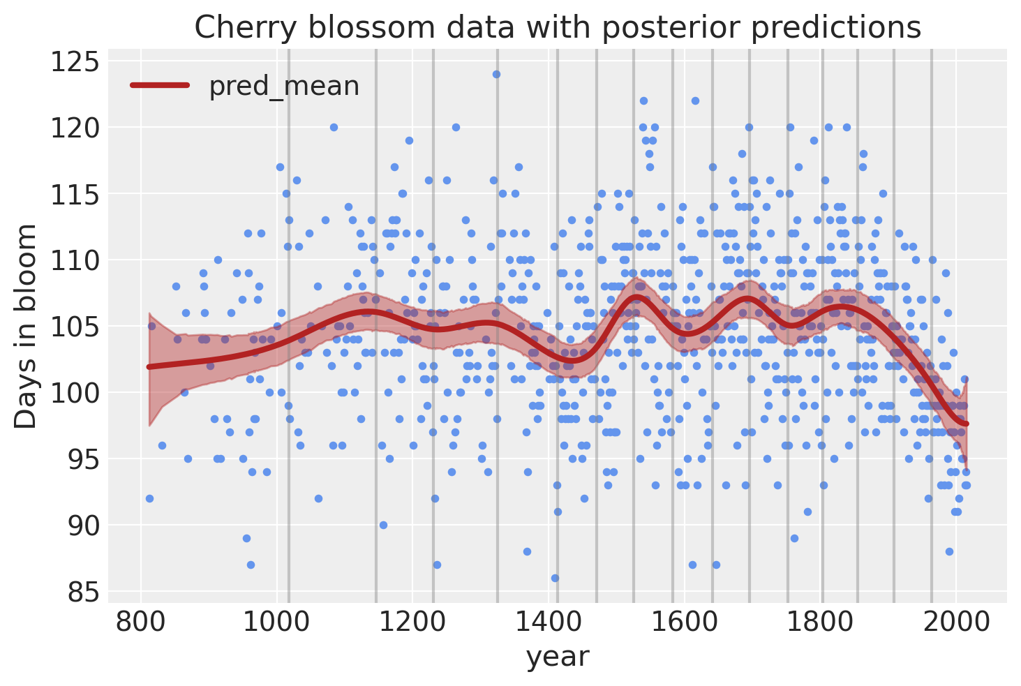
最后,我们可以使用后验预测检查来可视化模型的预测。
post_pred = az.summary(idata, var_names=["mu"]).reset_index(drop=True)
blossom_data_post = blossom_data.copy().reset_index(drop=True)
blossom_data_post["pred_mean"] = post_pred["mean"]
blossom_data_post["pred_hdi_lower"] = post_pred["hdi_3%"]
blossom_data_post["pred_hdi_upper"] = post_pred["hdi_97%"]
blossom_data.plot.scatter(
    "year",
    "doy",
    color="cornflowerblue",
    s=10,
    title="Cherry blossom data with posterior predictions",
    ylabel="Days in bloom",
)
for knot in knot_list:
    plt.gca().axvline(knot, color="grey", alpha=0.4)

blossom_data_post.plot("year", "pred_mean", ax=plt.gca(), lw=3, color="firebrick")
plt.fill_between(
    blossom_data_post.year,
    blossom_data_post.pred_hdi_lower,
    blossom_data_post.pred_hdi_upper,
    color="firebrick",
    alpha=0.4,
);
预测新数据#
现在假设我们获得了一个新数据集,其年份范围与原始数据集相同,并且我们希望使用拟合模型获得此新数据集的预测。 我们可以使用经典的 PyMC 工作流程 Data 容器和 set_data 方法来做到这一点。
不过,在我们到达那里之前,让我们注意一下,我们没有说新数据集包含新的年份,即样本外年份。 这是有意的,因为样条无法外推到用于拟合模型的数据集范围之外——因此它们在时间序列分析中受到限制。 但是,在之前见过的数据范围内,这没有问题。
撇开这种精确度不谈,让我们重新定义我们的模型,这次添加 Data 容器。
COORDS = {"obs": blossom_data.index}
with pm.Model(coords=COORDS) as spline_model:
    year_data = pm.Data("year", blossom_data.year)
    doy = pm.Data("doy", blossom_data.doy)

    # intercept
    a = pm.Normal("a", 100, 5)

    # Create spline bases & coefficients
    ## Store knots & design matrix for prediction
    spline_model.knots = np.percentile(year_data.eval(), np.linspace(0, 100, num_knots + 2))[1:-1]
    spline_model.dm = dmatrix(
        "bs(x, knots=spline_model.knots, degree=3, include_intercept=False) - 1",
        {"x": year_data.eval()},
    )
    spline_model.add_coords({"spline": np.arange(spline_model.dm.shape[1])})
    splines_basis = pm.Data("splines_basis", np.asarray(spline_model.dm), dims=("obs", "spline"))
    w = pm.Normal("w", mu=0, sigma=3, dims="spline")

    mu = pm.Deterministic(
        "mu",
        a + pm.math.dot(splines_basis, w),
    )
    sigma = pm.Exponential("sigma", 1)

    D = pm.Normal("D", mu=mu, sigma=sigma, observed=doy)
pm.model_to_graphviz(spline_model)

with spline_model:
    idata = pm.sample(
        nuts_sampler="nutpie",
        random_seed=rng,
    )
    idata.extend(pm.sample_posterior_predictive(idata, random_seed=rng))
/Users/alex_andorra/tptm_alex/pymc/pymc/pytensorf.py:1057: FutureWarning: compile_pymc was renamed to compile. Old name will be removed in a future release of PyMC
  warnings.warn(
/Users/alex_andorra/tptm_alex/pymc/pymc/pytensorf.py:1057: FutureWarning: compile_pymc was renamed to compile. Old name will be removed in a future release of PyMC
  warnings.warn(
采样器进度
总链数: 4
活动链数: 0
完成链数: 4
正在采样
预计完成时间: now
| 进度 | 抽取 | 发散 | 步长 | 梯度/抽取 |
|---|---|---|---|---|
| 2000 | 0 | 0.52 | 7 | |
| 2000 | 0 | 0.53 | 15 | |
| 2000 | 0 | 0.52 | 7 | |
| 2000 | 0 | 0.53 | 7 |
Sampling: [D]
现在我们可以换出数据并使用新数据更新设计矩阵
new_blossom_data = (
    blossom_data.sample(50, random_state=rng).sort_values("year").reset_index(drop=True)
)

# update design matrix with new data
year_data_new = new_blossom_data.year.to_numpy()
dm_new = build_design_matrices([spline_model.dm.design_info], {"x": year_data_new})[0]
使用 set_data 更新模型中的数据
with spline_model:
    pm.set_data(
        new_data={
            "year": year_data_new,
            "doy": new_blossom_data.doy.to_numpy(),
            "splines_basis": np.asarray(dm_new),
        },
        coords={
            "obs": new_blossom_data.index,
        },
    )
剩下的就是从后验预测分布中采样
with spline_model:
    preds = pm.sample_posterior_predictive(idata, var_names=["mu"])
Sampling: []
绘制预测图,检查一切是否顺利
_, axes = plt.subplots(1, 2, figsize=(16, 5), sharex=True, sharey=True)

blossom_data.plot.scatter(
    "year",
    "doy",
    color="cornflowerblue",
    s=10,
    title="Posterior predictions",
    ylabel="Days in bloom",
    ax=axes[0],
)
axes[0].vlines(
    spline_model.knots,
    blossom_data.doy.min(),
    blossom_data.doy.max(),
    color="grey",
    alpha=0.4,
)
axes[0].plot(
    blossom_data.year,
    idata.posterior["mu"].mean(("chain", "draw")),
    color="firebrick",
)
az.plot_hdi(blossom_data.year, idata.posterior["mu"], color="firebrick", ax=axes[0])

new_blossom_data.plot.scatter(
    "year",
    "doy",
    color="cornflowerblue",
    s=10,
    title="Predictions on new data",
    ylabel="Days in bloom",
    ax=axes[1],
)
axes[1].vlines(
    spline_model.knots,
    blossom_data.doy.min(),
    blossom_data.doy.max(),
    color="grey",
    alpha=0.4,
)
axes[1].plot(
    new_blossom_data.year,
    preds.posterior_predictive.mu.mean(("chain", "draw")),
    color="firebrick",
)
az.plot_hdi(new_blossom_data.year, preds.posterior_predictive.mu, color="firebrick", ax=axes[1]);
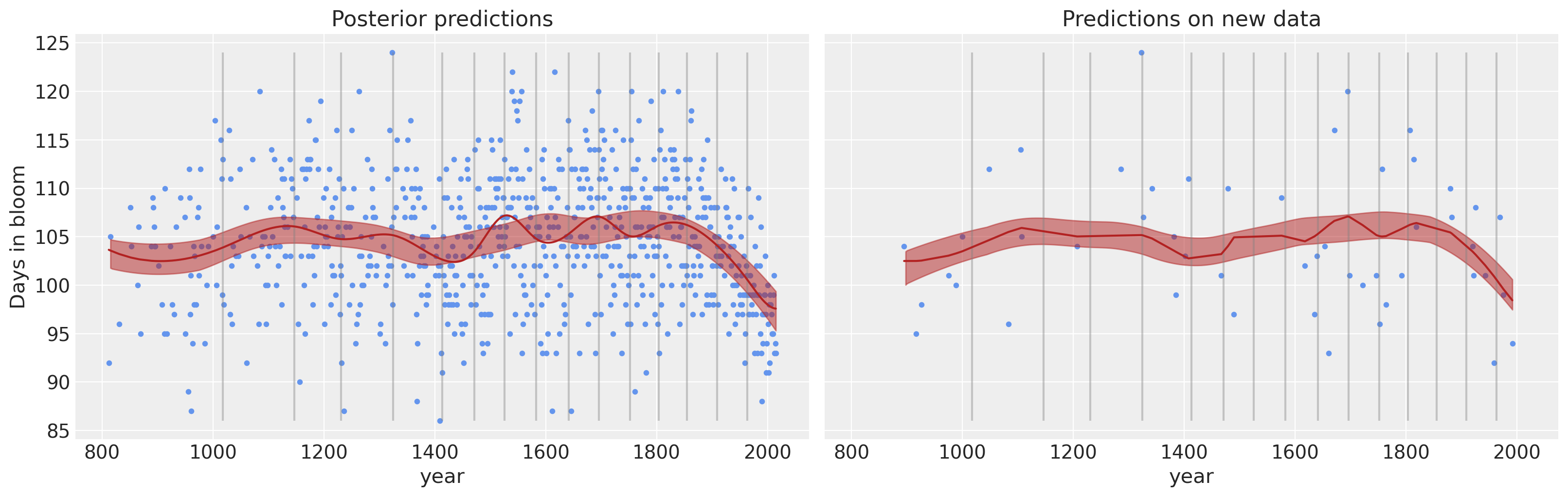
还有… 瞧! 诚然,这个例子不是最现实的例子,但我们相信您可以将其调整为您最疯狂的梦想;)
参考文献#
Osvaldo A Martin、Ravin Kumar 和 Junpeng Lao. Python 中的贝叶斯建模和计算。 Chapman and Hall/CRC, 2021. doi:10.1201/9781003019169.
Richard McElreath. Statistical rethinking: A Bayesian course with examples in R and Stan. Chapman and Hall/CRC, 2018.
水印#
%load_ext watermark
%watermark -n -u -v -iv -w -p pytensor,xarray,patsy
Last updated: Mon Feb 03 2025

Python implementation: CPython
Python version       : 3.12.3
IPython version      : 8.22.2

pytensor: 2.27.0
xarray  : 2024.3.0
patsy   : 1.0.1

pandas    : 2.2.1
arviz     : 0.20.0
pymc      : 5.20.0+24.g3b6e35163
matplotlib: 3.8.3
numpy     : 1.26.4

Watermark: 2.4.3
许可声明#
此示例库中的所有笔记本均根据 MIT 许可证 提供,该许可证允许修改和重新分发用于任何用途,前提是保留版权和许可声明。
引用 PyMC 示例#
要引用此笔记本,请使用 Zenodo 为 pymc-examples 存储库提供的 DOI。
重要提示
许多笔记本都改编自其他来源:博客、书籍……在这种情况下,您也应该引用原始来源。
另请记住引用您的代码使用的相关库。
这是一个 bibtex 中的引用模板
@incollection{citekey,
  author    = "<notebook authors, see above>",
  title     = "<notebook title>",
  editor    = "PyMC Team",
  booktitle = "PyMC examples",
  doi       = "10.5281/zenodo.5654871"
}
渲染后可能看起来像