


贝叶斯调节效应分析#
本笔记本涵盖贝叶斯调节效应分析。当我们认为一个预测变量(调节变量)可能会影响另一个预测变量和结果之间线性关系时,这适用。在这里,我们看一个例子,研究训练时长和肌肉质量之间的关系,其中年龄(调节变量)可能会影响这种关系。
本笔记本并非旨在作为解决各种数据分析问题的一站式解决方案,而是旨在作为教育性说明,展示调节效应分析的工作原理以及如何在 PyMC 中进行贝叶斯参数估计。
请注意,这有时会与中介效应分析混淆。当我们认为一个预测变量对结果变量的影响(部分或完全)通过第三个中介变量介导时,中介效应分析是适用的。读者可以参考 Hayes 的教科书 [2017],这是一本关于调节效应和相关模型的综合(尽管是频率学派的)指南,以及 PyMC 示例 贝叶斯中介效应分析。
import arviz as az
import matplotlib.pyplot as plt
import numpy as np
import pandas as pd
import pymc as pm
import xarray as xr

from matplotlib.cm import ScalarMappable
from matplotlib.colors import Normalize
az.style.use("arviz-darkgrid")
%config InlineBackend.figure_format = 'retina'
首先,在下面的(隐藏)代码单元格中,我们定义了一些用于绘图的辅助函数,我们将在稍后使用它们。
显示代码单元格源代码
def make_scalarMap(m):
    """Create a Matplotlib `ScalarMappable` so we can use a consistent colormap across both data points and posterior predictive lines. We can use `scalarMap.cmap` to use as a colormap, and `scalarMap.to_rgba(moderator_value)` to grab a colour for a given moderator value."""
    return ScalarMappable(norm=Normalize(vmin=np.min(m), vmax=np.max(m)), cmap="viridis")


def plot_data(x, moderator, y, ax=None):
    if ax is None:
        fig, ax = plt.subplots(1, 1)
    else:
        fig = plt.gcf()

    h = ax.scatter(x, y, c=moderator, cmap=scalarMap.cmap)
    ax.set(xlabel="x", ylabel="y")
    # colourbar for moderator
    cbar = fig.colorbar(h)
    cbar.ax.set_ylabel("moderator")
    return ax


def posterior_prediction_plot(result, x, moderator, m_quantiles, ax=None):
    """Plot posterior predicted `y`"""
    if ax is None:
        fig, ax = plt.subplots(1, 1)

    post = az.extract(result)
    xi = xr.DataArray(np.linspace(np.min(x), np.max(x), 20), dims=["x_plot"])
    m_levels = result.constant_data["m"].quantile(m_quantiles).rename({"quantile": "m_level"})

    for p, m in zip(m_quantiles, m_levels):
        y = post.β0 + post.β1 * xi + post.β2 * xi * m + post.β3 * m
        region = y.quantile([0.025, 0.5, 0.975], dim="sample")
        ax.fill_between(
            xi,
            region.sel(quantile=0.025),
            region.sel(quantile=0.975),
            alpha=0.2,
            color=scalarMap.to_rgba(m),
            edgecolor="w",
        )
        ax.plot(
            xi,
            region.sel(quantile=0.5),
            color=scalarMap.to_rgba(m),
            linewidth=2,
            label=f"{p*100}th percentile of moderator",
        )

    ax.legend(fontsize=9)
    ax.set(xlabel="x", ylabel="y")
    return ax


def plot_moderation_effect(result, m, m_quantiles, ax=None):
    """Spotlight graph"""

    if ax is None:
        fig, ax = plt.subplots(1, 1)

    post = az.extract(result)

    # calculate 95% CI region and median
    xi = xr.DataArray(np.linspace(np.min(m), np.max(m), 20), dims=["x_plot"])
    rate = post.β1 + post.β2 * xi
    region = rate.quantile([0.025, 0.5, 0.975], dim="sample")

    ax.fill_between(
        xi,
        region.sel(quantile=0.025),
        region.sel(quantile=0.975),
        alpha=0.2,
        color="k",
        edgecolor="w",
    )

    ax.plot(xi, region.sel(quantile=0.5), color="k", linewidth=2)

    # plot points at each percentile of m
    percentile_list = np.array(m_quantiles) * 100
    m_levels = np.percentile(m, percentile_list)
    for p, m in zip(percentile_list, m_levels):
        ax.plot(
            m,
            np.mean(post.β1) + np.mean(post.β2) * m,
            "o",
            c=scalarMap.to_rgba(m),
            markersize=10,
            label=f"{p}th percentile of moderator",
        )

    ax.legend(fontsize=9)

    ax.set(
        title="Spotlight graph",
        xlabel="$moderator$",
        ylabel=r"$\beta_1 + \beta_2 \cdot moderator$",
    )
训练对肌肉量的影响是否随年龄增长而减弱?#
我从一篇博文 van den Berg [n.d.] 中获得灵感,该博文研究了年龄是否影响(调节)训练对肌肉百分比的影响。我们可能会推测,更多的训练会带来更高的肌肉质量,至少对于年轻人来说是这样。但情况可能是,训练和肌肉质量之间的关系随年龄而变化——也许训练在增加老年人的肌肉质量方面效果较差?
示意性的框和箭头符号通常用于表示调节效应,箭头从调节变量指向预测变量和结果变量之间的连线。
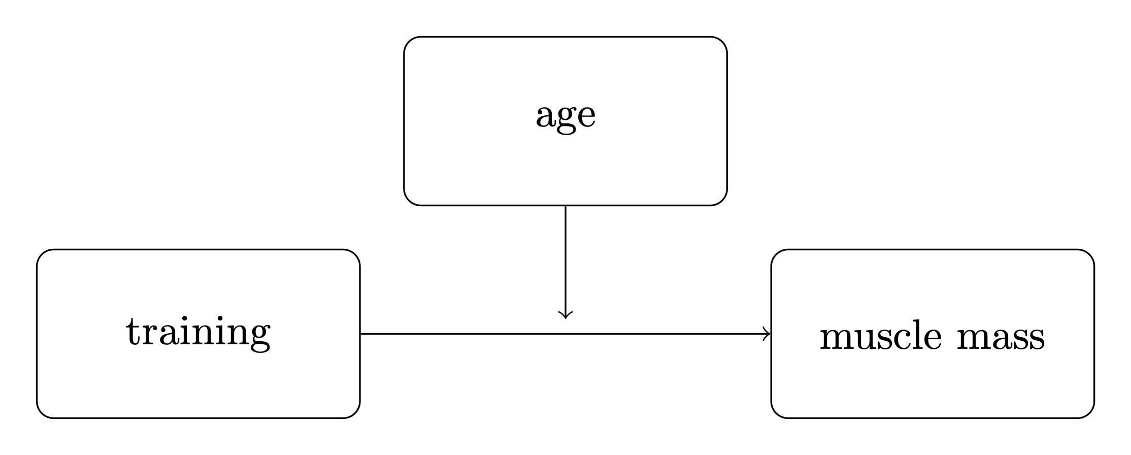
使用一致的符号可能很有用,因此我们将定义
\(x\) 作为主要预测变量。在本例中,它是训练。
\(y\) 作为结果变量。在本例中,它是肌肉百分比。
\(m\) 作为调节变量。在本例中,它是年龄。
调节效应模型#
虽然视觉示意图(上图)是在您已经了解调节效应是什么时理解复杂模型的有用速记,但您无法仅从图中推导出它。因此,让我们正式指定调节效应模型——它将结果变量 \(y\) 定义为
其中 \(y\)、\(x\) 和 \(m\) 是您的观测数据,以下是模型参数
\(\beta_0\) 是截距,其值在本模型的解释中没有那么重要。
\(\beta_1\) 是 \(y\)(肌肉百分比)随 \(x\)(训练时长)单位增加的速率。
\(\beta_2\) 是交互项 \(x \cdot m\) 的系数。
\(\beta_3\) 是 \(y\)(肌肉百分比)随 \(m\)(年龄)单位增加的速率。
\(\sigma\) 是观测噪声的标准差。
我们可以看到,均值 \(y\) 只是一个多元线性回归,其中两个预测变量 \(x\) 和 \(m\) 之间存在交互项。
我们可以通过将此视为一个多元线性回归来深入了解为什么会这样,其中 \(x\) 和 \(m\) 作为预测变量,但其中 \(m\) 的值影响 \(x\) 和 \(y\) 之间的关系。这是通过使 \(x\) 的回归系数成为 \(m\) 的函数来实现的
如果我们将其定义为线性函数 \(f(m) = \beta_1 + \beta_2 \cdot m\),我们得到
稍后我们可以使用 \(f(m) = \beta_1 + \beta_2 \cdot m\) 来可视化调节效应。
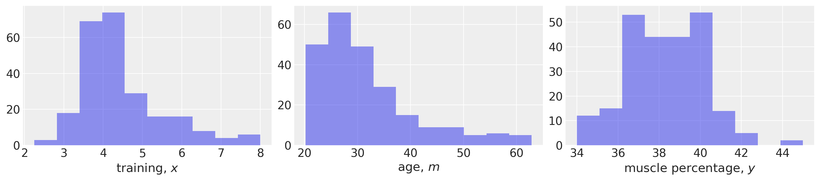
导入数据#
首先,我们将加载示例数据并进行一些基本的数据可视化。该数据集取自 van den Berg [n.d.],但尚不清楚这是否对应于真实的研究数据,或者是否是模拟数据。
def load_data():
    try:
        df = pd.read_csv("../data/muscle-percent-males-interaction.csv")
    except:
        df = pd.read_csv(pm.get_data("muscle-percent-males-interaction.csv"))

    x = df["thours"].values
    m = df["age"].values
    y = df["mperc"].values
    return (x, y, m)


x, y, m = load_data()

# Make a scalar color map for this dataset (Just for plotting, nothing to do with inference)
scalarMap = make_scalarMap(m)
fig, ax = plt.subplots(1, 3, figsize=(14, 3))

ax[0].hist(x, alpha=0.5)
ax[0].set(xlabel="training, $x$")

ax[1].hist(m, alpha=0.5)
ax[1].set(xlabel="age, $m$")

ax[2].hist(y, alpha=0.5)
ax[2].set(xlabel="muscle percentage, $y$");
定义 PyMC 模型并进行推断#
def model_factory(x, m, y):
    with pm.Model() as model:
        x = pm.ConstantData("x", x)
        m = pm.ConstantData("m", m)
        # priors
        β0 = pm.Normal("β0", mu=0, sigma=10)
        β1 = pm.Normal("β1", mu=0, sigma=10)
        β2 = pm.Normal("β2", mu=0, sigma=10)
        β3 = pm.Normal("β3", mu=0, sigma=10)
        σ = pm.HalfCauchy("σ", 1)
        # likelihood
        y = pm.Normal("y", mu=β0 + (β1 * x) + (β2 * x * m) + (β3 * m), sigma=σ, observed=y)

    return model
model = model_factory(x, m, y)
绘制模型图以确认其是否符合预期。
pm.model_to_graphviz(model)

with model:
    result = pm.sample(draws=1000, tune=1000, random_seed=42, nuts={"target_accept": 0.9})
Sampling 4 chains for 1_000 tune and 1_000 draw iterations (4_000 + 4_000 draws total) took 9 seconds.
可视化迹图以检查收敛性。
az.plot_trace(result);
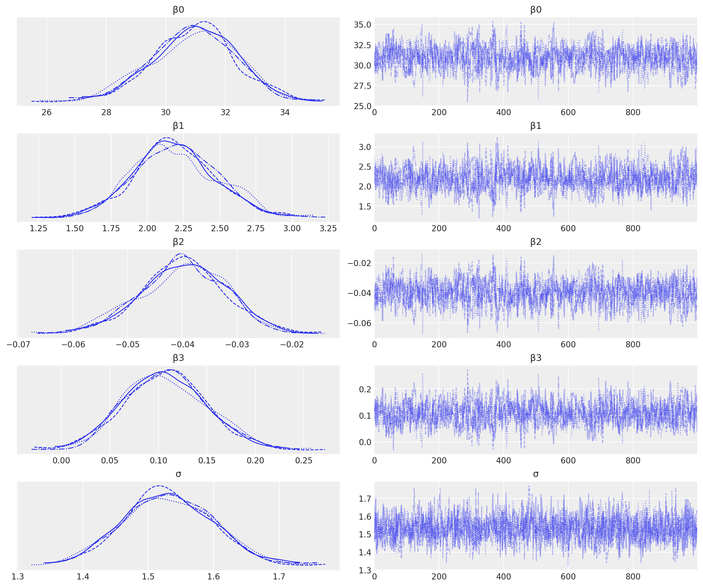
我们有良好的链混合,并且每条链的后验分布看起来非常相似,因此这方面没有问题。
可视化重要参数#
首先,我们将使用配对图来查看联合后验分布。这可能有助于我们识别交互项的任何估计问题(请参阅下面关于多重共线性的讨论)。
az.plot_pair(
    result,
    marginals=True,
    point_estimate="median",
    figsize=(12, 12),
    scatter_kwargs={"alpha": 0.01},
);
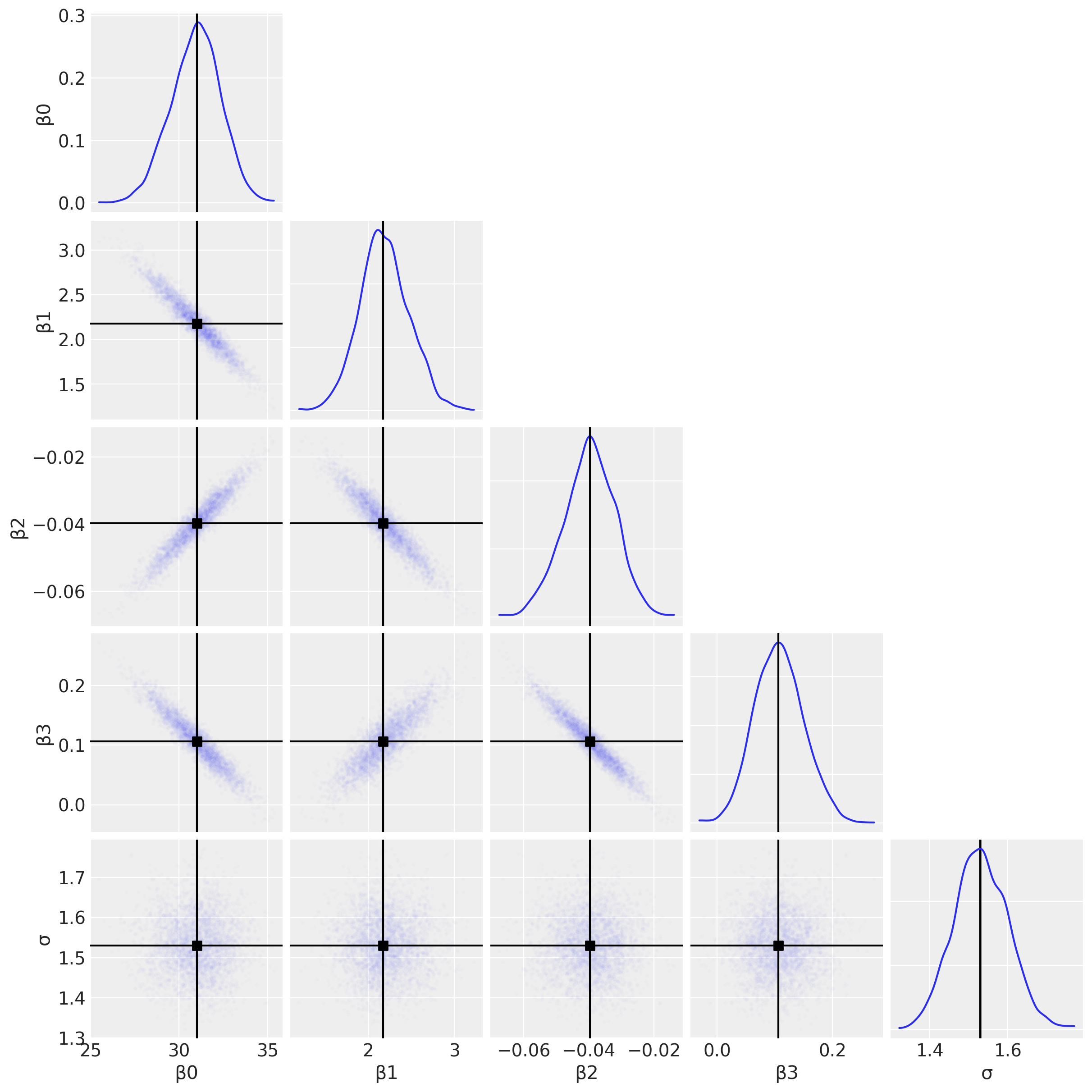
仅仅为了完整起见,我们可以绘制每个 \(\beta\) 参数的后验分布,并使用它来得出研究结论。
az.plot_posterior(result, var_names=["β1", "β2", "β3"], figsize=(14, 4));
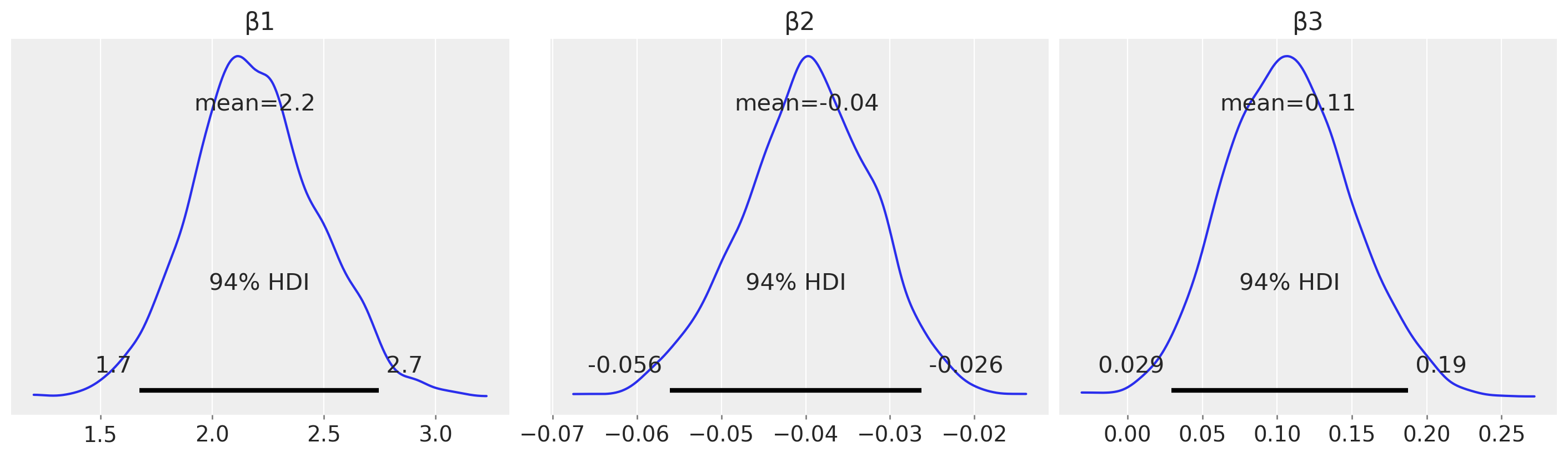
例如,从估计(相对于假设检验)的角度来看,我们可以查看 \(\beta_2\) 上的后验分布,并声称存在可信的小于零的调节效应。
后验预测检验#
定义我们感兴趣可视化的 \(m\) 的一组分位数。
m_quantiles = [0.025, 0.25, 0.5, 0.75, 0.975]
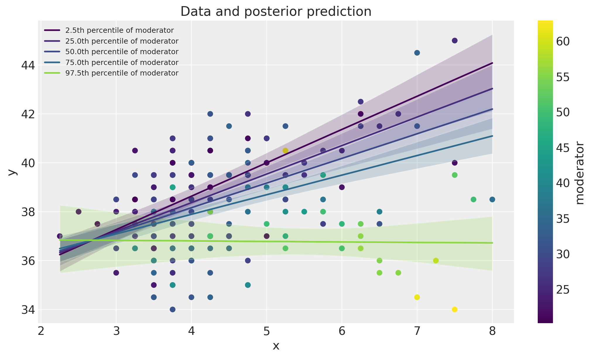
数据空间中的可视化#
在这里,我们将数据与模型后验预测检验一起绘制。这可以作为一种有用的可视化方法,用于比较模型预测与数据。
fig, ax = plt.subplots(figsize=(10, 6))
ax = plot_data(x, m, y, ax=ax)
posterior_prediction_plot(result, x, m, m_quantiles, ax=ax)
ax.set_title("Data and posterior prediction");
聚光灯图#
我们还可以通过绘制 \(\beta_1 + \beta_2 \cdot m\) 作为 \(m\) 的函数来可视化调节效应。这被称为聚光灯图,请参阅 Spiller et al. [2013] 和 McClelland et al. [2017]。
fig, ax = plt.subplots(1, 2, figsize=(10, 5))
plot_moderation_effect(result, m, m_quantiles, ax[0])
az.plot_posterior(result, var_names="β2", ax=ax[1]);
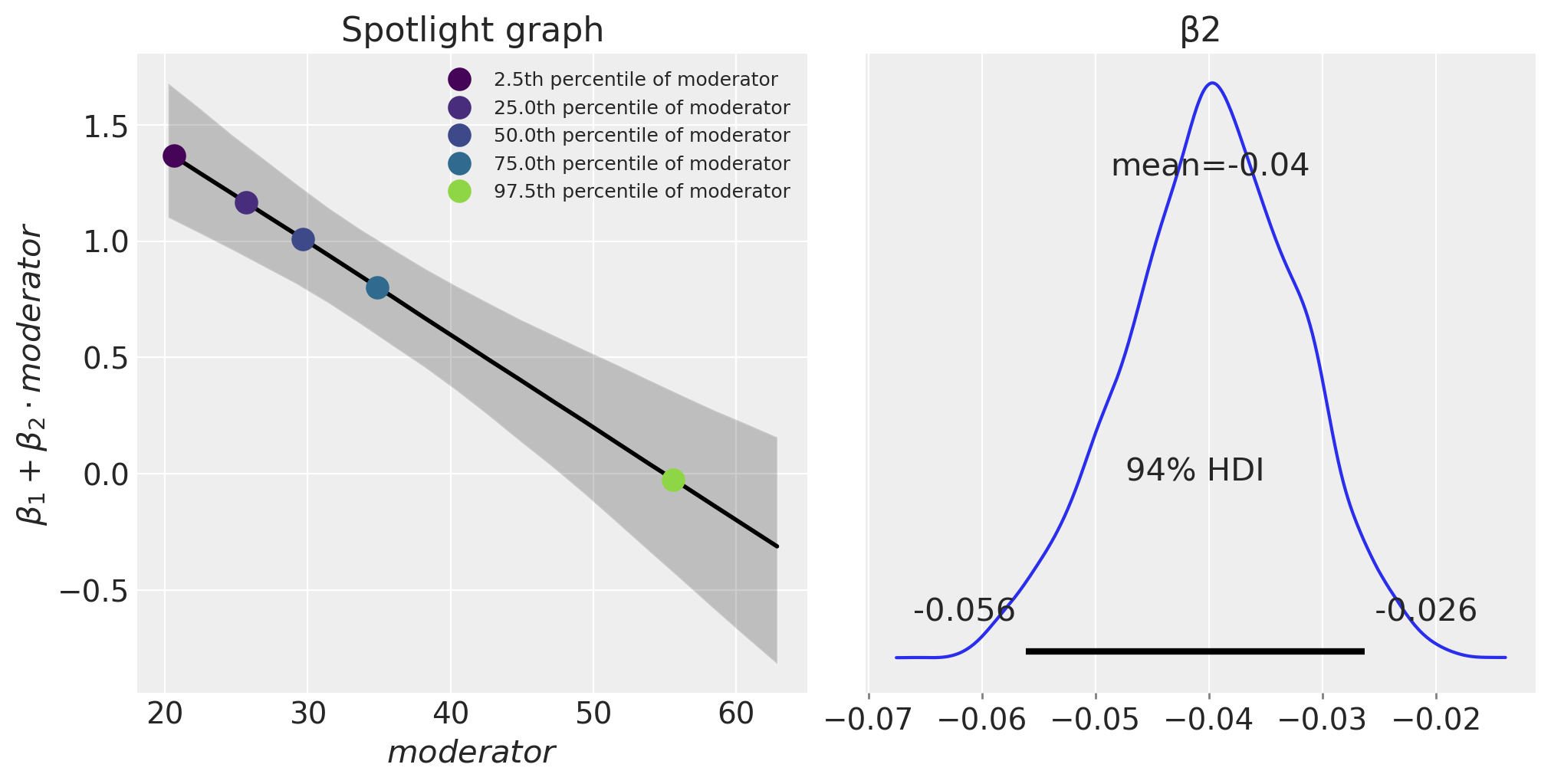
表达式 \(\beta_1 + \beta_2 \cdot \text{moderator}\) 定义了结果(肌肉百分比)相对于 \(x\)(每周训练时长)单位变化率。我们可以看到,随着年龄(调节变量)的增长,每周训练时长对肌肉百分比的影响减小。
延伸阅读#
有关“调节效应”的更多信息,或 McClelland et al. [2017] 称为聚光灯图的内容,可以在 Bauer 和 Curran [2005] 和 Spiller et al. [2013] 中找到。尽管这些论文采用了频率学派(而非贝叶斯)的视角。
Zhang 和 Wang [2017] 比较了最大似然法和贝叶斯方法在预测变量缺失数据的情况下进行调节效应分析。
多重共线性、数据中心化和带有交互项的线性模型也在许多著名的贝叶斯教科书中讨论过 [Kruschke, 2014, McElreath, 2018, Gelman et al., 2013, Gelman et al., 2020]。
参考文献#
John Kruschke. Doing Bayesian data analysis: A tutorial with R, JAGS, and Stan. Academic Press, 2014.
Richard McElreath. Statistical rethinking: A Bayesian course with examples in R and Stan. Chapman and Hall/CRC, 2018.
Andrew F Hayes. Introduction to mediation, moderation, and conditional process analysis: A regression-based approach. Guilford publications, 2017.
R. G van den Berg. Spss moderation regression tutorial. URL: https://www.spss-tutorials.com/spss-regression-with-moderation-interaction-effect/ (访问于 2022-03-20)。
Stephen A Spiller, Gavan J Fitzsimons, John G Lynch Jr, and Gary H McClelland. Spotlights, floodlights, and the magic number zero: simple effects tests in moderated regression. Journal of marketing research, 50(2):277–288, 2013.
Gary H McClelland, Julie R Irwin, David Disatnik, and Liron Sivan. Multicollinearity is a red herring in the search for moderator variables: a guide to interpreting moderated multiple regression models and a critique of iacobucci, schneider, popovich, and bakamitsos (2016). Behavior research methods, 49(1):394–402, 2017.
Dawn Iacobucci, Matthew J Schneider, Deidre L Popovich, and Georgios A Bakamitsos. Mean centering helps alleviate “micro” but not “macro” multicollinearity. Behavior research methods, 48(4):1308–1317, 2016.
Dawn Iacobucci, Matthew J Schneider, Deidre L Popovich, and Georgios A Bakamitsos. Mean centering, multicollinearity, and moderators in multiple regression: the reconciliation redux. Behavior research methods, 49(1):403–404, 2017.
Daniel J Bauer and Patrick J Curran. Probing interactions in fixed and multilevel regression: inferential and graphical techniques. Multivariate behavioral research, 40(3):373–400, 2005.
Qian Zhang and Lijuan Wang. Moderation analysis with missing data in the predictors. Psychological methods, 22(4):649, 2017.
Andrew Gelman, John B. Carlin, Hal S. Stern, David B. Dunson, Aki Vehtari, and Donald B. Rubin. Bayesian Data Analysis. Chapman and Hall/CRC, 2013.
Andrew Gelman, Jennifer Hill, and Aki Vehtari. Regression and other stories. Cambridge University Press, 2020.
水印#
%load_ext watermark
%watermark -n -u -v -iv -w -p pytensor,aeppl,xarray
Last updated: Sun Feb 05 2023

Python implementation: CPython
Python version       : 3.10.9
IPython version      : 8.9.0

pytensor: 2.8.11
aeppl   : not installed
xarray  : 2023.1.0

pandas    : 1.5.3
arviz     : 0.14.0
xarray    : 2023.1.0
numpy     : 1.24.1
pymc      : 5.0.1
matplotlib: 3.6.3

Watermark: 2.3.1
许可声明#
此示例库中的所有笔记本均根据 MIT 许可证 提供,该许可证允许修改和再分发用于任何用途,前提是保留版权和许可声明。
引用 PyMC 示例#
要引用此笔记本,请使用 Zenodo 为 pymc-examples 存储库提供的 DOI。
重要提示
许多笔记本都改编自其他来源:博客、书籍……在这种情况下,您也应该引用原始来源。
还请记住引用您的代码使用的相关库。
这是一个 BibTeX 引用模板
@incollection{citekey,
  author    = "<notebook authors, see above>",
  title     = "<notebook title>",
  editor    = "PyMC Team",
  booktitle = "PyMC examples",
  doi       = "10.5281/zenodo.5654871"
}
渲染后可能看起来像